ORANGE: Movie Color Palettes
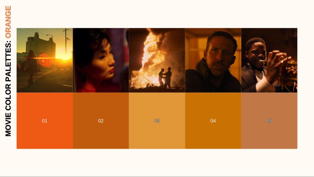
Orange — the comforting glow of a campfire, the vibrant splash of autumn, but also the stark alert of a hazard sign or the destructive force of an explosion. In our ongoing “Movie Color Palette” series, following explorations of red, blue, yellow, green, and magenta, we arrive at orange, a hue uniquely positioned between intense passion and energetic caution. It possesses a captivating duality, capable of conveying both inviting warmth and urgent warning, youthful energy and impending intensity.
In this sixth installment, we’ll delve into the psychology and diverse symbolism of orange in film. How does this warm, energetic hue shape our emotional response? When does it signal danger, and when does it offer comfort? We’ll analyze how filmmakers across genres utilize orange — think the “golden hour” magic, the intensity of explosions, the specific palettes of sci-fi worlds, or the candlelit interiors of period pieces — through lighting, costume, and production design. Through iconic film examples, we’ll see how orange adds layers of meaning and visual dynamism to the stories we love.
MOVIE COLOR PALETTE SERIES
Our exploration of color’s role in visual storytelling continues. Each article in the “Movie Color Palette” series aims to dissect the visual language of film, one hue at a time, providing insights to deepen your appreciation and enhance your own filmmaking craft. Let’s dive into the warm embrace (and occasional fiery warning) of cinematic orange!
ORANGE: FROM EARTH PIGMENTS TO EARLY TECHNICOLOR WARMTH
Before we explore the specific ways orange illuminates the silver screen, it’s helpful to understand its journey through art history and human perception.
Interestingly, the word “orange” is a distinct color name that is relatively young in many languages. It’s directly derived from the fruit, which arrived in Europe centuries ago but wasn’t widely cultivated until the later Middle Ages.
This doesn’t mean ancient cultures didn’t see reddish-yellow or yellowish-red hues. They often lacked a separate category, grouping these shades with either red or yellow.
Despite the lack of a specific name, pigments creating orange-like colors existed and were used symbolically.
ANCIENT EGYPT
In tomb paintings and decorations, the Egyptians utilized reddish-yellow ochres and minerals like realgar (an orange-red arsenic sulfide). These hues could evoke the warmth of the sun, the color of the desert landscape, or be associated with specific deities related to energy or protection.

While gold (yellow) and turquoise (blue-green) often held higher symbolic status, these warm earth tones were integral parts of their palette.
ANCIENT GREECE AND ROME
Ochres continued to be essential. Reddish-yellows might appear in depictions of fire, sunsets, autumn harvests, or be associated with figures like Bacchus/Dionysus, representing revelry and the changing seasons.

Roman fresco from the fullonica of Veranius Hypsaeus in Pompeii | Museo Archeologico Nazionale
However, orange itself didn’t carry the strong, distinct symbolic weight of red (war, passion) or the later associations of blue or purple.
MEDIEVAL AND RENAISSANCE PALETTES
As pigment technology evolved, artists gained access to brighter orange-reds like minium (red lead) and used materials like saffron for rich yellows that could be blended. Orange hues appeared more frequently in depictions of fire, sunsets, rich fabrics, or autumnal scenes.

Illuminated Gospel, Amhara peoples, Ethiopia, late 14th–early 15th century | The Metropolitan Museum of Art
Situated between passionate red and often divine (or sometimes treacherous) yellow, orange occupied an intermediate space. It could signify energy, warmth, and the bounty of harvest. However, it could also serve as a color of warning or transition, lacking the consistent symbolic gravity of primary colors or royal purple.
ORANGE FINDS ITS ARTISTIC VOICE
Later artistic movements fully embraced orange’s expressive potential. Baroque masters like Rembrandt masterfully used warm, orange-toned light and shadow (chiaroscuro) to create dramatic focal points and intimate atmospheres.

Rembrandt van Rijn’s masterpiece ‘Night Watch’ | Rijksmuseum
By the time of the Impressionists and Post-Impressionists, with the advent of new, vibrant synthetic pigments like cadmium orange, the color truly came into its own.
Artists like Van Gogh and Gauguin used orange boldly. Often juxtaposing it with blues and purples to create powerful contrasts, capture the intensity of light (especially sunsets), and express raw emotion.

Vincent van Gogh ‘Willows at Sunset’ | Kröller-Müller Museum
EARLY CINEMA AND THE GLOW OF TECHNICOLOR:
The story of orange in early cinema is fundamentally a story about technology. Unlike its spectral neighbors, red and yellow, which could often be approximated even in limited color systems, rendering a true, vibrant orange consistently was difficult.
Its successful and widespread appearance on screen was directly tied to advancements in color film processes, most notably the crucial development of three-strip Technicolor.
TWO-STRIP TECHNICOLOR
The earliest widespread color process (dominant until the mid-1930s) primarily captured reds and greens. True, vibrant oranges were difficult, if not impossible, to render accurately.
THREE-STRIP TECHNICOLOR
The arrival of three-strip Technicolor in the mid-1930s was a game-changer for orange. This process could capture a much wider spectrum, allowing for rich, saturated oranges to appear on screen.
Filmmakers quickly utilized this newfound capability. In early three-strip Technicolor films (late 1930s), orange added a new level of visual richness and realism (or heightened reality). It was perfect for depicting:
- FIRELIGHT AND CANDLELIGHT: Creating warm, intimate, or dramatic interior scenes.
- SUNSETS AND SUNRISES: Adding dramatic flair and beauty to landscapes.
- COSTUMES AND DECOR: Reflecting period details or adding visual vibrancy, especially in musicals or historical adventures.
- WARMTH AND ENERGY: Generally infusing scenes with a sense of warmth, comfort, or dynamism.
Filmmakers quickly utilized this newfound capability to render orange. In early three-strip Technicolor films, orange added a new level of visual richness and realism (or heightened reality). Consider landmark productions like Gone With The Wind (1939), where orange hues were essential for depicting dramatic sunsets and the fiery destruction of Atlanta.

Gone with the Wind (1939) | MGM
Fantasy adventures like The Thief of Bagdad (1940) embraced the expanded palette, using vibrant oranges for magical effects, exotic set designs, and elaborate costumes.

The Thief of Bagdad (1940) | Universal Pictures
Generally, orange became perfect for depicting firelight and candlelight, adding dramatic flair to sunsets and sunrises, enriching costumes and decor, and infusing scenes with a sense of warmth, comfort, or dynamism.
| In these early applications, orange was perhaps used less for deep, complex symbolism and more for its immediate visual impact. Specifically, its warmth, its energy, and its ability to enrich the newly colorful cinematic world. These initial uses, made possible by technological advancements, laid the foundation for film makers in the Golden Age and beyond to explore the deeper emotional and narrative potential of orange. |
ORANGE ON SCREEN: ICONIC DIRECTORS HARNESS WARMTH AND WARNING
As Technicolor matured and filmmakers gained confidence with the expanded color palette, orange stepped out from simply representing firelight and sunsets. Iconic directors began to consciously wield its unique energy — derived from the passion of red and the vibrancy of yellow — to create specific atmospheres, underscore themes, and define memorable cinematic moments. They explored its duality, using its warmth for comfort and nostalgia. While also symbolizing its intensity for danger, artificiality, and psychological unease.
STANLEY KUBRICK: ORANGE AS CANDLELIGHT, FIRE & MOOD
Stanley Kubrick’s meticulous visual control extended to his varied use of orange. In Barry Lyndon (1975), he famously relied almost exclusively on candlelight, bathing 18th-century interiors in a warm, flickering orange glow that conveyed historical authenticity and fragile intimacy.

Barry Lyndon (1975) | Warner Bros.
This contrasts dramatically with the visceral, fiery orange of explosions and combat in Full Metal Jacket (1987), used to represent the hellish chaos of war.

Full Metal Jacket (1987) | Warner Bros.
Later, in Eyes Wide Shut (1999), warm orange practical lighting subtly contributes to the film’s dreamlike, psychologically charged atmosphere, suggesting uneasy intimacy or hidden desires.

Eyes Wide Shut (1999) | Warner Bros.
Kubrick employed orange contextually — for painterly realism, violent impact, or nuanced atmospheric effect — always with precise intent.
FRANCIS FORD COPPOLA: ORANGE AS WAR’S INFERNO AND FAMILIAL FACADE
Francis Ford Coppola utilized the intense, fiery aspects of orange to stunning effect. In Apocalypse Now (1979), orange dominates the explosive napalm sequences, becoming synonymous with the destruction, chaos, and hellish reality of the Vietnam War.

Apocalypse Now (1979) | Universal Pictures
The saturated orange glow of explosions against the dark jungle creates unforgettable images of horror and surreal beauty, perfectly capturing the mission’s descent into madness.
In contrast, within the rich, often sepia-toned palette of The Godfather (1972) and Part II (1974), warm oranges appear in lamp-lit interiors during scenes of family gatherings or business dealings.
 |
 |
(L) The Godfather (1972), (R) The Godfather: Part II (1974) | Paramount Pictures
This orange evokes tradition and familial warmth, yet often serves as a deceptive facade, masking the underlying corruption, darkness, and simmering violence inherent in the Corleone world.
NICOLAS ROEG: ORANGE AS ATMOSPHERIC DECAY AND ALIENATION
Nicolas Roeg, known for his fragmented narratives and striking visuals, often used color atmospherically. In Don’t Look Now (1973), the decaying beauty of Venice is rendered in a palette rich with watery blues, ominous reds, and significantly, warm, earthy oranges and ochres found in the aging architecture and dimly lit interiors.

Don’t Look Now (1973) | Criterion Collection
This orange isn’t vibrant. Rather, it’s often muted, contributing to the film’s pervasive sense of grief, mystery, and impending dread.
In The Man Who Fell to Earth (1976), orange appears in the stark desert landscapes, emphasizing the alien protagonist’s (David Bowie) isolation and displacement on Earth, contrasting with the cooler tones of technology or the lushness he remembers.

The Man Who Fell to Earth (1976) | British Lion Film Corporation
TERRENCE MALICK: THE MAGIC HOUR ORANGE OF DAYS OF HEAVEN
Terrence Malick’s Days of Heaven (1978) remains legendary for its breathtaking cinematography, largely captured by Néstor Almendros during the fleeting moments of “magic hour.”

Days of Heaven (1978) | Paramount Pictures
While often described as golden, the light in these sequences frequently tips into rich, deep oranges. Almendros masterfully utilized this natural, transient orange glow to bathe the early 20th-century Texas landscapes and the film’s characters in a nostalgic, painterly, and almost mythic light.
STEVEN SPIELBERG: THE WARM ORANGE GLOW OF ADVENTURE IN RAIDERS OF THE LOST ARK
Steven Spielberg and cinematographer Douglas Slocombe masterfully utilize orange in Raiders of the Lost Ark (1981) to define its classic adventure atmosphere.
The most striking use is the flickering orange glow of torchlight illuminating ancient tombs like the Well of Souls, carving suspense and mystery out of the darkness while highlighting danger.

Raiders of the Lost Ark (1981) | Paramount Pictures
Orange also suffuses the frame during scenes depicting the harsh Egyptian desert sun or dramatic sunsets during Indy’s travels. Thus, orange evokes heat, exotic locales, and the epic scope of his quest.

Raiders of the Lost Ark (1981) | Paramount Pictures
Even moments of intense danger, like fiery explosions or the Ark’s unleashed power, burn with orange hues. Spielberg uses this warm, often intense color palette to ground the adventure. Ultimately, orange creates a tangible sense of place, danger, and thrilling discovery.
GEORGE P. COSMATOS: THE EXPLOSIVE ORANGE OF 80S/90S ACTION
Director George P. Cosmatos was a key figure in the high-octane action and thriller genres of the 1980s and early 90s. His films often employed color for maximum visceral impact.
In his work, orange frequently appears not as a subtle thematic layer but as the direct, intense color of fire, explosions, and imminent danger. Think of the jungle warfare and fiery set pieces in Rambo: First Blood Part II (1985) or the urban chaos and explosive confrontations in Cobra (1986).

Rambo: First Blood Part II (1985) | Miramax Films
In these films, the bright, saturated orange of explosions and firelight serves to heighten the sense of action, destruction, and intensity. The color becomes a visual signature of the genre during that era.

Tombstone (1993) | Buena Vista Pictures
Similarly, orange contributes naturally to the atmosphere in the Western Tombstone (1993). Through the depiction of desert sunsets, dusty landscapes, warm firelight, and lamplit saloon interiors, it grounds the action in the specific heat and feel of the Old West.
SPIKE LEE: THE ORANGE OF URBAN HEAT AND SOCIAL COMMENTARY
Filmmaker Spike Lee often uses vibrant color to amplify his exploration of urban life and social tension. He frequently employs orange to represent both literal and metaphorical heat.
This is most powerfully seen in Do the Right Thing (1989). Saturated oranges and reds visually convey the oppressive temperature of a sweltering Brooklyn summer day and the simmering racial conflicts about to ignite, permeating the lighting and design.

Do The Right Thing (1989) | Universal Pictures
In other films, like the 70s-set BlacKkKlansman (2018), orange contributes to evoking a specific period aesthetic.

BlacKkKlansman (2018) | Focus Features
| These directors demonstrate the growing sophistication in the use of orange during this era. They moved beyond its simple associations with warmth and fire, using it to signify complex psychological states, critique society, build atmosphere, and create distinct generic aesthetics. They unlocked the potential residing between red and yellow, adding another vital layer to the expressive language of color in cinema. |
ORANGE IN CONTEMPORARY CINEMA: FROM WASTELANDS TO WARM FUTURES
The legacy of orange in cinema, established by the iconic directors of previous eras, continues to evolve in the hands of contemporary filmmakers. With the advanced tools of digital cinematography and color grading, directors today can manipulate orange with incredible precision, pushing its expressive boundaries. They use it not only to evoke natural warmth but also to create highly stylized atmospheres, signal danger, explore complex themes, and define unique visual worlds.
SEAN BAKER: THE SATURATED ORANGE OF LA STREET LIFE IN TANGERINE
Sean Baker often uses vibrant color to capture specific environments, and in Tangerine (2015), famously shot on iPhones, orange dominates through the amplified Los Angeles sunlight.

Tangerine (2015) | Magnolia Pictures
Baker and cinematographer Radium Cheung push the saturation of these warm, golden-orange hues, creating a hyperreal, sun-blasted aesthetic that reflects the frenetic energy of the characters and their chaotic Christmas Eve journey through Hollywood.
This intense orange grounds the film in its specific time and place while simultaneously giving it a distinctive, high-energy visual style, turning everyday sunlight into a key atmospheric element.
DAVID ROBERT MITCHELL: ORANGE AS DREAMLIKE NOSTALGIA AND SUBTLE UNEASE
Director David Robert Mitchell, often collaborating with DP Mike Gioulakis, uses orange atmospherically in his stylish, genre-bending films like It Follows (2014) to create a signature sense of dreamlike nostalgia or subtle unease.
Orange appears sparingly in the hazy glow of sunsets or warm interior practicals, offering fleeting moments of warmth contrasting with the film’s pervasive dread.

It Follows (2014) | Animal Kingdom
For Mitchell, orange enhances mood and evokes the uncanny lurking beneath familiar surfaces.
LYNNE RAMSAY: ORANGE AS ATMOSPHERIC ACCENT
Filmmaker Lynne Ramsay, known for her visually textured and psychologically intense films, uses orange subtly and contextually. It often appears not as a dominant symbol, but as an atmospheric accent — perhaps a shift to warmer tones signifying a change in location in Morvern Callar (2002).

Morvern Callar (2002) | BBC Film
Even in We Need to Talk About Kevin (2011), a film overwhelmingly defined by its symbolic use of red, orange appears fleetingly in practical lighting, offering a fragile, warm counterpoint to the pervasive sense of dread.

We Need to Talk About Kevin (2011) | BBC Film
Rather than bold statements, Ramsay integrates orange naturally into her carefully crafted palettes, using its warmth or intensity primarily to enhance mood and add realistic layers to her visceral, character-driven stories.
DENIS VILLENEUVE: THE UNSETTLING ORANGE OF DYSTOPIA
Denis Villeneuve frequently employs orange, often paired with yellows or contrasted against blues, to create unsettling yet visually stunning environments. In Blade Runner 2049 (2017), the sprawling, radioactive ruins of Las Vegas are bathed in a thick, hazy orange glow.

Blade Runner 2049 (2017) | Columbia Pictures
This isn’t the warm orange of a setting sun. It’s a toxic, suffocating hue representing environmental catastrophe, decay, and isolation.
Similarly, in Dune (2021), the vast desert landscapes of Arrakis are rendered in harsh, oppressive yellows and oranges. It emphasizes the planet’s deadly heat, unforgiving nature, and the preciousness of its resource, the spice.

Dune: Part 1 (2021) | Legendary Entertainment
Villeneuve uses orange to signify danger, otherworldly landscapes, and worlds pushed to an extreme.
DANNY BOYLE: THE VISCERAL ORANGE OF COSMIC POWER IN SUNSHINE
Danny Boyle’s intense sci-fi thriller Sunshine (2007), beautifully shot by Alwin H. Küchler, places the color orange at the absolute heart of its visual and thematic concerns.

Sunshine (2007) | Fox Searchlight Pictures
Tasked with reigniting the dying sun, the film’s crew is constantly confronted by its overwhelming presence, represented by blindingly intense oranges, yellows, and golds. This isn’t just warmth. It’s the terrifying beauty, immense heat, and sheer power of a star.

Sunshine (2007) | Fox Searchlight Pictures
Within the spaceship Icarus II, the cool blues and metallic grays are often pierced by the artificial orange glow of emergency lighting or the searing glare from viewing portals, creating a constant visual tension between human fragility and cosmic forces.
DAMIEN CHAZELLE: ORANGE AS DREAM, AMBITION, AND INTENSITY
Damien Chazelle often wields orange to visualize the burning intensity of dreams and ambition in his films, frequently collaborating with DP Linus Sandgren. In La La Land (2016), the iconic magic hour sequences are drenched in warm, vibrant oranges, symbolizing romantic aspiration and the alluring myth of Los Angeles.

La La Land (2016) | Lionsgate
This contrasts sharply with the often harsh, pressurized orange tungsten glow found in the practice rooms and under the stage lights of Whiplash (2014), reflecting obsessive dedication and high-stress performance.

Whiplash (2014) | Sony Pictures Classics
Similarly, Babylon (2022) likely uses the fiery oranges of decadent parties and chaotic film sets to represent the consuming ambition and volatile excess of early Hollywood.

Babylon (2022) | Paramount Pictures
Chazelle masterfully modulates orange — from dreamy sunset to intense spotlight — to highlight his characters’ driving passions.
GEORGE MILLER: THE FIERY ORANGE OF THE APOCALYPSE
George Miller’s return to the wasteland in Mad Max: Fury Road (2015) is a masterclass in kinetic filmmaking, driven by a powerful, yet seemingly simple, color palette.

Mad Max: Fury Road (2015) | Warner Bros.
Fiery, saturated oranges dominate the film, representing the scorching desert sun, the rusted metal of the vehicles, explosive chaos, and the raw, primal energy of survival.
Miller revisits and expands upon this signature fiery aesthetic in the prequel, Furiosa: A Mad Max Saga (2024), further cementing orange as the defining color of his unforgiving, visually stunning post-apocalyptic vision.

Furiosa: A Mad Max Saga (2024) | Warner Bros.
This intense orange, often contrasted starkly against clear blue skies or the cooler blue tones of night scenes in both films, creates a visceral, high-octane visual experience. It’s the color of fire, fuel, and fury, perfectly embodying the harsh desert setting and the relentless action that defines this world.
BARRY JENKINS: ORANGE AS INTIMATE WARMTH IN IF BEALE STREET COULD TALK
In the visually rich and emotionally resonant If Beale Street Could Talk (2018), director Barry Jenkins and cinematographer James Laxton utilize orange not for spectacle, but for profound intimacy.

If Beale Street Could Talk (2018) | Annapurna Pictures
Within the film’s carefully crafted palette, warm, orange-toned light often emanates from practical sources like lamps within interior scenes. This soft, inviting glow envelops the central couple, Tish (KiKi Layne) and Fonny (Stephan James), creating tangible feelings of warmth, tenderness, and cherished memory.
This gentle orange becomes a visual refuge, a pocket of love and connection standing in stark contrast to the harsher blues and grays of the external world and the injustices they face.
WES ANDERSON: THE NOSTALGIC ORANGE OF AUTUMN AND WHIMSY
Wes Anderson, known for his meticulous and highly stylized color palettes, often uses orange to evoke warmth, nostalgia, and a specific sense of time and place. In the stop-motion animation Fantastic Mr. Fox (2009), the entire film is steeped in the rich, earthy oranges, yellows, and browns of autumn, creating a cozy, rustic atmosphere.

Fantastic Mr. Fox (2009) | Twentieth Century Fox
In Moonrise Kingdom (2012), warm, golden-orange hues often feature in scenes depicting young love and adventure, imbued with a sense of innocent nostalgia.

Moonrise Kingdom (2012) | Focus Features
Anderson’s orange is often comforting, stylized, and deeply tied to memory and feeling.
GREG MOTTOLA: ORANGE AS NOSTALGIA AND NATURALISTIC WARMTH
Director Greg Mottola often employs orange within his naturalistic, character-driven comedies to subtly evoke specific moods, primarily warmth and nostalgia.
This is most evident in Adventureland (2009), where the hazy, golden-orange light of late summer afternoons and amusement park practicals perfectly captures a feeling of youthful longing and a specific 1987 setting.

Adventureland (2009) | Miramax Films
Rather than using orange for overt symbolism, Mottola typically leverages its naturalistic qualities — the glow of sunsets, warm interior lamps, period-specific decor — to ground his stories in a relatable atmosphere and enhance themes of memory or fleeting moments.
JIM JARMUSCH: ORANGE AS TIMELESS INTIMACY IN ONLY LOVERS LEFT ALIVE
Jim Jarmusch’s atmospheric vampire tale, Only Lovers Left Alive (2013), uses color beautifully to delineate the secluded world of its ancient, bohemian protagonists.
Cinematographer Yorick Le Saux often bathes the intimate scenes featuring Adam (Tom Hiddleston) and Eve (Tilda Swinton) — whether in decaying Detroit or exotic Tangier — in the warm, deep orange glow emanating from vintage lamps and other low-light practical sources.

Only Lovers Left Alive (2013) | Sony Pictures Classics
This evocative orange light creates a palpable sense of intimacy, timelessness, and artistic melancholy. It defines their spaces as havens operating outside the normal rhythms of the modern world.

Only Lovers Left Alive (2013) | Sony Pictures Classics
The orange feels lived-in, almost decadent, perfectly reflecting the vampires’ long history and artistic sensibilities. This warmth contrasts effectively with the cooler, often blue-toned, nighttime cityscapes they occasionally explore, highlighting their separation from contemporary society.
JUSTIN KURZEL’S MACBETH: THE FIERY ORANGE OF AMBITION AND WAR
Justin Kurzel’s visually arresting adaptation of Macbeth (2015) plunges the viewer into a brutal, elemental world, and its color palette reflects this intensity.
While often dominated by the bleak blues and grays of the Scottish landscape and mist-shrouded castles, the film uses orange with visceral, symbolic power, primarily linking it to fire, violence, and Macbeth’s burning, destructive ambition.
Macbeth (2015) | See-Saw Films
Cinematographer Adam Arkapaw frequently contrasts the cool, desaturated exteriors with interiors lit by the flickering orange glow of torches and hearths. Thus, creating pockets of uneasy warmth amidst deep shadows that hint at conspiracy and danger.

Macbeth (2015) | See-Saw Films
However, the most unforgettable use of orange comes during the battle sequences, particularly the film’s climax. As Birnam Wood appears to come to Dunsinane (represented by embers carried by soldiers), the battlefield is engulfed in an apocalyptic inferno of smoke and intense orange-red light.

Macbeth (2015) | See-Saw Films
This overwhelming, hellish orange visually represents the chaos of war, the consuming nature of Macbeth’s guilt and ambition, and the fiery destruction of his reign. It’s a primal, elemental use of color, transforming the landscape into a nightmarish vision fueled by violence and prophecy.
MATT REEVES: THE SODIUM-VAPOR ORANGE OF GOTHAM’S DECAY IN THE BATMAN
Matt Reeves and cinematographer Greig Fraser paint a dark, rain-soaked Gotham in The Batman (2022). Orange serves as a crucial contrast color against the bleak palette.
Its most pervasive form is the sickly, sodium-vapor glow of streetlights, bathing the decaying city in an unsettling, artificial light that reflects its moral corrosion and pervasive dread.

The Batman (2022) | Warner Bros.
Intense orange also flares during explosions or from Batman’s signal flare, signifying danger and temporary illumination.

The Batman (2022) | Warner Bros.
Furthermore, the film’s rare sunrise moments employ orange/red light symbolically, hinting perhaps at fragile hope or judgment.

The Batman (2022) | Warner Bros.
Reeves uses this specific, often unsettling orange not as a dominant hue, but as a vital atmospheric counterpoint, enhancing the film’s grounded, yet stylized, neo-noir vision.
CHRISTOPHER NOLAN: ORANGE AS SPECTACLE AND SCIENCE
Christopher Nolan often uses color for specific, impactful moments rather than pervasive atmospheric tones. In Oppenheimer (2023), orange is, naturally, the color of fire and explosion.

Oppenheimer (2023) | Universal Pictures
The Trinity test sequence utilizes blindingly intense oranges and yellows to convey the terrifying power and awesome spectacle of the atomic bomb’s detonation, a moment of scientific breakthrough intertwined with world-altering consequences.
| From the desolate landscapes of Dune and Fury Road to the nostalgic warmth of Wes Anderson and the futuristic glow of Her, contemporary filmmakers continue to find new and compelling ways to utilize orange. Aided by the precision of digital tools, they explore its full spectrum – comfort, energy, nostalgia, warning, decay, intensity, and artificiality. Orange remains a vital and dynamic color in the modern movie palette, capable of instantly setting a mood, defining a world, and adding layers of emotional and thematic resonance to the story. |
THE POWER OF VISUAL REFERENCE: SHOTDECK ILLUMINATES CINEMATIC STORYTELLING
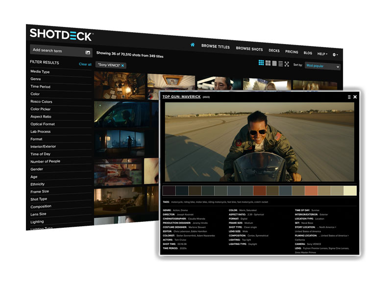
Throughout this exploration of orange in cinema, we’ve relied on striking visual examples to illustrate the color’s diverse range and emotional impact. From the fiery oranges of Apocalypse Now or Mad Max: Fury Road, the nostalgic glow of Days of Heaven or La La Land, to the unsettling urban oranges of Blade Runner 2049, these images are invaluable tools. They help us understand how color functions as an central part of the movie language. But where can film makers, film students, and passionate cinephiles find these specific shots, analyze color palettes in detail, and draw inspiration for their own work?
The answer, increasingly, is ShotDeck. ShotDeck is more than just a vast collection of film stills. It’s a revolutionary resource that’s transforming how filmmakers approach pre-production, visual research, and even film analysis itself. It’s the world’s largest searchable database of high-definition movie images, meticulously curated and tagged with an unprecedented level of detail.
Every image in this article, showcasing the use of orange across a range of films and directorial styles, was sourced from ShotDeck’s extensive library. As we continue our “Movie Color Palette” series, exploring the vibrant world of cinematic color, resources like ShotDeck will undoubtedly play an increasingly vital role. They empower film makers to learn from the masters, dissect visual techniques, find inspiration for using specific hues like orange, and ultimately, shape the future of cinema.
THE BOTTOM LINE:
Our journey through the cinematic world of orange reveals a color far more versatile and impactful than its simple associations with warmth or fire might suggest. From its relatively recent distinction as a named color and its challenging beginnings in early Technicolor, orange has evolved into a vital tool in the filmmaker’s palette.
Its unique position between red and yellow allows it to convey a complex spectrum of emotions, from comforting warmth and youthful energy to urgent warning and intense danger. Understanding how filmmakers leverage this duality is key to appreciating the nuanced language of cinematic color.
THE FILMMAKERS ACADEMY ADVANTAGE:

Filmmaking is a collaborative art. That’s why at Filmmakers Academy, we believe in the power of connection. Beyond our comprehensive courses, we offer a community where you can network with fellow film makers. Not only that, but you can share your work and find collaborators for your next project. Our platform provides a space to connect with industry professionals, learn from experienced mentors, and build lasting relationships that can propel your career forward.
JOIN FILMMAKERS ACADEMY AND SAVE $50!
Ready to take your filmmaking skills to the next level? Join the Filmmakers Academy community and gain access to exclusive content, expert mentorship, and a network of passionate filmmakers. Use code FABLOG50 to save $50 on your annual membership!


