In the vibrant tapestry of cinematic storytelling, color plays a role far more significant than mere aesthetics. It’s a language, a powerful tool that filmmakers wield to evoke emotions, establish mood, and shape our understanding of characters and their worlds. Last time, we explored the fiery intensity of RED. Now, we turn our attention to its complementary counterpart: BLUE.
Blue, the color of the sky and the sea, is often associated with tranquility, serenity, and peace. But its cinematic applications extend far beyond these simple connotations. Blue can represent melancholy, isolation, and the vastness of the unknown. It can also signify coldness, technology, and even the supernatural. From the icy landscapes of science fiction epics to the dimly lit interiors of neo-noir thrillers, blue has been used throughout film history. It creates a wide range of atmospheric effects, imbuing scenes with subtle, yet powerful, layers of meaning.
In this article, we’ll delve into the psychology and symbolism of blue in film. We’ll explore how different shades and intensities of blue — from the vibrant, almost electric blue of a neon sign to the muted, desaturated blue of a winter morning — can elicit profoundly different emotional responses.
We’ll analyze how master filmmakers like David Fincher, Barry Jenkins, and Wong Kar-wai have employed blue to craft unforgettable cinematic moments, enhance their narratives, and define the visual identities of their films. All the while, examining how blue can be used to create a sense of calm or to heighten suspense, represent the natural world or the artificial, and symbolize hope or despair.
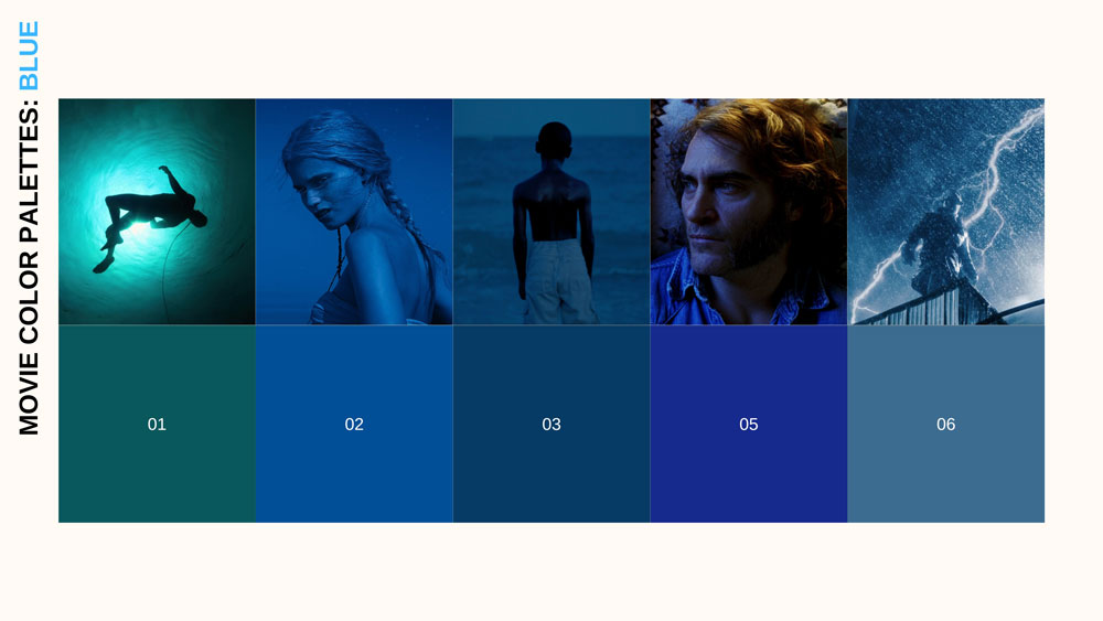
MOVIE COLOR PALETTE SERIES
This exploration of blue is the second installment in our “Movie Color Palette” series. In each article, we dissect the use of a specific color in film, uncovering its hidden meanings and its power to shape the cinematic experience.
By understanding the nuanced language of color, you’ll not only gain a deeper appreciation for the artistry of filmmaking but also equip yourself with powerful tools to enhance your own visual storytelling. So, let’s dive into the world of blue and discover the myriad stories it has to tell.
THE EVOLUTION OF BLUE THROUGHOUT ART HISTORY:
Blue hasn’t always held the prominent place it does today in art and film. This section explores the evolution of blue, from its relative obscurity in ancient cultures to its early, somewhat limited, use in Technicolor cinema. We’ll trace its changing cultural significance, its artistic applications, and the technological advancements that ultimately unlocked its full cinematic potential.
ANTIQUITY
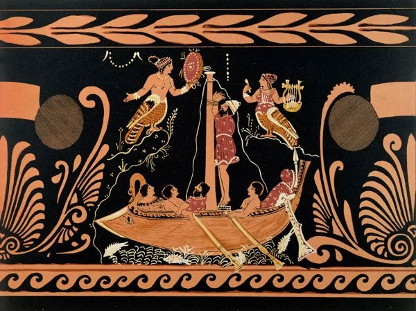
Unlike readily available reds and browns, blue has a surprisingly elusive history in human perception. Many ancient cultures lacked a distinct word for “blue,” often grouping it with green or darker shades. This reflects a different way of categorizing color, focused less on specific hues.
The Ancient Greeks, for example, described the sea as “wine-dark” in Homer’s Odyssey, lacking a direct equivalent to our “blue.” Scholars believe they perceived colors more by lightness/darkness than distinct hues. Similarly, the Hebrew Bible doesn’t explicitly name “blue,” using broader terms for darkness or depth. This pattern extends to numerous indigenous cultures worldwide.
 |
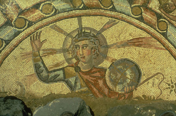 |
(L) Ulysses and the Sirens from antique Greek vase (19th century); Bibliotheque des Arts Decoratifs, Paris (R) Mosaic floor depicting Helios in Hammath Tiberias, Israel (286-337 BCE; image courtesy of Center of Jewish Art)
The Ancient Japanese word “ao” (青) included both blue and green, only later differentiating into specific shades like “mizuiro” (light blue) and “kon” (dark blue).
 |
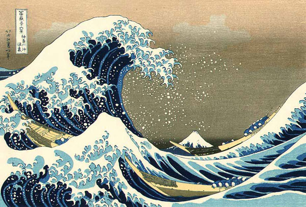 |
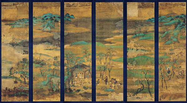
(L) Senzui Byobu, Landscape (11th century); Kyoto National Museum (R) Great Wave off Kanagawa by Katsushika Hokusai (1831)
Ancient Chinese used “qīng” (青) for a range encompassing blue, green, and even black, emphasizing “dark” or “verdant” qualities over a precise hue.
 |
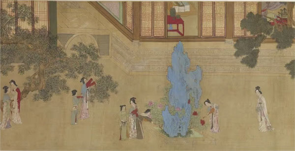 |
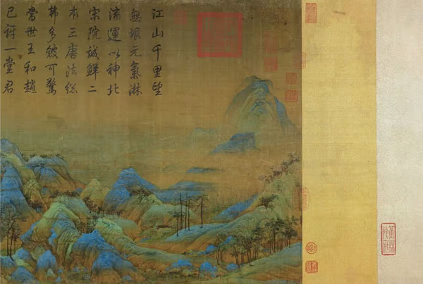
(L) The beginning of A Thousand Li of Rivers and Mountains by Wang Ximeng (c. 1113) (R) A close-up of Spring Morning in the Han Palace by Qiu Ying (c. 1552)
This delayed recognition of blue likely stems from its rarity in readily accessible natural elements. Creating vibrant, stable blue pigments was also historically difficult and expensive, unlike the earth tones common in early art.
The Egyptians were a notable exception, developing the synthetic “Egyptian blue” from copper silicate. However, even this technological advancement didn’t immediately lead to a common, descriptive word for blue.
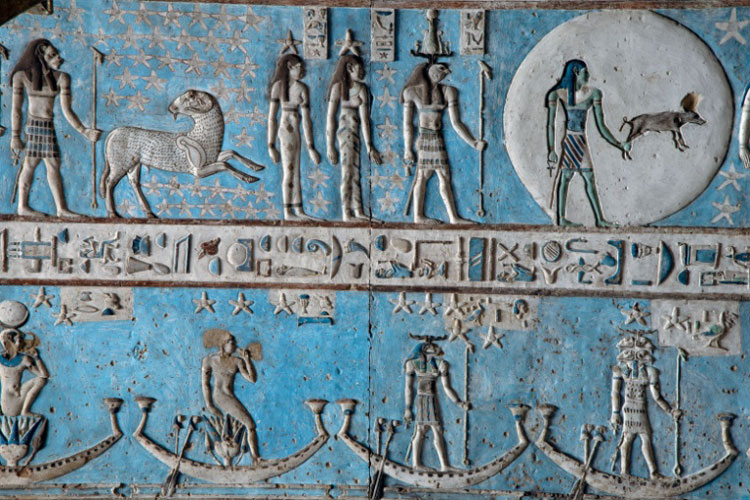
Egyptian blue dates back to the Egyptian Fourth Dynasty (4,500 years ago)
The pigment, and thus the color, remained primarily associated with the heavens, divinity, and royalty — a symbolic, rather than everyday, color. This ancient obscurity highlights Blue’s later, dramatic rise in art.
MIDDLE AGES
In the Middle Ages, the use of blue in art expanded significantly. This is thanks partly to the introduction of ultramarine, a vibrant blue pigment made from lapis lazuli, a semi-precious stone mined primarily in Afghanistan. Ultramarine was incredibly expensive — often more valuable than gold — and its use was typically reserved for depicting the most important figures in religious paintings, such as the Virgin Mary’s robes.
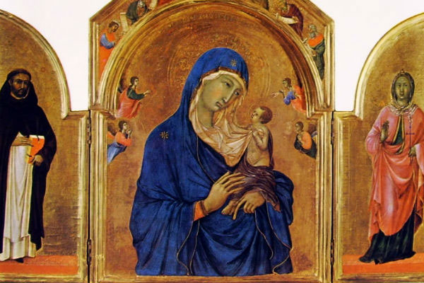
The Virgin with Child and Saints by Duccio Boninsegna (c. 1315 CE)
This association with the divine and the precious further cemented blue’s status as a color of significance.
THE RENAISSANCE, ROMANTIC ERA & THE IMPRESSIONISTS
As artistic movements evolved, so too did the use and interpretation of blue. The Renaissance saw a broader application of blue in landscapes and portraits, reflecting a growing understanding of perspective and atmospheric effects.
The Romantic era embraced blue’s capacity to evoke melancholy, longing, and the sublime power of nature. Think of the vast, blue-toned seascapes of J.M.W. Turner, capturing the awe-inspiring and sometimes terrifying beauty of the ocean.
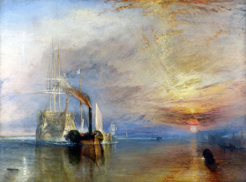
The Fighting Temeraire Tugged to Her Last Berth to Be Broken Up by J.M.W. Turner (1838)
The Impressionists, fascinated by light and color, used blue extensively to depict shadows, reflections, and the ever-changing hues of the sky and water.
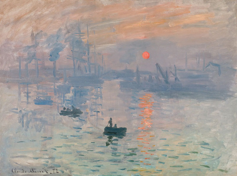
Impression, Sunrise by Claude Monet (1872)
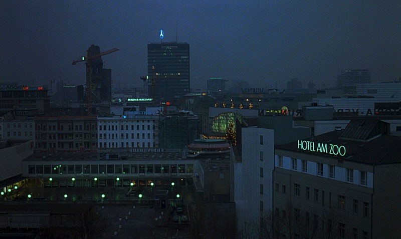
BLUE IN EARLY CINEMA:
This rich artistic heritage of blue — its connection to the divine, the natural world, and a spectrum of human emotions — set the stage for its cinematic debut. However, the transition from canvas to screen wasn’t immediate.
Early filmmaking, even with the advent of Technicolor, faced significant technical limitations. The early three-strip Technicolor process, while revolutionary, struggled to reproduce certain colors accurately, and vibrant blues were particularly challenging. They often appeared muted, greenish, or lacked the depth and saturation found in paintings.
Despite these constraints, filmmakers recognized blue’s potential. They used it strategically, often to evoke specific moods or represent elements that were naturally associated with blue hues. Films like The Adventures of Robin Hood (1938) and The Thief of Bagdad (1940), showcases of early Technicolor, employed blue for nighttime scenes.
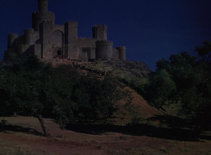
The Adventures of Robin Hood (1938)
They created a sense of mystery and otherworldliness. Magical realms and moments of tranquility also lent themselves to blue tones, even if the technology couldn’t yet capture the full richness of the color.
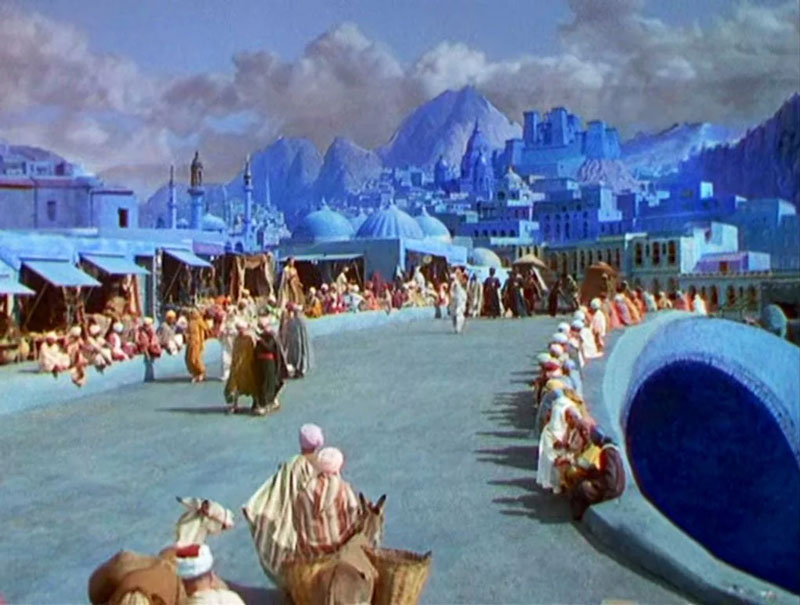
The Thief of Bagdad (1940)
These early cinematic uses of blue, though limited by the available technology, were crucial stepping stones. They demonstrated an understanding of blue’s evocative power and laid the groundwork for its more sophisticated and expressive use in later decades. As color film technology matured, filmmakers gained greater control, finally unlocking the full spectrum of cinematic blue and its storytelling potential.
THE POWER OF BLUE BY ICONIC DIRECTORS:
With its inherent coolness and vast range of associations, blue became a powerful tool for creating atmosphere and conveying complex emotions on screen. From the vibrant hues of early Technicolor to the more controlled palettes of later decades, directors discovered the versatility of blue in shaping mood and underscoring narrative themes. Let’s explore how some of cinema’s most influential figures used blue to paint their cinematic worlds.
DOUGLAS SIRK: MELODRAMATIC BLUE
Douglas Sirk, a master of Hollywood melodrama, used color with extraordinary precision and emotional intelligence. While known for his vibrant, almost Technicolor-excessive palettes, blue often played a crucial, often subversive, role in his films.
In All That Heaven Allows (1955) and Written on the Wind (1956), blue is frequently associated with societal constraints, emotional repression, and the artificiality of upper-class life. Think of the cool, blue-toned interiors of the wealthy homes, contrasting with the warmer, more natural colors associated with freedom and genuine emotion.
All That Heaven Knows (1955) | Universal International Pictures
The blue light filtering through windows can suggest a sense of isolation or a world viewed through a distorted lens.
Sirk’s blue is rarely a simple representation of sadness; it’s a more complex color, hinting at societal critique and the suffocating nature of conformity. It’s a blue of unease, rather than outright despair.
Written On The Wind (1956) | Universal International Pictures
MICHELANGELO ANTONIONI: EXPRESSIVE POWER OF BLUE
Moving beyond Hollywood, European filmmakers were also exploring the expressive potential of blue. Michelangelo Antonioni, a key figure in Italian Neorealism and beyond, frequently used blue to convey alienation, isolation, and the emotional detachment of his characters.
Take films like Red Desert (1964) that use blue-toned landscapes and interiors to reflect the characters’ inner states. The color creates a sense of coldness and existential angst. The use of blue is also often desaturated, emphasizing a sense of emptiness and disconnection.
Red Desert (1964) | Francoriz Production
JEAN-LUC GODARD: EXISTENTIAL
Jean-Luc Godard, a pivotal figure in the French New Wave, employed blue in a radically different, yet equally powerful, manner. Godard’s use of color is often bold, disruptive, and self-consciously artificial.
In Pierrot le Fou (1965), blue becomes a dominant, almost overwhelming presence, often flooding entire scenes. This isn’t a naturalistic blue; it’s a stylized, heightened blue that reflects the film’s themes of alienation, existential angst, and the search for meaning in a chaotic world.
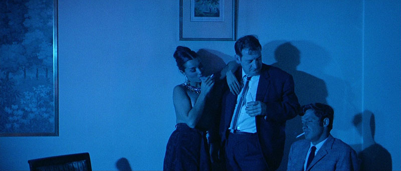
Pierrot le Fou (1965) | Rome Paris Films
The famous scene where Ferdinand (Jean-Paul Belmondo) paints his face blue before committing a desperate act is a prime example of Godard’s use of blue to convey a sense of detachment from reality and a descent into madness.
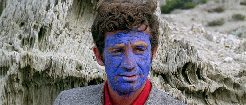
Pierrot le Fou (1965) | Rome Paris Films
Blue, for Godard, is often a color of disruption and rebellion, challenging conventional cinematic norms. He also uses blue as a primary color, and to contrast against the other primaries of red and yellow.
WIM WENDERS: POETIC
Wim Wenders, a key figure in New German Cinema, often uses blue to create a sense of melancholy, longing, and the vastness of both physical and emotional landscapes.
In Wings of Desire (1987), although much of the film is in black and white, the moments of color, often featuring blue skies and blue-toned cityscapes, represent a world of human experience that the angels can only observe, not fully participate in.
Wings of Desire (1987) | Argos Films
The blue here evokes a sense of beauty, but also a sense of distance and unfulfilled desire. Wenders’ blue is often associated with a search for meaning and connection, a yearning for something beyond the tangible. In Paris, Texas (1984), the use of blue in neon signs in the dark, night landscape conveys a sense of alienation.
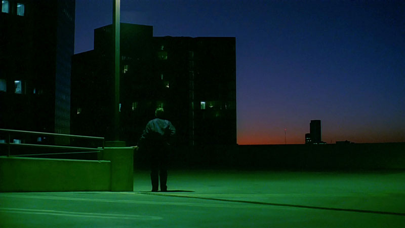
Paris, Texas (1984) | Argos Films
DAVID LYNCH: DREAMLIKE
David Lynch, a master of surreal and unsettling imagery, frequently uses blue to create a dreamlike, almost hypnotic atmosphere. In Blue Velvet (1986), the title itself announces the color’s importance.
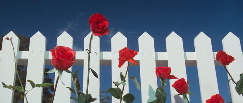
Blue Velvet (1986) | De Laurentiis Entertainment
The film’s opening sequence, with its idyllic suburban setting juxtaposed with disturbing undertones, features a strikingly vibrant blue sky, creating a sense of heightened, almost artificial reality. Throughout the film, blue lighting and set design contribute to the film’s unsettling, dreamlike quality, blurring the lines between reality and fantasy.
Blue Velvet (1986) | De Laurentiis Entertainment
These examples, spanning several decades and diverse cinematic styles, demonstrate the evolving use of blue as a powerful storytelling tool. From the restrained elegance of Hitchcock to the bold expressionism of Lynch, directors have harnessed blue’s inherent qualities and symbolic associations to create a wide range of moods and meanings. It’s a color that can be both calming and unsettling, realistic and surreal, a testament to its versatility and its enduring power in the language of cinema.
Blue in the Modern Cinematic Landscape:
The legacy of those iconic filmmakers who harnessed blue’s power continues to resonate, inspiring contemporary directors to explore its expressive potential in new and innovative ways. Modern cinema, with its advanced color grading capabilities and diverse stylistic approaches, has seen blue employed with remarkable subtlety, boldness, and thematic depth.
Let’s examine how several prominent filmmakers of recent decades have utilized blue to shape their narratives and create unforgettable visual experiences.
BARRY JENKINS: MOONLIGHT AND MEMORY
Barry Jenkins, known for his emotionally resonant and visually stunning films, uses blue with profound sensitivity.
In Moonlight (2016), blue becomes almost synonymous with Chiron (Ashton Sanders), the film’s protagonist, across three distinct stages of his life. The film’s title itself alludes to the color’s significance. The blue-tinged moonlight that bathes key scenes represents moments of vulnerability, intimacy, and self-discovery.
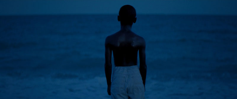
Moonlight (2016) | A24
It’s a blue of introspection, of hidden emotions surfacing under the cover of night. The color also connects to Chiron’s identity and his relationship with Juan (Mahershala Ali), his mentor, who tells him, “In moonlight, black boys look blue.” This association links blue to both race and a sense of belonging.
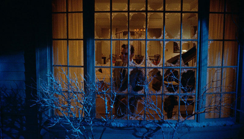
PAUL THOMAS ANDERSON: NOSTALGIA AND UNEASE
Paul Thomas Anderson, a master of character-driven narratives and evocative visuals, often employs blue to create a sense of nostalgia, unease, or the undercurrents of something hidden beneath the surface.
In There Will Be Blood (2007), while the film is dominated by earthy tones, the cool blue of the night sky and the occasional blue-toned interior provide a stark contrast to the harshness and greed of the oil-drilling world. These moments of blue offer a visual and emotional counterpoint, hinting at a world beyond the relentless pursuit of wealth.
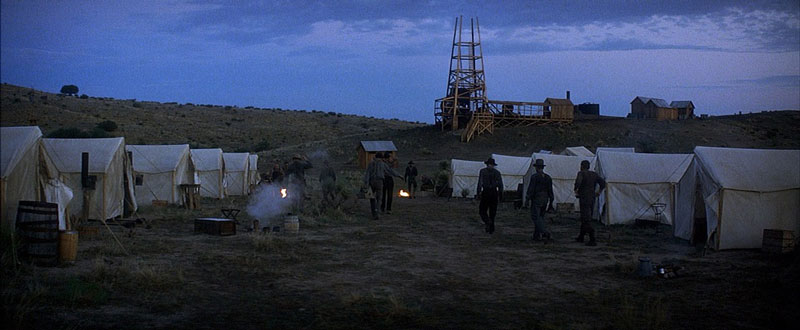
There Will Be Blood (2007) | Miramax
In Inherent Vice (2014), Anderson uses blue in a more pervasive and stylized way. The film, a hazy, neo-noir detective story set in 1970s California, is bathed in a palette of muted blues, greens, and yellows, creating a dreamlike, almost hallucinatory atmosphere.
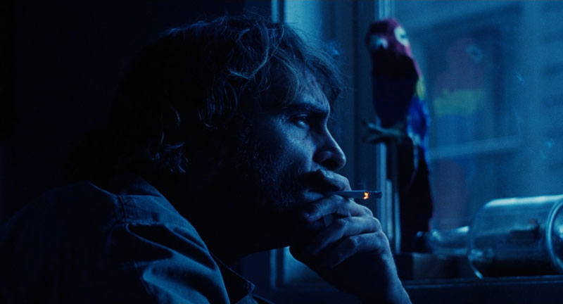
Inherent Vice (2014) | Warner Bros.
The blue tones contribute to the film’s sense of disorientation and paranoia, reflecting the protagonist Doc Sportello’s (Joaquin Phoenix) perpetually stoned state and the increasingly convoluted nature of the mystery he’s investigating. The blue here is not a naturalistic blue. It’s a filtered blue, evoking the hazy, faded quality of memory and the sense of a world slipping away.
It suggests a longing for a past that may never have existed, a sense of loss and disillusionment that permeates the film. The blue-toned lighting in smoky interiors and nighttime scenes further enhances this atmosphere, creating a visual representation of Doc’s subjective experience.
ZACK SNYDER: STYLIZED POWER AND OTHERWORLDLINESS
Zack Snyder, known for his visually striking and often hyper-stylized action films, frequently uses blue to create a sense of power, otherworldliness, and heightened reality.
In Watchmen (2009), Dr. Manhattan, a godlike being, is rendered in a glowing, almost ethereal blue. This color choice immediately sets him apart from the other characters, emphasizing his immense power and his detachment from humanity.
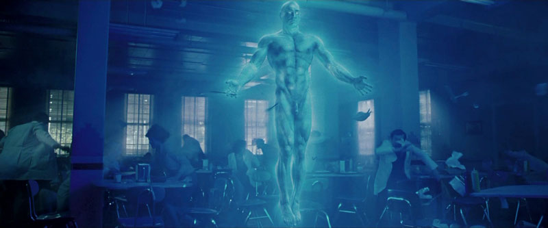
Watchmen (2009) | Warner Bros.
In Man of Steel (2013), the cool blue tones often associated with Superman’s world provide a visual contrast to the warmer, more earth-toned scenes of his upbringing, highlighting his alien origins.
Man of Steel (2013) | Warner Bros.
Snyder’s blue is often a deliberate departure from realism, used to create a visually arresting and thematically significant effect.
GEORGE MILLER: COUNTERPOINT TO FURY
George Miller, the visionary behind the Mad Max franchise, demonstrates a masterful understanding of color contrast.
In Mad Max: Fury Road (2015), while the film is dominated by the fiery oranges and yellows of the desert wasteland, Miller strategically employs blue to create moments of respite, hope, and even the supernatural.
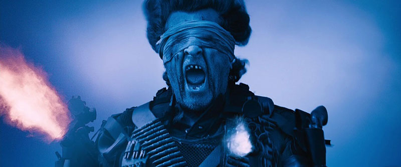
Mad Max: Fury Road (2015) | Warner Bros.
The intense blue of the night scenes provides a stark contrast to the daytime chaos, offering a brief visual and emotional reprieve. The “Vuvalini of Many Mothers,” a group of older women who represent a connection to the past and the possibility of a better future, are often associated with blue tones, suggesting a sense of wisdom and resilience.
JAMES CAMERON: THE ABYSS AND THE ALIEN
James Cameron, a pioneer of visual effects and immersive storytelling, has a long and significant relationship with the color blue. In The Abyss (1989), the deep blue of the ocean depths becomes a character in itself, representing both the beauty and the danger of the unknown.
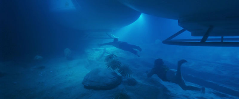
The Abyss (1989) | Twentieth Century Fox
The bioluminescent creatures that inhabit the abyss add another layer of blue, creating a visually stunning and otherworldly environment.
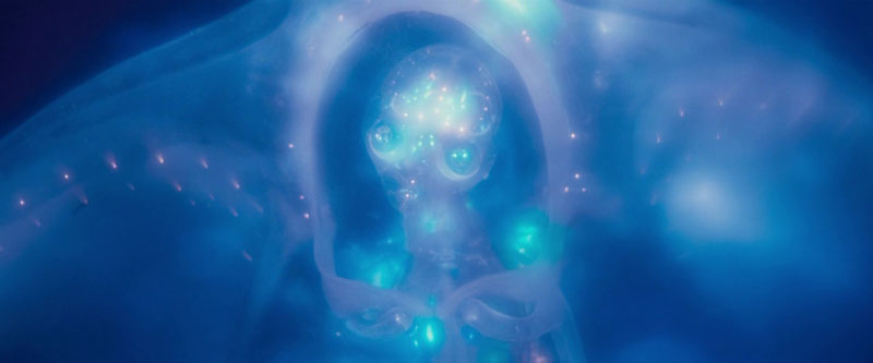
The Abyss (1989) | Twentieth Century Fox
In Avatar (2009), Cameron creates an entire alien world bathed in shades of blue. The Na’vi, the indigenous inhabitants of Pandora, are blue-skinned, and the bioluminescent flora and fauna of the planet create a breathtaking spectacle of blue light.
Avatar (2009) | Twentieth Century Fox
This immersive use of blue establishes a sense of wonder and reinforces the film’s themes of environmentalism and connection to nature.
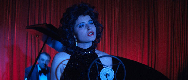
THE POWER OF VISUAL REFERENCE: HOW SHOTDECK IS REVOLUTIONIZING FILMMAKING
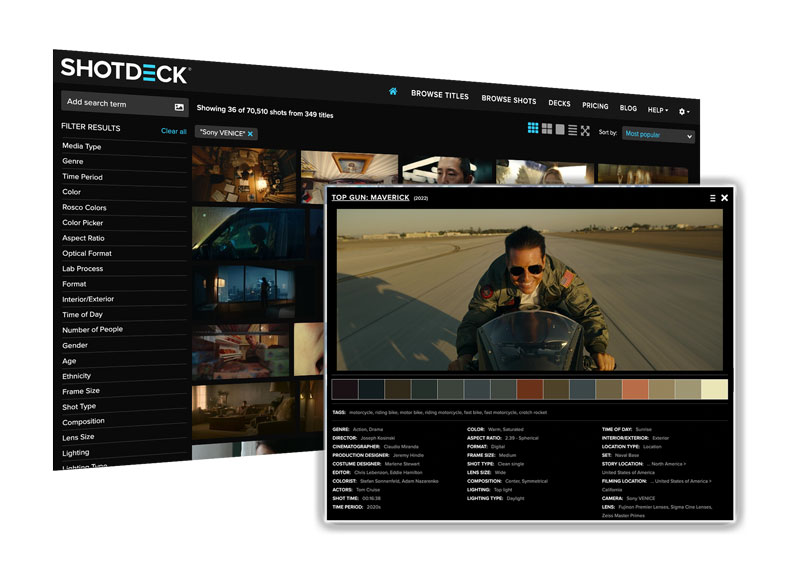
Throughout this exploration of blue in cinema, we’ve relied on striking visual examples to illustrate the color’s diverse applications and emotional impact. From the haunting blues of Blue Velvet to the vibrant, otherworldly blues of Avatar and the subtle, nuanced blues of Moonlight, these images serve as invaluable tools. They help us understand how color functions as a fundamental element of cinematic language. But where can filmmakers, film students, and passionate cinephiles find these specific shots? How can you analyze color palettes in detail or simply seek visual inspiration for your own projects?
The answer is ShotDeck. ShotDeck is more than just a vast image library; it’s a revolutionary resource that’s transforming the way filmmakers approach pre-production, visual research, and even film analysis. It’s the world’s largest searchable database of high-definition movie images, meticulously curated and tagged with an unprecedented level of detail.
Every image in this article, showcasing the masterful use of blue across a range of films and directorial styles, was sourced from ShotDeck’s extensive collection. As we continue our “Movie Color Palette” series, exploring the vibrant world of cinematic color, resources like ShotDeck will undoubtedly play an increasingly vital role. They empower filmmakers to learn from the masters, dissect visual techniques, and find inspiration, ultimately shaping the future of cinema.
THE BOTTOM LINE: THE UNSPOKEN COLOR OF BLUE
Our exploration of blue in cinema reveals a color of surprising complexity and enduring power. From its early, often symbolic uses to the sophisticated and diverse applications of modern filmmakers, blue has proven to be a remarkably versatile storytelling tool.
It can evoke a vast range of emotions, create atmosphere, define characters, and underscore thematic concerns. This journey through blue is just one step in our larger exploration of the “Movie Color Palette.”
As we continue this series, remember that every color choice in film is deliberate. A conscious decision by the filmmaker to shape your experience and enhance the narrative. Start seeing films in color, and you’ll unlock another level of their storytelling.
THE FILMMAKERS ACADEMY ADVANTAGE
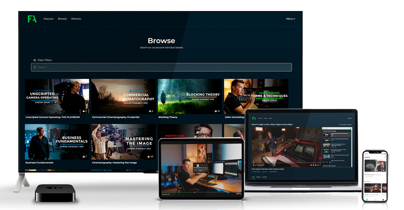
Filmmaking is a collaborative art. That’s why at Filmmakers Academy, we believe in the power of connection. Beyond our comprehensive courses, we offer a thriving community where you can network with fellow filmmakers. Not only that but you can share your work and find collaborators for your next project. Our platform provides a space to connect with industry professionals, learn from experienced mentors, and build lasting relationships that can propel your career forward.