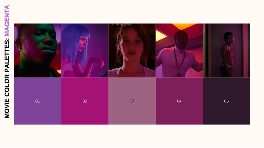
MAGENTA: Movie Color Palettes
We’ve journeyed through the primal power of red, the cool depths of blue, the vibrant energy of yellow, and the multifaceted nature of green. Now, we venture into a truly unique part of the spectrum: MAGENTA. This captivating color doesn’t exist as a single wavelength of light. It’s a perceptual creation born from the blend of red and blue. This inherent artificiality gives magenta a distinctive quality in cinema, often used to signify the unreal, the magical, the technological, or even a bold sense of rebellion.
Join us as we continue to dissect the language of color in film. By understanding the nuances of hues like magenta, you’ll gain a richer appreciation for cinematic artistry and discover new ways to utilize color in your own visual storytelling.
MOVIE COLOR PALETTE SERIES
In this fifth installment, we’ll explore the fascinating psychology and symbolism of magenta on screen. How does this vibrant, yet non-spectral hue influence our emotions? We’ll analyze how filmmakers wield magenta — through striking lighting choices, deliberate costume design, and evocative production elements — to create specific moods, from playful fantasy to unsettling artificiality. Through compelling film examples, we’ll see how magenta can define character, enhance narrative, and leave a powerful visual imprint.
MAGENTA: THE COLOR THAT WASN’T (AND THEN WAS)
Before we explore magenta’s role in cinema, it’s crucial to understand its place in the color spectrum and its relatively recent emergence as a distinct concept. Unlike red, blue, or yellow, which correspond to specific wavelengths of light found in the rainbow, magenta is an extra-spectral color. It doesn’t exist as a single wavelength.
Our brains perceive magenta when our eyes receive a mix of red and blue light, with green light being absent. This fundamental difference means magenta lacks the deep, ancient history tied to natural pigments that colors like red ochre or blue lapis lazuli possess.
ANTIQUITY AND THE MIDDLE AGES: THE REIGN OF PURPLE
Ancient cultures didn’t have a word or a distinct concept for “magenta” as we know it. However, they did have purples and violets, colors residing spectrally between red and blue. These hues often carried powerful associations.
TYRIAN PURPLE
Perhaps the most famous example, Tyrian purple was an incredibly expensive and labor-intensive dye derived from sea snails, used primarily by Roman emperors and the highest echelons of society. Its rarity made it the ultimate symbol of royalty, power, and luxury.
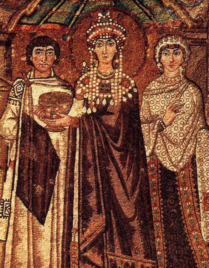
Sixth-century Empress Theodora wearing Tyrian Purple | Public Domain
OTHER PURPLES/VIOLETS
In religious contexts during the Middle Ages and Renaissance, purple and violet pigments (often derived from minerals or plants) were associated with royalty (both earthly and divine), spirituality, penitence, and sometimes mourning. Occupying a space between the warmth of red and the coolness of blue, these colors could also evoke a sense of mystery or ambiguity.

These purples and violets, while related, are not the vibrant, electric hue we typically associate with magenta today. The pigments available were often less saturated or stable than modern equivalents.
THE 19TH CENTURY BREAKTHROUGH: THE BIRTH OF SYNTHETIC MAGENTA
The color we recognize as magenta truly exploded onto the scene in the mid-19th century with the invention of synthetic aniline dyes. In 1856, William Henry Perkin accidentally created mauveine (a purple dye), paving the way for other synthetic colors. Crucially, in 1859, the vibrant reddish-purple dye fuchsine was synthesized. It was renamed “magenta” shortly after, commemorating the Franco-Austrian victory at the Battle of Magenta in Italy that same year.
This synthetic origin is key. Magenta wasn’t a color waiting to be extracted from nature. Rather, magenta was a product of industrial chemistry. This gave it an inherently “modern” and perhaps “artificial” quality right from its inception. It quickly became popular in fashion and design, valued for its striking intensity.
EARLY CINEMA AND TECHNICOLOR: MAGENTA’S ABSENCE
Given that magenta as a widely available, vibrant, named color was a relatively new phenomenon when cinema was born, and especially when early color processes like Technicolor emerged, its deliberate, symbolic use in early filmmaking (pre-Golden Age) was virtually non-existent.
There were several reasons for this. Early color processes, including two-strip and even initial three-strip Technicolor, struggled to accurately reproduce the full spectrum of colors. Capturing stable, vibrant purples, violets, and especially the specific hue of magenta was extremely difficult. The focus was often on achieving pleasing (if sometimes inaccurate) reds, greens, blues, and yellows.
Moreover, magenta simply didn’t have the same deep-seated cultural or artistic history as primary colors. Filmmakers were working with established palettes and symbols, and this newly synthesized color hadn’t yet fully permeated the artistic consciousness in the same way. As with other colors, some silent films might have used purple or reddish-purple tints or toning for specific atmospheric effects (like suggesting royalty or twilight). But this is distinct from using magenta as an integrated part of a full-color image design.

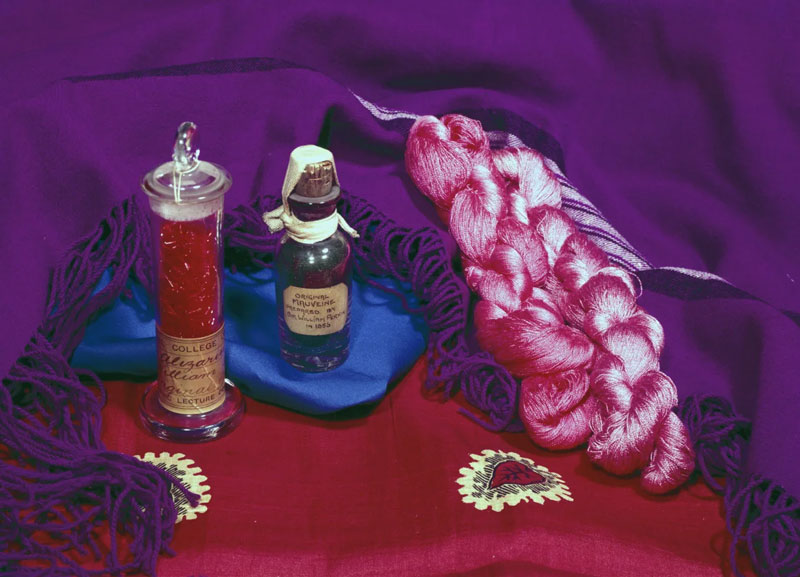
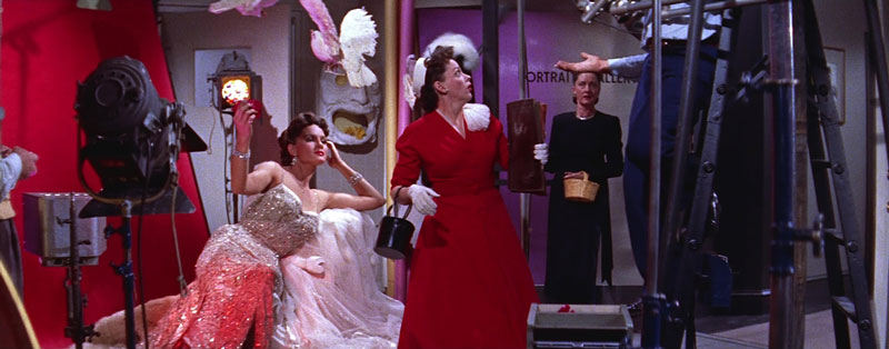
Brewster (1930) | Percy Douglas Brewster
Therefore, while hints of purples or reddish-violets might appear in early Technicolor films, often as a result of the process’s limitations rather than specific intent, the conscious, sophisticated use of magenta as a distinct cinematic tool truly belongs to later eras. The Golden Age and subsequent decades, with improved film stocks, more advanced color grading, and a deeper understanding of color psychology, provided the fertile ground for magenta to finally make its mark on the silver screen.
MAGENTA ON SCREEN: EARLY GLIMMERS OF A VIBRANT HUE
While the full, vibrant potential of magenta wouldn’t be consistently unlocked until later film stocks and digital grading emerged, filmmakers of the classic and New Hollywood eras certainly didn’t shy away from the colors residing between red and blue — the purples, violets, and fuchsias. The technological limitations of early color processes often meant these hues were difficult to reproduce consistently, but their appearances, when achieved, could be particularly striking, often signifying luxury, artificiality, or heightened emotion.
VINCENTE MINNELLI: THEATRICALITY AND FANTASY
Vincente Minnelli, a director synonymous with the lush visuals of the Technicolor musical, wasn’t afraid to employ bold, non-naturalistic colors to create fantastical worlds. While specific uses of pure magenta might be debated due to Technicolor’s rendering, his films often feature vibrant fuchsias and purples.
In An American in Paris (1951) or Gigi (1958), these magenta-adjacent hues contribute to the overall sense of theatricality, romance, and Parisian chic.

An American in Paris (1951) | Loew’s
They appear in costumes and set design, adding splashes of vibrant energy and enhancing the dreamlike, escapist quality of the musical numbers.

Gigi (1958) | MGM
The “artificiality” inherent in these non-primary colors perfectly suited the heightened reality of the musical genre.
FEDERICO FELLINI: SURREALISM AND SENSUALITY IN COLOR
As we discussed in the section on yellow, Federico Fellini fully embraced color’s expressive potential in Juliet of the Spirits (1965). Alongside other vibrant hues, magenta and fuchsia tones are prominent in Juliet’s surreal visions and fantasy sequences.
Juliet of the Spirits (1965) | Rizzoli Film
These colors are often associated with sensuality, the bizarre, spiritual exploration, and breaking free from mundane reality. The artificial, non-spectral nature of magenta aligns perfectly with the film’s dreamlike logic and its exploration of the subconscious.
Juliet of the Spirits (1965) | Rizzoli Film
Fellini uses these intense colors to create a visually stimulating, emotionally charged atmosphere that externalizes Juliet’s inner world.
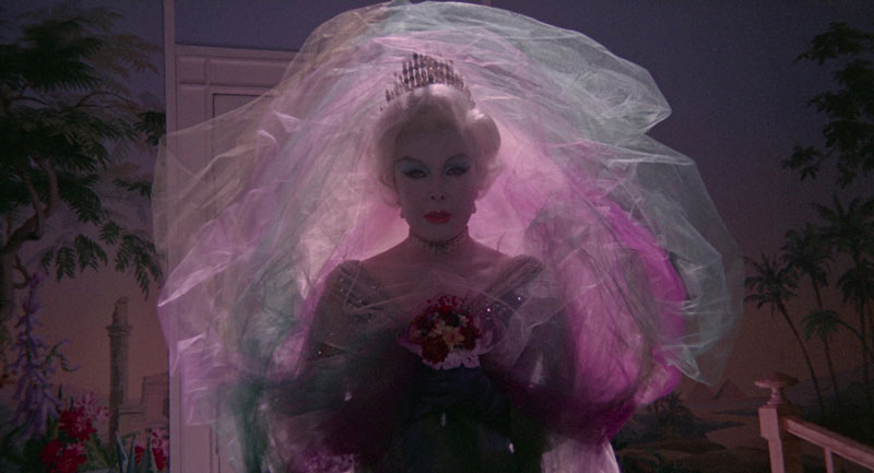
GEORGE CUKOR: THE DRAMATIC MAGENTA OF A STAR IS BORN (1954)
George Cukor’s 1954 version of A Star is Born is a dazzling showcase of Technicolor and CinemaScope, a Hollywood melodrama infused with musical spectacle. Within its rich and deliberately heightened color palette, magenta and its close cousins — vibrant fuchsias and deep purples — play a significant role, often associated with the world of show business, heightened emotion, and the intense trajectory of Esther Blodgett/Vicki Lester’s (Judy Garland) rise to fame.
A Star is Born (1954) | Transcona Enterprises
This isn’t the magenta of subtlety. It’s often deployed within the film’s numerous performance sequences and depictions of Hollywood glamour. These scenes often utilize magenta and fuchsia tones to emphasize theatricality, star power, and the intoxicating allure of the stage. The color becomes linked to Vicki Lester’s manufactured persona, the dazzling star created for public consumption.

A Star is Born (1954) | Transcona Enterprises
BOB RAFELSON’S HEAD: PSYCHEDELIC MAGENTA AND DECONSTRUCTION
Bob Rafelson’s cult classic Head (1968), the surreal cinematic deconstruction of The Monkees’ manufactured image, perfectly embodies the psychedelic visual style of the late 1960s, an era where bold, non-naturalistic colors like magenta often took center stage. While perhaps not the single dominant color, magenta likely appears throughout the film’s fragmented, dreamlike sequences, contributing to the overall sense of disorientation and artifice.
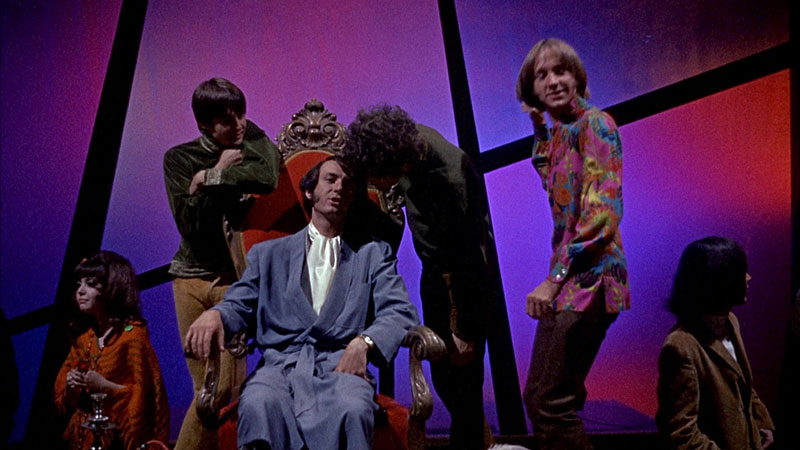
Head (1968) | Raybert Productions
Given the film’s critique of pop stardom and media manipulation, magenta could be employed ironically — in the stylized lighting of a performance, the garish decor of a Hollywood set, or during surreal visual effects — to represent the synthetic, manufactured nature of The Monkees’ world.
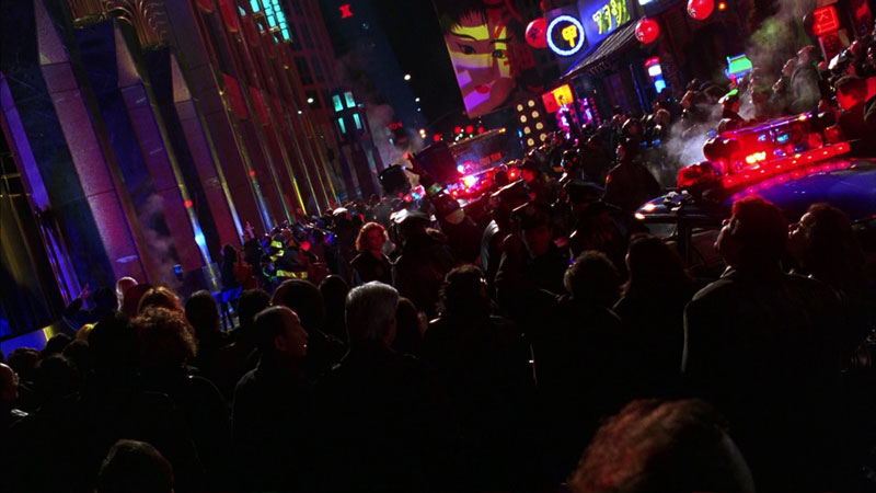
JOHN SCHLESINGER’S MIDNIGHT COWBOY: MAGENTA AMIDST THE GRIT
John Schlesinger’s groundbreaking Midnight Cowboy (1969) is renowned for its gritty, realistic portrayal of late 1960s New York City, a world far removed from vibrant, stylized color palettes. However, within this deliberately desaturated and often bleak visual landscape, flashes of more artificial color, including magenta or fuchsia tones, likely serve to heighten the sense of alienation and the contrast between Joe Buck’s (Jon Voight) naive dreams and the harsh reality he encounters.

Midnight Cowboy (1969) | Florin Productions
Think of the neon signs of Times Square or the colored lighting within dimly lit bars and party scenes. These bursts of magenta wouldn’t represent joy or magic. Instead, they would underscore the artificiality, the seediness, and the superficial allure of the city life Joe tries desperately to penetrate.
EARLY SCI-FI AND FANTASY:
While specific director examples might be sparse, early science fiction and fantasy films sometimes utilized purples and magenta-like colors, often achieved through lighting gels or optical effects, to suggest otherworldly environments, alien technology, or magical energy. These colors, being less common in the natural world, inherently signaled something beyond the ordinary.
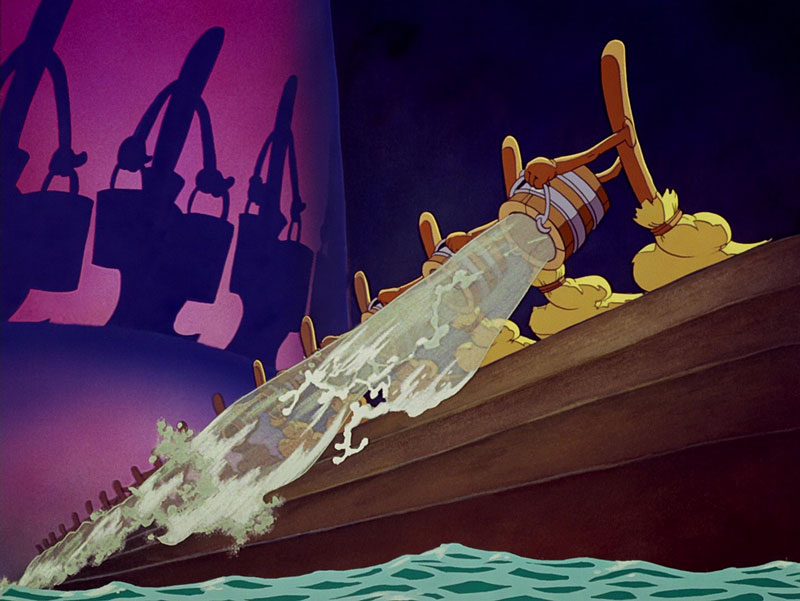
WALT DISNEY’S FANTASIA: MAGENTA IN ANIMATED FANTASY
Walt Disney’s groundbreaking Fantasia (1940) was not just an ambitious fusion of classical music and animation. The iconic movie was also a bold exploration of the possibilities of Technicolor. While the precise reproduction of a true, vibrant magenta was still challenging with the era’s technology, the film utilizes rich purples, violets, and fuchsia-like tones — colors in the magenta family — to create moments of magic, mystery, and pure visual spectacle.
Fantasia (1940) | Walt Disney Productions
Animation offered Disney’s artists direct control over the palette, allowing them to push color beyond mere realism. Think of the ethereal colors accompanying the abstract Bach sequence (“Toccata and Fugue in D Minor”), the magical energy conjured in “The Sorcerer’s Apprentice,” or the potentially darker, purplish shadows and glows used to depict the demonic forces in “Night on Bald Mountain.”
Fantasia (1940) | Walt Disney Productions
These non-primary colors, less common in nature, instantly signal the fantastical and contribute to the film’s dreamlike, otherworldly quality, demonstrating early cinema’s desire to use the full spectrum, even magenta-adjacent hues, for powerful emotional and atmospheric effect.
THE EMERGING POWER OF MAGENTA:
It’s important to reiterate that the precise control over magenta hues that contemporary filmmakers enjoy was not available during much of this era. Colors could shift based on film stock, printing processes, and projection.
However, these iconic directors understood the potential of the colors between red and blue. They used purples, violets, and fuchsias — the closest available approximations — to add richness, theatricality, surrealism, and emotional depth to their films.
These early explorations, even with technical limitations, paved the way for magenta to become a more distinct and deliberately employed tool in the cinematic palettes of later generations. The 1980s, with its embrace of neon aesthetics and advancements in film technology, would see magenta truly begin to flourish on screen.
MAGENTA COMES ALIVE: THE ELECTRIC HUES OF THE 80S AND 90S
As cinema moved into the 1980s and 1990s, magenta, fuchsia, and vibrant purple tones began to appear with greater frequency and deliberate intent. No longer just a subtle accent or a byproduct of early color processes, these hues became key components in defining the look and feel of films exploring urban nightlife, burgeoning technology, stylized action, and heightened emotional states. This era embraced the artificiality that magenta could represent, using it to create distinct and memorable visual worlds.
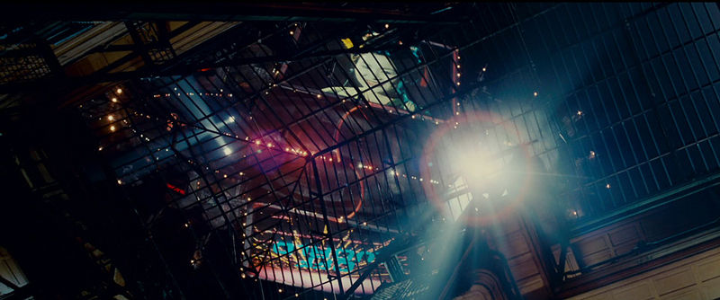
RIDLEY SCOTT: NEON NOIR AND FUTURE SHOCK IN BLADE RUNNER
Ridley Scott’s influential Blade Runner (1982) is a masterclass in atmospheric world-building. While dominated by deep blues and fiery oranges, the film’s iconic vision of a dystopian Los Angeles is punctuated by the pervasive glow of neon signs and advertisements.
Blade Runner (1982) | Warner Bros.
Blade Runner (1982) | Warner Bros.
Magenta and fuchsia are key components of this neon palette, bathing the rain-slicked streets and shadowy interiors in an artificial, alluring, yet unsettling light. This magenta isn’t natural. It represents the synthetic, technologically saturated, and morally ambiguous future the film depicts. It contributes to the film’s neo-noir atmosphere, creating a sense of beauty intertwined with decay and alienation.
TIM BURTON: GOTHIC GRANDEUR AND VILLAINOUS VIBRANCY
Tim Burton’s distinctive visual style often incorporates deep purples and magenta tones to enhance his gothic, expressionistic worlds. In Batman (1989), the chaotic energy and theatrical menace of the Joker (Jack Nicholson) are often visually linked to vibrant, almost garish purples and magentas in his costume and associated environments.
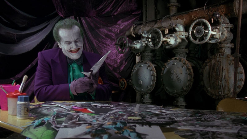
Batman (1989) | Warner Bros.
These colors contrast sharply with the dark, brooding blues and grays of Gotham City and Batman himself. The magenta/purple palette reinforces the Joker’s anarchic personality and the film’s overall heightened, comic book reality. This trend continued in Batman Returns (1992), where these hues add to the gothic fairytale atmosphere.

Batman Returns (1992) | Warner Bros.
JOEL SCHUMACHER: HYPER-STYLIZED NEON EXCESS
Taking the neon aesthetic to its absolute extreme, Joel Schumacher’s Batman Forever (1995) and Batman & Robin (1997) drenched Gotham City in lurid magenta, pink, and purple lighting.
Batman Forever (1995) | Warner Bros.
While often criticized for their campiness, these films undeniably showcase magenta used for maximum visual impact. The intense, often overwhelming neon glow defined the look of these films, creating a hyper-stylized, almost cartoonish environment.
Batman & Robin (1997) | Warner Bros.
Here, magenta represents pure spectacle and artificiality, a departure from realism in favor of extreme visual flair.
ADRIAN LYNE: STYLIZED PASSION IN FLASHDANCE
Adrian Lyne’s influential visual style in the 1980s often featured bold, atmospheric lighting, and Flashdance (1983) is a prime example. While telling a gritty story, the film’s iconic dance sequences and nightclub scenes are frequently bathed in stylized washes of color, including prominent pinks, purples, and magentas.

Flashdance (1983) | Paramount Pictures
This use of colored lighting gels wasn’t aiming for realism. It was about creating mood, energy, and visual excitement. The magenta hues contribute to the film’s sense of passion, youthful energy, and the aspirational, almost dreamlike quality of the performance sequences. It perfectly captures the slick, high-contrast aesthetic prevalent in 80s music videos and popular culture.
PAUL SCHRADER: THE HYPER-STYLIZED MAGENTA OF MISHIMA
Paul Schrader’s Mishima: A Life in Four Chapters (1985) is a visually stunning and structurally daring biopic, utilizing distinct color palettes to differentiate between the narrative threads of Yukio Mishima’s life.
Within these segments, brought to life by the Oscar-nominated production design of Eiko Ishioka and the cinematography of John Bailey, magenta and vibrant fuchsia tones play a crucial role.
Mishima: A Life in Four Chapters | Zoetrope Studios
These colors are deliberately non-naturalistic. They are used in the abstract sets, dramatic lighting, and symbolic costumes to represent Mishima’s inner world, his obsessive preoccupation with beauty, ritual, passion, and death.
Mishima: A Life in Four Chapters | Zoetrope Studios
The magenta here feels artificial, intense, and deeply theatrical, perfectly mirroring the heightened reality of Mishima’s own literary creations. Therefore, it contrasts sharply with the muted realism of his final day and the monochrome flashbacks of his past.
WONG KAR-WAI: THE ATMOSPHERIC MAGENTA OF LONGING
Wong Kar-wai, often collaborating with cinematographer Christopher Doyle, is celebrated for his highly stylized and deeply atmospheric films that explore themes of love, memory, and missed connections.
Think of the neon-drenched streets and dimly lit interiors in films like Chungking Express (1994) and especially Fallen Angels (1995).

Chunking Express (1994) | Jet Tone Production
Magenta often mixes with deep blues and greens in the ambient glow of bars, noodle stands, or rain-slicked pavements, creating a world that feels both vibrant and isolating.

Fallen Angels (1995) | Block 2 Pictures
This artificial, often pulsating light reflects the fleeting nature of the characters’ encounters and their internal states of longing or displacement.
JOHN HUGHES’ WEIRD SCIENCE: THE ELECTRIC MAGENTA OF TEEN FANTASY
John Hughes’ classic teen sci-fi comedy Weird Science (1985) perfectly captures the vibrant, sometimes garish, aesthetic of its era. And magenta plays a key role in visualizing the film’s central fantastical event.
The pivotal scene where nerdy protagonists Gary and Wyatt use their computer, some dubious science, and a hacked government mainframe to create their perfect woman, Lisa (Kelly LeBrock), is a whirlwind of chaotic energy.
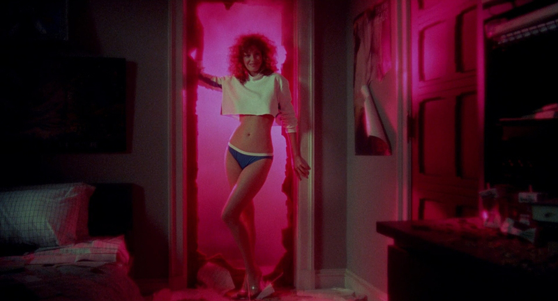
Weird Science (1985) | Universal Pictures
This use of magenta light, mixed with simulated lightning and computer graphics, visually represents the unnatural, almost magical process taking place. It signals a break from mundane reality, heralding the arrival of the extraordinary Lisa.
THE FOUNDATION FOR MODERN MAGENTA:
The filmmakers of the 80s and 90s firmly established magenta and its related hues as powerful tools in the cinematic palette. They leveraged its connection to artificial light, technology, nightlife, and heightened emotions.
Whether used to create dystopian unease, gothic theatricality, neon excess, or futuristic vibrancy, this era demonstrated magenta’s versatility and its ability to make a bold visual statement, paving the way for the even more nuanced and diverse applications seen in contemporary cinema.
MAGENTA IN CONTEMPORARY CINEMA: NEON DREAMS AND ELECTRIC EMOTIONS
The limitations that constrained the use of magenta in early cinema largely disappeared with advancements in film stocks and the rise of digital filmmaking and color grading.
Contemporary directors now have precise control over this vibrant, extra-spectral hue, enabling them to wield its unique psychological and symbolic power with greater intent. Magenta, often associated with the artificial glow of neon, digital realms, or heightened emotional states, has found a prominent place in the modern cinematic palette.
NICOLAS WINDING REFN: THE NEON-SOAKED UNDERWORLD
Perhaps no contemporary director is more associated with the stylized use of neon colors, including magenta, than Nicolas Winding Refn. In films like Only God Forgives (2013) and The Neon Demon (2016), magenta often appears in the form of intense, atmospheric lighting.
Only God Forgives (2013) | Space Rocket Nation
It bathes nocturnal cityscapes, slick interiors, and moments of sudden violence in an electric, often unsettling glow.
The Neon Demon (2016) | Space Rocket Nation
Refn’s magenta isn’t soft or romantic. It’s artificial, hyper-stylized, and frequently linked to themes of alienation, desire, danger, and the seductive emptiness of modern life. It creates a dreamlike, yet often menacing, atmosphere.
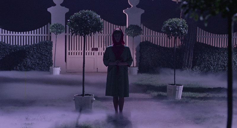
SOFIA COPPOLA: FEMININITY, ISOLATION, AND STYLIZED HISTORY
Sofia Coppola employs magenta and related pink hues with a more subtle, atmospheric touch. In Lost in Translation (2003), the neon lights of Tokyo frequently cast a magenta glow, although muted. It reflects the characters’ sense of cultural disorientation and emotional isolation amidst the vibrant, overwhelming city.

Lost in Translation (2003) | Focus Features
In Marie Antoinette (2006), magenta appears within the lavish, almost candy-colored palette of the costumes and production design.
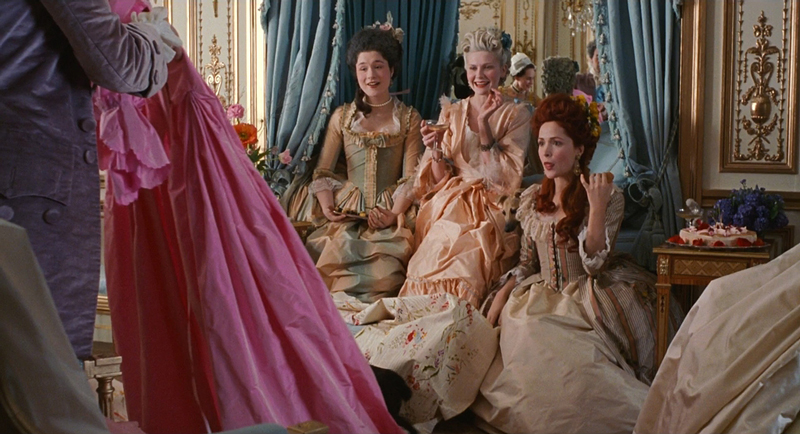
Marie Antoinette (2006) | Columbia Pictures
Here, it contributes to a sense of youthful femininity, opulence, and perhaps a touch of rebellious frivolity, all while hinting at the artificiality and confinement of the historical setting.
BAZ LUHRMANN: SPECTACLE, ROMANCE, AND THEATRICALITY
Baz Luhrmann’s visually extravagant films often utilize magenta as part of their bold, theatrical palettes. In Moulin Rouge! (2001), magenta and fuchsia tones contribute to the Parisian nightclub’s bohemian, romantic, and ultimately tragic atmosphere.
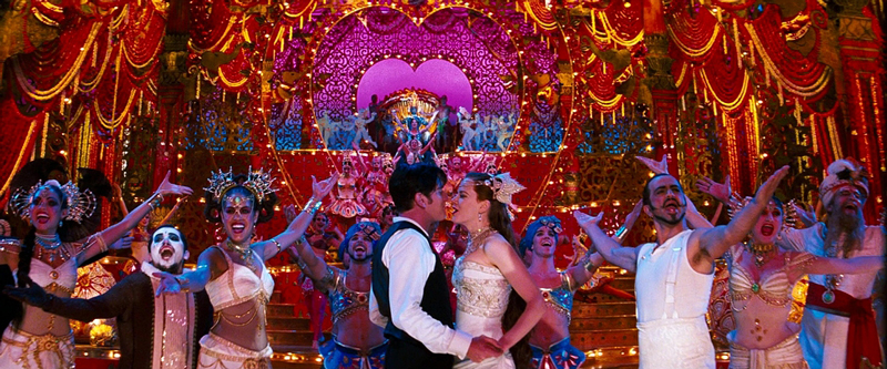
Moulin Rouge! (2001) | Twentieth Century Fox
The color enhances the sense of spectacle, passion, and heightened reality that defines Luhrmann’s style. Similarly, in Romeo + Juliet (1996), magenta appears in lighting and costumes, adding to the film’s modern, vibrant, and emotionally charged interpretation of the classic story.

Romeo + Juliet (1996) | Twentieth Century Fox
GASPAR NOÉ: SENSORY OVERLOAD AND ALTERED STATES
Gaspar Noé is known for his provocative and visually intense films, and he frequently uses aggressive color palettes, including overwhelming magenta, to immerse the viewer in altered states of consciousness or moments of extreme sensory experience.
Enter the Void (2009) | Fidélité Films
In Enter the Void (2009) and Climax (2018), pulsating magenta lighting contributes to a sense of disorientation, drug-induced hallucination, or impending chaos.
Enter the Void (2009) | Fidélité Films
It’s a visceral use of color, designed to affect the viewer on a primal level, often creating feelings of both attraction and repulsion.

Climax (2018) | A24
GRETA GERWIG: HYPER-FEMININITY AND ARTIFICIALITY IN BARBIE
Greta Gerwig’s Barbie (2023) is a masterclass in using pink and magenta to create a specific world and convey thematic ideas. While pink is dominant, vibrant magenta is integral to Barbieland’s hyper-feminine, unapologetically artificial aesthetic.

Barbie (2023) | Warner Bros.
It represents a world of manufactured perfection, playful consumerism, and a specific brand of idealized femininity.
Barbie (2023) | Warner Bros.
The film uses these colors both celebratory and satirically, highlighting the joy and the limitations of this constructed reality.
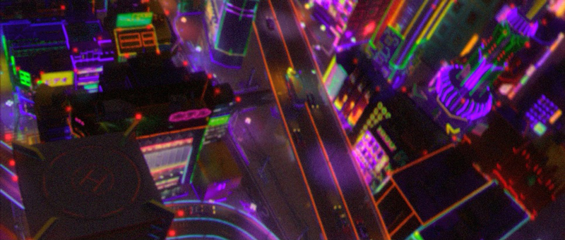
SCI-FI AND ANIMATION: DIGITAL WORLDS AND STYLIZED REALITIES
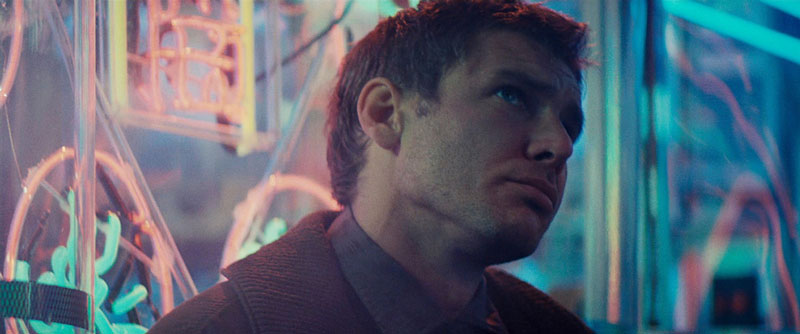
Magenta also frequently appears in modern science fiction and animation. Films exploring cyberpunk aesthetics, virtual reality, or futuristic cityscapes often use magenta neon lighting to create a sense of technological advancement and artificiality (e.g., hints in Blade Runner 2049).

Blade Runner 2049 (2017) | Columbia Pictures
Animated films like Spider-Man: Into the Spider-Verse (2018) and Across the Spider-Verse (2023) utilize bold, graphic color palettes.
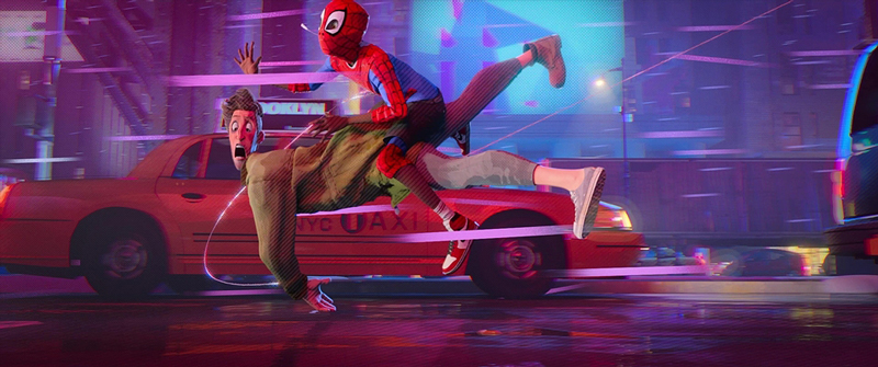
Spider-Man: Into the Spider-Verse (2018) | Columbia Pictures
Magenta plays a key role in defining characters (like Spider-Gwen) and creating dynamic, visually exciting action sequences.
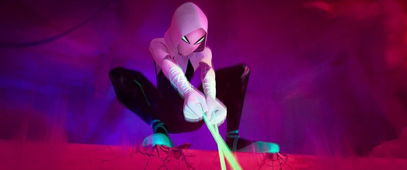
Spider-Man: Across the Spider-Verse (2023) | Columbia Pictures
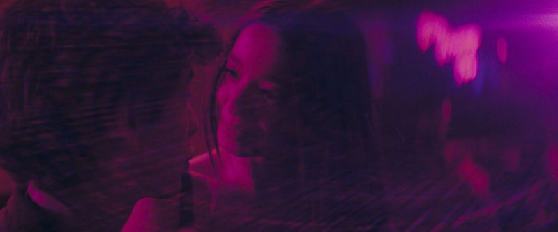
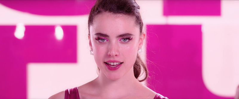
SEAN BAKER: MAGENTA’S FAIRYTALE GLOW AND GRITTY REALITY IN ANORA
In Sean Baker’s vibrant slice-of-life film Anora (2024), magenta appears not as a dominant theme, but as part of the authentic tapestry of its New York City and Las Vegas settings, often flashing in neon signs or atmospheric club lighting. However, it takes on a more pointed significance during key moments.
Anora (2024) | Neon
Notably, magenta light bathes Anora (Mikey Madison) during her whirlwind ‘Cinderella tryst’ with the oligarch’s son. This specific use likely represents the temporary, almost fantastical nature of this unexpected relationship. A fleeting fairytale moment bathed in an artificial, romantic glow. It stands in stark contrast to the harsher realities of her everyday life.
CORALIE FARGEAT: THE VISCERAL MAGENTA OF THE SUBSTANCE
Coralie Fargeat’s body horror sensation The Substance (2024) utilizes color in a bold, visceral way.
The Substance (2024) | MUBI
Given the genre and Fargeat’s stylized approach, magenta depicts the synthetic allure of the generated double. In addition, it conveys moments of grotesque beauty, amplifying the film’s themes of body obsession, aging, and the horrific consequences of manufactured perfection.
TERRENCE MALICK: IMPRESSIONISTIC MAGENTA IN SONG TO SONG
Terrence Malick’s Song to Song (2017), with its signature flowing, impressionistic style, uses color more for sensory experience than overt symbolism. Magenta appears within the film’s exploration of the Austin music scene, particularly in the vibrant, shifting lights of concerts and backstage parties.

Song to Song (2017) | Buckeye Pictures
Captured often with natural or available light sources, this magenta wouldn’t feel artificial in the same way as neon. Rather, it contributes to the fleeting, dreamlike atmosphere. It reflects moments of intense passion, creative energy, intoxication, or the ephemeral nature of the relationships and artistic pursuits depicted. It’s all part of Malick’s visual tapestry.
DAVID O. RUSSELL: SUBTLE MAGENTA IN SILVER LININGS PLAYBOOK IN
David O. Russell’s Silver Linings Playbook (2012), while not a defining color, magenta reflects the film’s generally naturalistic approach to its suburban setting and characters grappling with mental health.

Silver Linings Playbook (2012) | The Weinstein Company
However, subtle hints appear incidentally — perhaps in the atmospheric lighting of a party, specific costume details (like Tiffany’s dance attire), or decor within certain locations. It contributes less to overt symbolism and more to the authentic texture of the characters’ world.
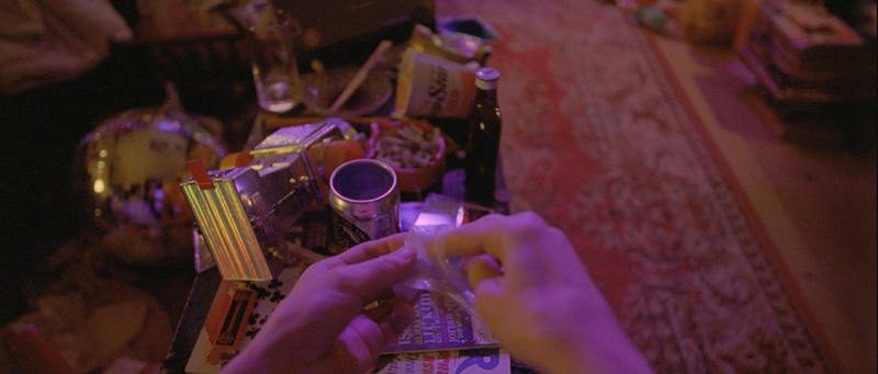
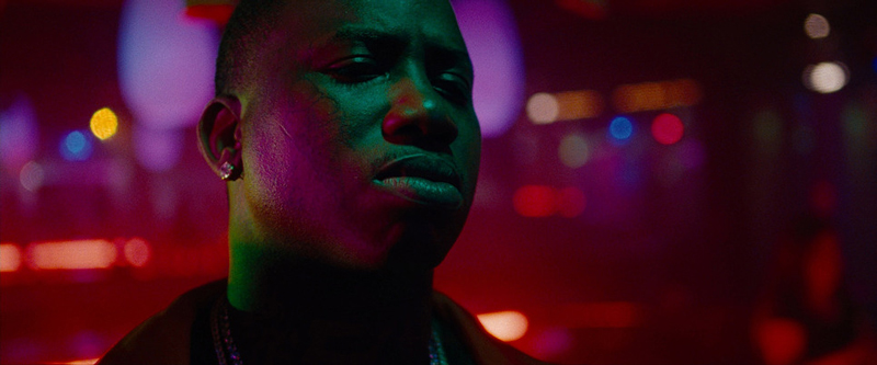
SAFDIE BROTHERS: THE ANXIOUS MAGENTA OF UNCUT GEMS THE
Magenta features prominently within the claustrophobic, neon-lit environments of Uncut Gems (2019). It’s seen in the harsh, artificial glow of the Diamond District jewelers’ lights, the disorienting blacklight sequences in the nightclub, and the general urban night ambiance.
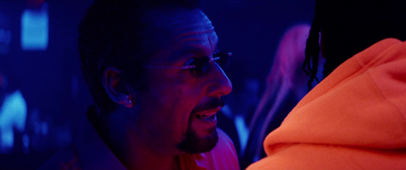
Uncut Gems (2019) | A24
This magenta isn’t comforting. Contrarily, far from it. It enhances the sense of anxiety, high-stakes tension, and the intoxicating, dangerous allure of Howard’s gambling addiction and the glittering, yet treacherous, world he inhabits.
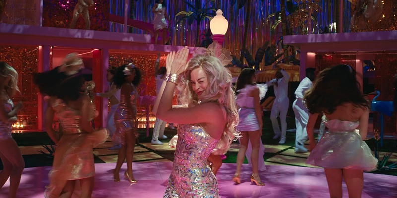
HARMONY KORINE: HEDONISTIC MAGENTA IN THE BEACH BUM & SPRING BREAKERS
Harmony Korine masterfully wields magenta and neon pinks as key components of his hyper-stylized, often controversial explorations of modern hedonism. In Spring Breakers (2012), magenta is inseparable from the neon-drenched, dreamlike-turned-nightmarish depiction of the spring break fantasy.
Spring Breakers (2012) | Muse Productions
It represents youthful excess, artificiality, danger, and transgression.
Similarly, in The Beach Bum (2019), magenta contributes to the hazy, sun-soaked, deliberately garish aesthetic of Florida’s counter-culture.
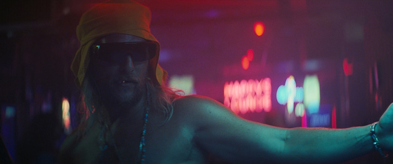
The Beach Bum (2019) | Iconoclast
It’s part of the perpetual party atmosphere surrounding Moondog (Matthew McConaughey), reflecting a world of carefree indulgence and altered states, rendered in eye-popping, saturated hues.
THE POWER OF VISUAL REFERENCE: SHOTDECK ILLUMINATES CINEMATIC STORYTELLING
Throughout this exploration of magenta in cinema, we’ve relied on visual examples to illustrate the color’s diverse applications and emotional impact. From the vibrant, theatrical magentas of Moulin Rouge! and Barbie to the unsettling neon glow in Only God Forgives or the surreal hues in Juliet of the Spirits, these images are invaluable tools. They help us understand how color functions as a part of the movie language. But where can filmmakers, film students, and passionate cinephiles find these specific shots, analyze color palettes in detail, and draw inspiration for their own work?
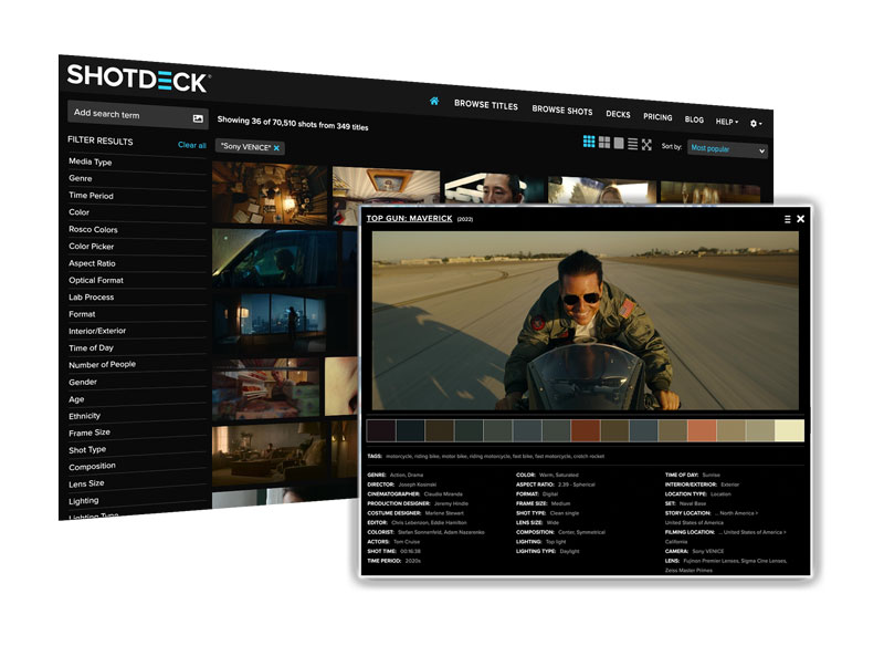
The answer, increasingly, is ShotDeck. ShotDeck is more than just a vast collection of film stills. It’s a revolutionary resource that’s transforming how we approach pre-production, visual research, and even film analysis itself. It’s the world’s largest searchable database of high-definition movie images, curated and tagged with an unprecedented level of detail.
Every image in this article, showcasing the masterful use of magenta across a range of films and directorial styles, was sourced from ShotDeck’s extensive library. As we continue our “Movie Color Palette” series, exploring the vibrant world of color, resources like ShotDeck will undoubtedly play an increasingly vital role. They empower film makers to learn from the masters, dissect visual techniques, find inspiration, and ultimately, shape the future of cinema.
THE BOTTOM LINE:
From its synthetic origins to its vibrant presence on the modern screen, magenta has carved out a unique niche in movie color theory. Initially challenging to create, it grew in later decades, becoming a go-to hue for representing the artificial, the fantastical, the technological, and the emotionally charged.
We’ve seen auteurs from Minnelli and Fellini to Refn and Gerwig utilize magenta and its adjacent tones to create moods and visuals. This exploration highlights magenta’s versatility and its power to evoke a complex range of responses, proving that even colors outside the natural spectrum are essential tools in the palette.
THE FILMMAKERS ACADEMY ADVANTAGE:
Filmmaking is a team effort. That’s why at Filmmakers Academy, we believe in the power of connection. Beyond our comprehensive courses, we offer a community where you can network with fellow film makers. Not only that but you can share your work and find people for your next project. Our platform provides a space to connect with industry professionals, learn from experienced mentors, and build lasting relationships that can propel your career forward.


