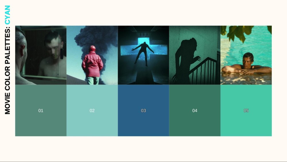
After exploring the foundational colors of cinema, our Movie Color Palette series now turns to a hue defined by its compelling duality: CYAN. It is the color of life-giving serenity — think of clear ocean lagoons and icy glacial caves. Yet, in cinema, it is just as often the color of cold, sterile detachment — the hum of fluorescent lights in a hospital, the glow of a computer screen in a dark room, or the inhuman gleam of a dystopian city. This unique ability to represent both natural purity and artificial coldness makes cyan a remarkably versatile tool for filmmakers.
This article will explore the psychology behind cyan’s contrasting meanings and its diverse applications in film. We will examine how its position between green and blue allows it to borrow and blend their emotional qualities. Through specific film examples, we will analyze how directors use cyan to build worlds, from serene natural paradises to chilling futuristic landscapes, and how it profoundly impacts the mood and tone of a story.
MOVIE COLOR PALETTE SERIES
Join us for the ninth chapter in our comprehensive exploration of cinematic color. Understanding how to wield a color as nuanced as cyan is key to mastering modern visual storytelling. By dissecting its use, we continue our mission to provide filmmakers with the knowledge to make conscious and impactful creative choices.
CYAN ON SCREEN: THE HUE OF TECHNOLOGY, ATMOSPHERE & OTHER WORLDS
As color film technology, particularly three-strip Technicolor, granted filmmakers greater control over their palettes, directors began to explore the unique qualities of cyan. While less common as a primary symbolic color than red or green, its deliberate use by iconic directors created unforgettable visual moods.
JACQUES TATI: THE COOL, MODERNIST CYAN OF PLAYTIME
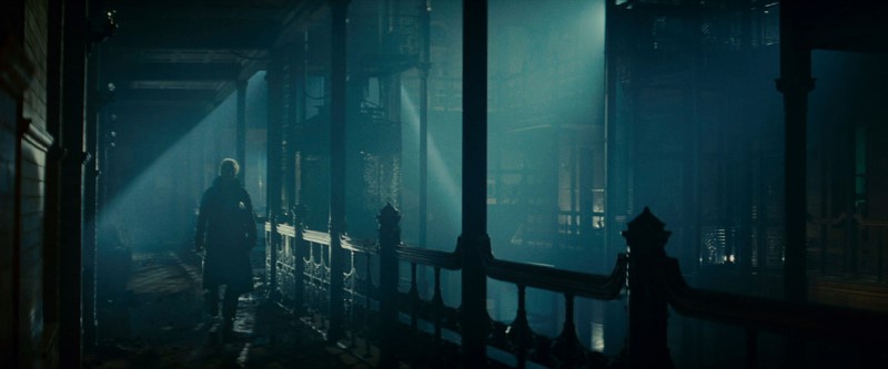
French director and comedic genius Jacques Tati used color with the precision of an architect in his masterpiece, PlayTime (1967). He created a hyper-modern, almost dystopian version of Paris dominated by glass, steel, and a strictly controlled color palette. The film’s first half is defined by cool, impersonal colors: steely grays, beiges, and a prominent, clean cyan-blue.
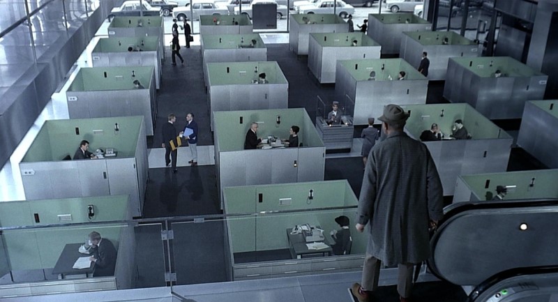
PlayTime (1967) | StudioCanal International
Here, cyan is the color of modern efficiency, reflective glass, and institutional conformity. Tati uses this specific, controlled cyan to create a world that is sleek and visually stunning but also cold, sterile, and comically alienating, against which the bumbling, more human character of Monsieur Hulot delightfully struggles.
STANLEY KUBRICK: THE CLINICAL CYAN OF A SCI-FI FUTURE
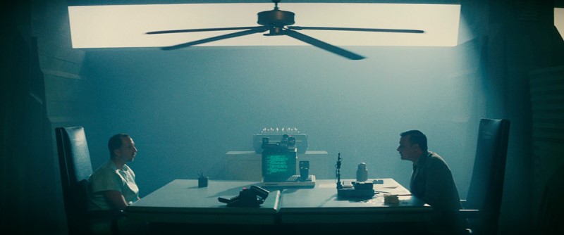
Stanley Kubrick, a master of meticulous and often sterile visual design, utilized cyan to define the look of his science fiction masterpiece, 2001: A Space Odyssey (1968). Working with cinematographers Geoffrey Unsworth and John Alcott, Kubrick bathed the interiors of the Discovery One spaceship in a cool, clinical, cyan-toned light.
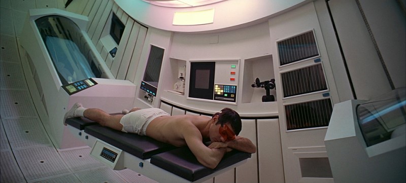
2001: A Space Odyssey (1968) | Warner Bros.
Cyan conveys the artificial, dispassionate glow of computer screens, readouts, and fluorescent panels. The color enhances the sense of a sterile, highly controlled, and emotionally detached environment. This cool, cyan-dominated palette stands in stark contrast to the fiery reds of the malevolent HAL 9000 computer, creating a powerful visual dichotomy between cold, logical technology and rogue, dangerous emotion.
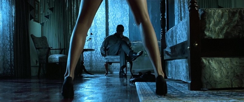
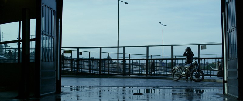
JACQUES DERAY: THE SEDUCTIVE, SUN-DRENCHED CYAN OF LA PISCINE
Jacques Deray’s classic thriller La Piscine (1969) is a masterclass in using setting and atmosphere to reflect simmering passion and dangerous jealousy. The film’s primary location, a luxurious villa on the French Riviera, is defined by two key elements: the intense summer sun and the cool, inviting swimming pool. Cinematographer Jean-Jacques Tarbès captures the pool’s water with a stunning, vibrant cyan-blue that becomes the visual and thematic heart of the film.
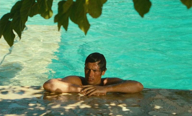
La Piscine (1969) | Société Nouvelle de Cinématographie (SNC)
Cyan, here, is the color of leisure, luxury, and seductive allure. The shimmering cyan surface represents a tranquil paradise, a place of escapism for the beautiful but bored characters. However, as the film’s underlying tensions mount, the very same pristine cyan water begins to feel charged with menace and foreboding. It becomes the stage for both languid desire and, ultimately, a dark, pivotal act, its cool clarity reflecting the hidden depths of the characters’ psyches. Ultimately, cyan is used to represent a paradise that is slowly, beautifully, and terrifyingly corrupted.
RIDLEY SCOTT: THE NEON HUES OF BLADE RUNNER
Ridley Scott’s Blade Runner (1982) is a masterclass in atmospheric world-building, and cyan is a fundamental component of its visual identity. Cinematographer Jordan Cronenweth uses cyan as the very air of his futuristic Los Angeles.
Blade Runner (1982) | Alcon Entertainment
It’s present in the hazy, polluted atmosphere, the constant rain, the shadowy interiors lit by exterior neon, and the glow of technological interfaces.
Blade Runner (1982) | Alcon Entertainment
This cool, pervasive cyan provides the atmospheric base against which the warmer, more vibrant neon oranges and magentas pop. It creates a world that feels technologically advanced, deeply melancholic, and stunningly beautiful.
TONY SCOTT: THE SLEEK, 80S CYAN OF THE HUNGER
Tony Scott’s stylish vampire film The Hunger (1983) is a perfect example of the sleek, modern aesthetic of the early 1980s. The film’s color palette, crafted by Stephen Goldblatt, is defined by deep blacks and cool, atmospheric lighting. The dominant cool tone is often a distinct cyan-blue, used to create a sense of cold elegance, ancient detachment, and modern sophistication for its vampire protagonists.
The Hunger (1983) | MGM/UA
This cool cyan, seen in smoky interiors and night scenes, contrasts sharply with flashes of hot red and magenta during moments of passion and violence, creating the film’s signature decadent, high-fashion horror look.
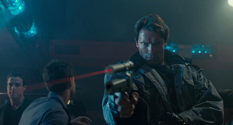
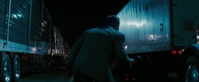
JAMES CAMERON: THE STEELY BLUES AND FIERY REDS OF THE TERMINATOR
James Cameron’s sci-fi action classic The Terminator (1984) establishes a gritty, urban atmosphere largely through its distinctive color palette. Cinematographer Adam Greenberg infused the film’s dominant nighttime scenes with steely, industrial blues and cool cyans, reflecting the cold, mechanical nature of the unstoppable killing machine.
The Terminator (1984) | Skydance
This cool palette is constantly punctuated by the fiery, intense reds of danger — the Terminator’s iconic POV display, the laser sights on weapons, and explosive bursts of violence.
The Terminator (1984) | Skydance
This stark contrast between the cold, oppressive blue of the environment and the hot, dangerous red of conflict became a visual shorthand for 80s action, perfectly capturing the film’s raw, menacing energy.
WIM WENDERS: THE FADED AMERICANA OF PARIS, TEXAS
In Wim Wenders’ iconic Paris, Texas (1984), cinematographer Robby Müller captures the vast American landscape with a palette that feels both realistic and deeply poetic. Cyan first appears as a constant, powerful presence in the form of the wide-open sky. This specific blue-green hue creates a sense of immense space and freedom, but also a profound melancholy and loneliness, serving as the expansive canvas for Travis’s journey.
Paris, Texas (1984) | Avenue Pictures
However, this natural cyan finds its haunting, artificial counterpart in the film’s nighttime scenes. Here, cyan emerges from the cold glow of neon signs and the sterile cast of fluorescent lighting in desolate bars and hotel rooms.
Paris, Texas (1984) | Avenue Pictures
This artificial cyan enhances the feeling of urban alienation and emotional distance, making the modern world feel as vast and isolating as the desert. Wenders and Müller masterfully use both the natural cyan of the sky and the synthetic cyan of the night to highlight Travis’s profound sense of displacement and his search for connection.
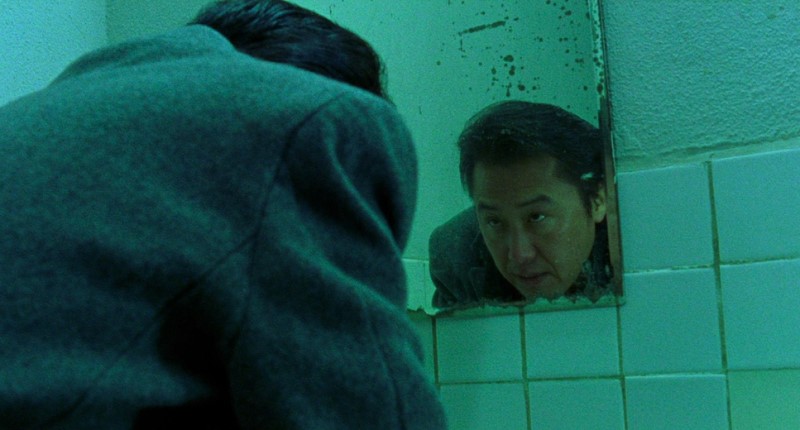
JOHN WOO: THE STYLIZED CYAN WASH OF HARD BOILED
John Woo’s Hong Kong action classic Hard Boiled (1992) utilizes color for pure emotional and stylistic impact, not for realism. The film’s iconic hospital climax is a stunning example, with entire sequences bathed in a dramatic, almost monochromatic cyan-green wash.
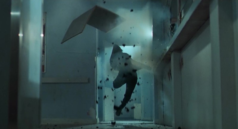
Hard Boiled (1992) | Shout! Studios
This highly stylized choice transforms the environment into an unreal, almost aquatic battleground, heightening the intensity and chaos of the prolonged gunfight. The pervasive cyan wash makes the bursts of vibrant red from the bloodshed even more shocking and graphic, turning the action sequence into a form of violent, visual poetry.
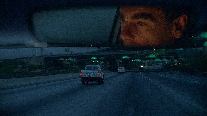
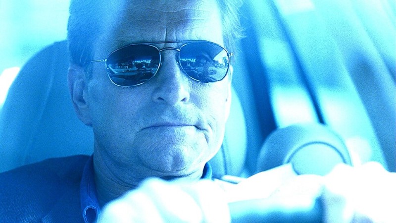
JAMES CAMERON: THE ACTION-PACKED CYAN OF TRUE LIES
James Cameron’s action-comedy True Lies (1994) is a prime example of the high-contrast teal (cyan-blue) and orange palette that defined 90s blockbuster filmmaking. Cyan is heavily used to tint night scenes, high-tech government facilities, and moments of espionage and suspense, giving them a cool, modern, and sleek feel.
True Lies (1994) | 20th Century Fox
This cool cyan is then consistently contrasted with the warm, fiery oranges of explosions, action sequences, and more intimate, warmly lit scenes. This deliberate color contrast creates a visually dynamic, exciting, and easy-to-read cinematic experience for the audience.
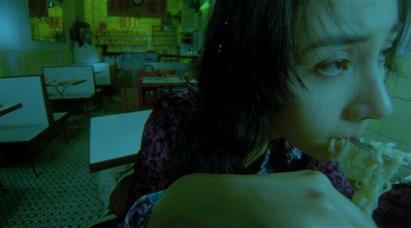
WONG KAR-WAI: THE ATMOSPHERIC CYAN OF HONG KONG NIGHT IN CHUNGKING EXPRESS & FALLEN ANGELS
In his mid-90s collaborations with cinematographer Christopher Doyle, Wong Kar-wai uses cyan as a key ingredient in his moody, atmospheric portraits of Hong Kong. In both Chungking Express (1994) and the darker Fallen Angels (1995), cyan appears not as a single symbolic color, but as part of the ambient, neon-drenched urban landscape.

Chunking Express (1994) | Jet Tone Production
It emanates from the fluorescent lights of subway tunnels, corridors, and late-night food stalls, mixing with sickly greens and lonely blues.
Chunking Express (1994) | Jet Tone Production
This cyan wash creates a profound sense of urban alienation and dreamlike melancholy, perfectly reflecting the characters’ fleeting connections and internal states of longing.
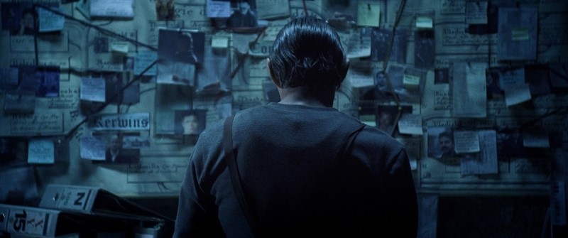
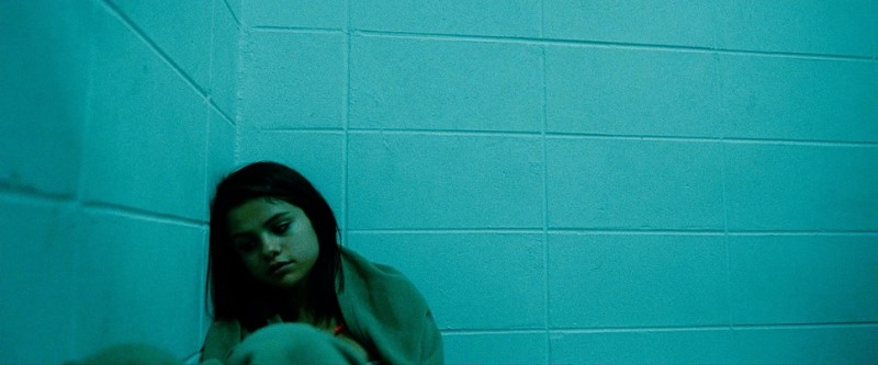
DAVID FINCHER: THE DESATURATED CYAN OF URBAN DECAY IN SE7EN
David Fincher’s Se7en (1995) is a film steeped in shadow and decay, and its color palette, crafted by Darius Khondji, reflects this oppressive world.
The film often employs a bleach bypass process, which crushes blacks and desaturates hues, but a sickly, desaturated cyan is a pervasive undercurrent. It appears in the cold, unending rain, the sterile light of police stations, and the grimy interiors of the city’s forgotten corners.

This is the cyan of rot and moral decay, a visual representation of the bleak, hopeless world the detectives navigate.
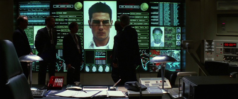
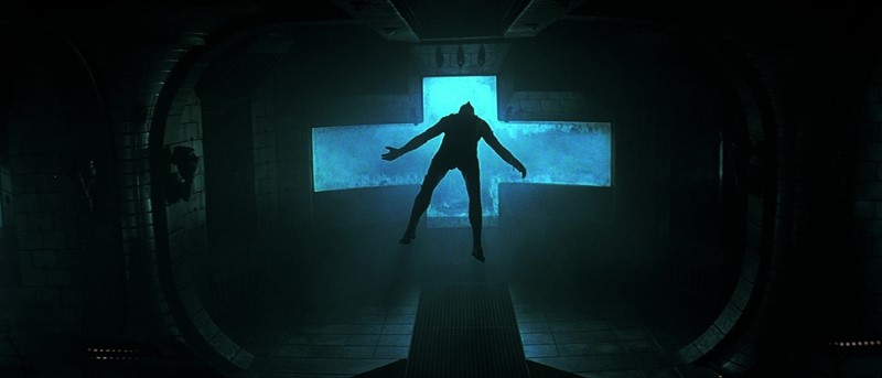
BRIAN DE PALMA: THE HIGH-TECH CYAN OF MISSION: IMPOSSIBLE
In the first Mission: Impossible film (1996), Brian De Palma established a cool, sleek visual style that relied heavily on a cyan-blue and gray palette.
Mission: Impossible (1996) | Paramount Pictures
This use of cyan throughout the film for technological interfaces and espionage environments reinforces the themes of professional detachment and high-stakes tension. It’s a look that would influence the spy genre for years to come.
PAUL W. S. ANDERSON: THE STERILE CYAN OF SCI-FI TECHNOLOGY IN EVENT HORIZON
Paul W.S. Anderson’s Event Horizon (1997) uses a classic sci-fi color dichotomy to build tension and atmosphere. The rescue ship, “Lewis and Clark,” is defined by a cool, sterile, and functional aesthetic, with its corridors and cockpits often lit with a distinct cyan-blue glow from computer screens and fluorescent-style practicals.
Event Horizon (1997) | Paramount Pictures
This cyan represents order, technology, and human control. This makes the eventual intrusion of the haunted “Event Horizon,” with its sickly greens and hellish reds, all the more jarring, using the color contrast to signify the shift from sterile science to cosmic horror.
TAKASHI MIIKE: THE CLINICAL WHITES AND SHOCKING REDS OF AUDITION
Takashi Miike’s Audition (1999) builds its creeping dread on a foundation of stark contrasts, primarily between clean, sterile whites, cyans, and the eventual, shocking eruption of visceral red.
Audition (1999) | Basara Pictures
The horror of Audition is derived from the violation of this clean, almost colorless world, making the roles of white (deceptive purity) and red (brutal reality) the central color story, while cyan seems to blend the lines.
MICHAEL MANN: THE COOL, URBAN CYAN OF A MODERN THRILLER
Michael Mann is a master of the modern urban thriller, and his films are often characterized by their cool, sleek, and atmospheric visual style. In films like Heat (1995) and especially Collateral (2004), the city of Los Angeles at night is rendered in a palette of cool blues and distinct cyans.
Heat (1995) | Warner Bros.
Cyan complements a world of glass, steel, and lonely sodium-vapor lights. The cyan often comes from practical sources — the greenish-blue tint of fluorescent lights, the glow of digital displays, or the specific hue of metal-halide streetlights.
Collateral (2004) | Paramount Pictures
This use of the color creates a sense of detachment, professional coolness, and urban isolation. Thus, it perfectly reflects the psychological states of his often solitary, obsessive protagonists.
THE WACHOWSKIS: THE DIGITAL GREEN-CYAN OF THE MATRIX
While often remembered simply as “green,” the iconic digital world of The Matrix (1999) is more accurately described as a monochromatic green-cyan. The Wachowskis and cinematographer Bill Pope deliberately created this look to mimic the phosphorescent green of early monochrome computer monitors, instantly signaling to the audience when they are inside the artificial, computer-generated reality.
The Matrix (1999) | Warner Bros.
This specific hue is sickly, unnatural, and pervasive, creating a stark visual contrast with the cooler, bluer tones of the “real world” aboard the Nebuchadnezzar. The cyan here is a symbol of digital imprisonment and a world that is fundamentally artificial.
CYAN IN CONTEMPORARY CINEMA: THE COLOR OF TECHNOLOGY, ISOLATION & OTHER WORLDS
Building on the atmospheric foundations laid by directors like Kubrick and Tati, contemporary filmmakers have fully unlocked the potential of cyan. Aided by digital color grading, which allows for precise control over hue and saturation, cyan has become a powerful and pervasive tool.
It’s often used to create specific, stylized worlds and to evoke feelings of technological advancement, clinical sterility, otherworldly presence, and emotional isolation. Its position as the cool counterpart in the ubiquitous “teal and orange” color palette has further cemented its place in the modern visual lexicon.
STEVEN SODERBERGH: CYAN AS NARRATIVE SHORTHAND IN TRAFFIC
Steven Soderbergh’s Traffic (2000) is a brilliant example of using color to guide the audience through a complex, multi-layered narrative. Each of the film’s interwoven storylines has its own distinct color palette. The storyline following Michael Douglas’s character, set in the world of Washington D.C. politics and suburban drug use, is given a distinct, cold, blue-cyan tint.
Traffic (2000) | IEG
This color choice creates a sense of emotional detachment, clinical coldness, and the sterile, often somber reality of the war on drugs from a governmental and personal perspective. The cyan here is a narrative tool, a visual shorthand that instantly tells the audience which part of the story they are watching.
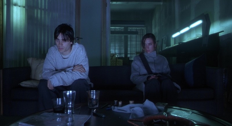
Darren Aronofsky: The Cold Cyan of Addiction in Requiem for a Dream
Darren Aronofsky and cinematographer Matthew Libatique use a highly subjective and symbolic color palette in Requiem for a Dream (2000) to chart the devastating trajectory of addiction. The film is structured around seasons, and while the early “Summer” section is filled with warm, hopeful tones, the final, harrowing “Winter” act descends into a world dominated by a cold, bleak cyan and blue.
Requiem for a Dream (2000) | Artisan Entertainment
As the characters hit their respective rock bottoms, the palette shifts to this chilling hue, reflecting the coldness of hospital rooms, jail cells, and profound emotional isolation. The clinical, almost deathly cyan tint visually represents the final, desolate stage of their addiction, where all warmth and hope have been extinguished. Aronofsky uses this color to create a powerful, visceral contrast to the film’s earlier warmth, making the characters’ tragic end feel both inevitable and absolutely chilling.
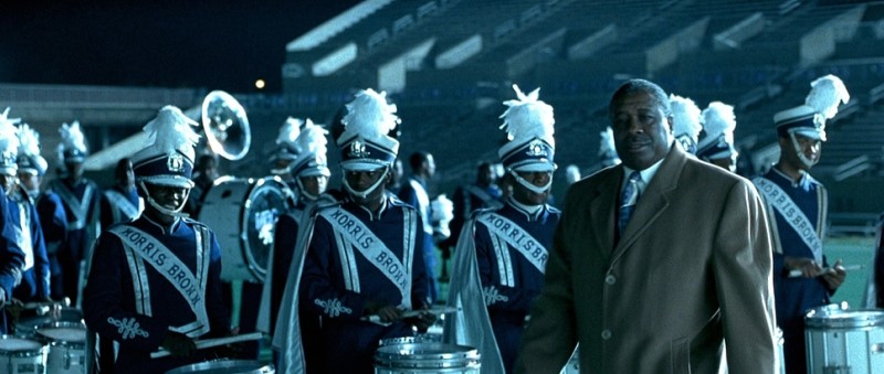
CHARLES STONE III: THE BOLD PRIMARY COLORS OF DRUMLINE
While the visual energy of Charles Stone III’s Drumline (2002) is primarily driven by the bold school colors of blue, orange, and red, the color cyan plays a crucial atmospheric role in the film’s most dynamic sequences. The iconic halftime shows and drum-offs often take place at night under massive stadium lights. These powerful lights frequently cast a cool, cyan-blue wash over the field, creating a striking contrast with the warm, vibrant colors of the band uniforms. This cool, electric cyan enhances the sense of spectacle, makes the primary colors pop, and adds a crisp, modern energy to the nighttime performances. While not a symbolic color itself, the use of cyan in the environmental lighting is essential to crafting the high-energy, exciting atmosphere that defines the film’s memorable musical showdowns.
Drumline (2002) | 20th Century Fox
The film’s straightforward, high-energy aesthetic relies on the immediate power of its primary color scheme to create visual dynamism.
Drumline (2002) | 20th Century Fox
LEN WISEMAN: THE MONOCHROMATIC CYAN OF THE UNDERWORLD SAGA
Len Wiseman’s Underworld (2003) is arguably one of the most iconic examples of a film defined by a single color family. The entire visual aesthetic is built upon a high-contrast, almost completely monochromatic cyan-blue palette. This pervasive cool tone, crafted by cinematographer Tony Pierce-Roberts, creates a sleek, modern gothic world of eternal night.
Underworld (2003) | Lakeshore Entertainment
The cyan represents the cold, ancient conflict between Vampires and Lycans and the emotionally detached nature of the death dealers, establishing a distinct and instantly recognizable cinematic universe defined by its signature color.
NEIL MARSHALL: THE EXPLORATORY CYAN-GREEN OF THE DESCENT
Neil Marshall’s horror masterpiece The Descent (2005) uses a limited palette to create its terrifyingly claustrophobic atmosphere. The film’s world is primarily darkness, punctuated only by the cavers’ light sources. The cool, weak glow of their headlamps and glow sticks often renders as a distinct cyan-green.
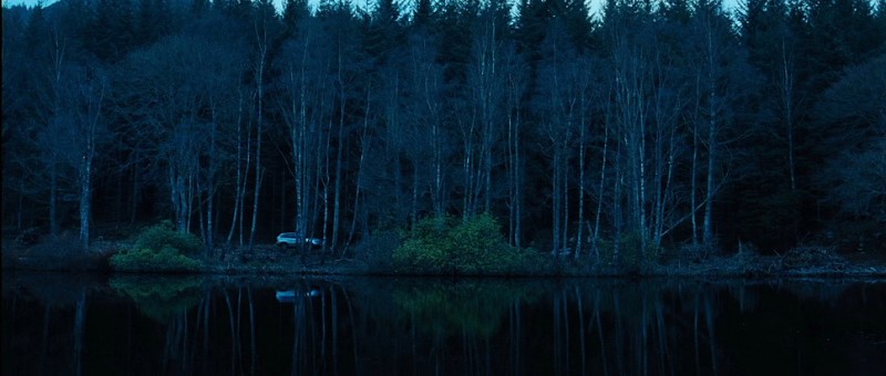
The Descent (2005) | Pathe Pictures
This limited, technological light represents their fragile lifeline and their attempts to map the unknown. It is a color of exploration and vulnerability, which is then violently contrasted with the primal red of blood and fire when the horrifying creatures are revealed.
ALFONSO CUARÓN: THE OPPRESSIVE CYAN OF A DYING WORLD IN CHILDREN OF MEN
Alfonso Cuarón’s dystopian masterpiece Children of Men (2006) is defined by its desaturated, gritty, and oppressive color palette. Cinematographer Emmanuel Lubezki renders the film’s dying world in a wash of cold, bleak colors, where a distinct cyan-gray tint is pervasive. It appears in the cold English light, the sterile interiors of government facilities, and the decaying urban landscapes.
Children of Men (2006) | Universal Pictures
This cyan is the color of hopelessness, infertility, and societal collapse, creating a chillingly realistic and unforgettable atmosphere.
JAMES CAMERON: THE BIOLUMINESCENT CYAN OF PANDORA IN AVATAR
James Cameron took the use of cyan to a spectacular, world-building extreme in Avatar (2009). The native inhabitants of Pandora, the Na’vi, are a distinct, bluish-skinned species. This choice immediately establishes their otherworldly nature.
Furthermore, the lush, bioluminescent flora of Pandora glows with ethereal blues and cyans, especially at night. This use of cyan creates a sense of wonder, magic, and a deep connection to nature — albeit an alien one.
Avatar (2009) | Disney (21st Century Fox)
It represents a world that is both beautiful and untamed, a vibrant ecosystem teeming with life. Cameron uses cyan to create a sense of immersive, fantastical beauty.
MCG: THE DESATURATED CYAN OF A POST-APOCALYPTIC FUTURE IN TERMINATOR SALVATION
In Terminator Salvation (2009), director McG and cinematographer Shane Hurlbut, ASC, crafted a distinct and influential post-apocalyptic aesthetic, moving away from the dark urban noir of the earlier films. The visual world is defined by a harsh, gritty, and desaturated color palette, achieved through a silver retention process (a form of bleach bypass) in post-production.
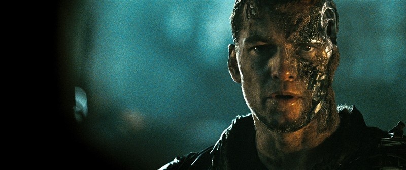
Terminator Salvation (2009) | Skydance Media
The dominant atmospheric color is a cold, metallic cyan that permeates the film’s shadows and mid-tones. This cyan is the color of a world scoured of life and warmth, reflecting the bleak reality of humanity’s war against the cold, unfeeling machines of Skynet. Moreover, this pervasive cyan tint enhances the sense of hopelessness and desolation.
It makes the scorched earth and metallic skeletons of the Terminators feel oppressive and all-encompassing. It’s a key visual element that defines the film’s harsh, war-torn reality.
DAVID FINCHER: THE COLD, CLINICAL CYAN OF THE GIRL WITH THE DRAGON TATTOO
David Fincher, alongside cinematographer Jeff Cronenweth, establishes the bleak, chilling atmosphere of The Girl with the Dragon Tattoo (2011) through a meticulously controlled and desaturated color palette, where cyan is a dominant and pervasive force. The film uses this specific cool hue to represent more than just the Swedish winter. It embodies the emotional coldness, isolation, and clinical nature of the mystery itself.
The Girl with the Dragon Tattoo (2011) | Columbia Pictures
The overcast exteriors are bathed in a cold, cyan-tinted light, while modern interiors and scenes involving Lisbeth Salander’s hacking are often illuminated by the sterile, digital glow of computer screens, reinforcing the detached and technological aspects of the investigation. The consistent use of this cool tone creates a world that feels both sophisticated and deeply unsettling, perfectly mirroring the dark narrative.
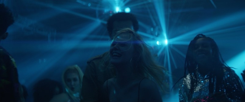
HARMONY KORINE: THE NEON CYAN OF HEDONISM IN SPRING BREAKERS
Harmony Korine’s Spring Breakers (2012) is defined by its hyper-stylized, neon-saturated aesthetic, and cyan is a central component. Along with its counterpart, neon magenta, cyan drenches the film’s depiction of the spring break fantasy. It appears in the lighting of parties, the glow of pools at night, and the overall atmospheric haze.

Spring Breakers (2012) | A24
This artificial cyan represents the alluring, yet ultimately hollow and dangerous, nature of the characters’ hedonistic quest, creating a visual world that is both intoxicating and deeply unsettling.
Spring Breakers (2012) | A24
JEFF NICHOLS: THE OTHERWORLDLY CYAN OF BELIEF IN MIDNIGHT SPECIAL
In his sci-fi road movie Midnight Special (2016), director Jeff Nichols grounds extraordinary events in a gritty, realistic world, and he uses cyan as the primary visual signifier for the supernatural. The film’s palette is largely composed of dark, naturalistic tones — the dim interiors of motels, nighttime highways, and rural landscapes. This makes the appearance of cyan incredibly powerful and impactful. It manifests most strikingly as the intense, piercing cyan-blue light that glows from the eyes of the gifted boy, Alton, when his powers are active.
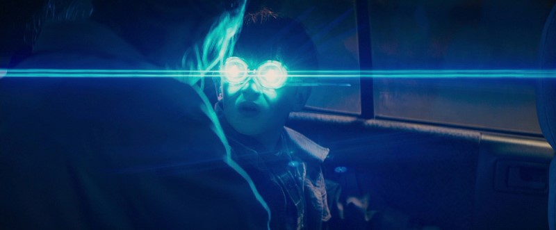
Midnight Special (2016) | Warner Bros.
This is cyan as a direct, otherworldly energy source. The cyan represents a power that is alien, pure, and beyond human comprehension — a visual representation of the faith and mystery that drives the narrative. Its artificial, technological feel contrasts sharply with the film’s grounded realism, creating moments of genuine awe and suspense whenever it appears.
GUILLERMO DEL TORO: THE AQUATIC CYAN OF LOVE IN THE SHAPE OF WATER
Guillermo del Toro, a master of dark fantasy and visual symbolism, uses cyan with profound emotional meaning in his Oscar-winning film, The Shape of Water (2017). The world of the mute protagonist, Elisa Esposito (Sally Hawkins), is drenched in shades of cyan and blue. Her apartment, her clothing, and the water that permeates the film all share this color.
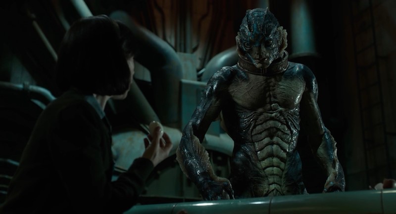
The Shape of Water (2017) | Searchlight Pictures
This connects her directly to the Amphibian Man, the creature she falls in love with, and to the watery realm from which he came. Cyan here is the color of her identity, of love, of empathy, and of a world that feels “perpetually underwater.” It contrasts sharply with the warmer, often golden or sickeningly green tones of the outside world, highlighting Elisa’s isolation and her unique connection to the creature.
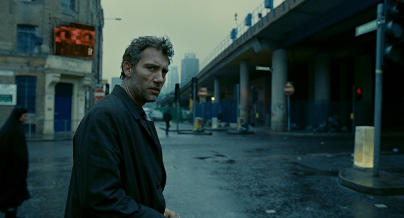
DENIS VILLENEUVE: THE ATMOSPHERIC CYAN OF A DYSTOPIAN FUTURE IN BLADE RUNNER 2049
In Blade Runner 2049 (2017), Denis Villeneuve and cinematographer Roger Deakins use cyan as the primary atmospheric color for their futuristic Los Angeles. The city is perpetually shrouded in a cold, hazy, cyan-blue mist, rain, and fog.
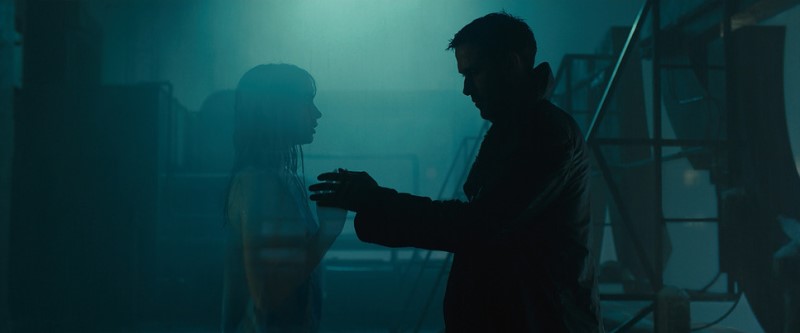
Blade Runner 2049 (2017) | Alcon Entertainment
This pervasive color, seen in exterior cityscapes and sterile interiors, represents the cold, detached, and ecologically damaged world. It serves as the visual foundation of the film’s neo-noir aesthetic and provides a stunning contrast to the toxic, radioactive orange of the abandoned Las Vegas sequences.
STEVEN CAPLE JR.: THE SUBTLE CYAN OF THE MODERN CORNER IN CREED II
While the core conflict in Creed II (2018) is represented by a classic red vs. blue dichotomy, the “blue” corner often leans into a modern, high-tech cyan. The lighting in Adonis Johnson’s training facilities and corner during fights often has a cool, cyan-blue tint, reflecting a modern, sleek, and strategic approach to the sport.
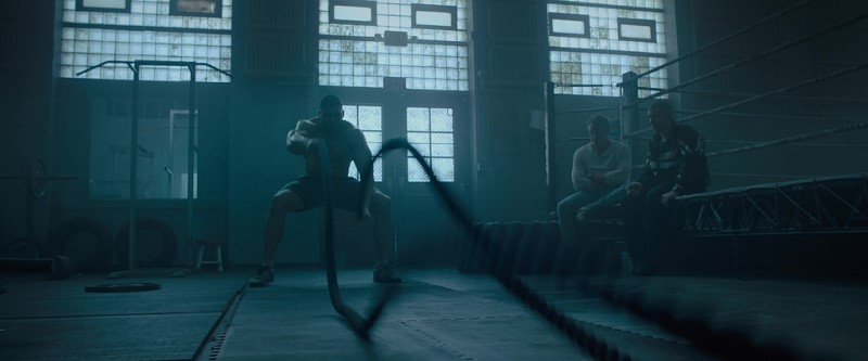
Creed II (2018) | MGM
This provides a subtle visual contrast to the more primal, aggressive red associated with his opponent, Viktor Drago (Florian Munteanu), adding a contemporary layer to the traditional boxing color scheme.
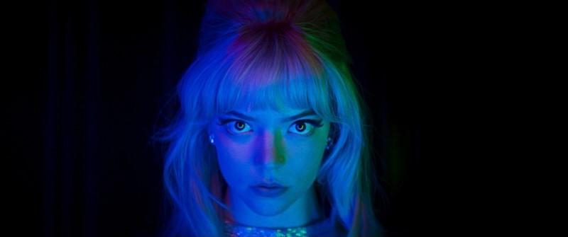
MAX MINGHELLA: THE ELECTRIC CYAN OF THE POP STAGE IN TEEN SPIRIT
Max Minghella’s Teen Spirit (2018) uses cyan as a key component of its modern pop music aesthetic. The performance sequences are frequently bathed in vibrant, artificial neon lighting, where electric blues and cyans contrast sharply with bold magentas and pinks.
Teen Spirit (2018) | LD Entertainment
This is the visual language of the contemporary pop stage, representing the high-tech, manufactured, and alluring world of fame.
The cyan lighting helps create a sense of spectacle and transformation, visually separating the protagonist’s ordinary life from her electrifying moments in the spotlight.
TODD HAYNES: THE TOXIC CYAN OF CORPORATE NEGLIGENCE IN DARK WATERS
Todd Haynes’ environmental thriller Dark Waters (2019) employs a deliberately desaturated and chillingly sterile color palette, where cyan is a prominent and thematic color. Cinematographer Edward Lachman drenches the film in cool, muted colors. This cyan is the cold, clinical color of corporate boardrooms, legal documents, and, most damningly, the Teflon-contaminated water itself.
Dark Waters (2019) | Participant Media
The persistent cool, cyan tones create an atmosphere of oppressive dread and institutional indifference, visually representing the toxic reality hidden beneath the surface of a small American town.
CHARBONIER & POWELL: THE TENSE CYAN OF CONFINEMENT IN THE BOY BEHIND THE DOOR
The independent thriller The Boy Behind the Door (2020) uses its color palette to heighten a sense of claustrophobia and fear. The interiors of the captor’s house are often steeped in a cool, sterile cyan-blue light. This color choice creates a cold, unwelcoming atmosphere, emphasizing the boys’ isolation and the clinical, detached nature of the threat they face.
The Boy Behind the Door (2020) | Kinogo Pictures
This cool cyan contrasts sharply with any warmer colors used in flashbacks to the “normal” world, creating a powerful visual representation of their terrifying ordeal.
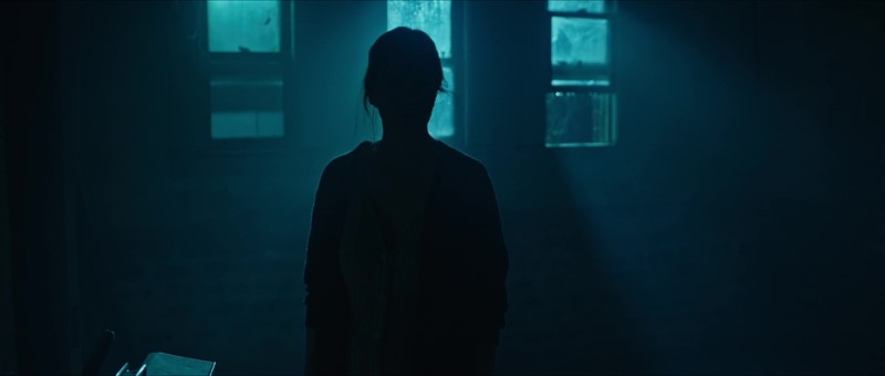
EDGAR WRIGHT: The Cool Cyan of Modernity in Last Night in Soho
In Edgar Wright’s psychological thriller Last Night in Soho (2021), cyan serves as a crucial visual anchor for the present-day timeline. The world of Eloise (Thomasin McKenzie) in modern London is frequently bathed in a cool, sometimes isolating, cyan and blue light, emanating from phone screens, laptops, and the city’s nocturnal glow.
Last Night in SoHo (2021) | Universal Pictures
This cool palette stands in stark contrast to the alluring, warm reds of her visions of the 1960s. The cyan effectively represents the colder, more detached reality of contemporary life, creating a powerful visual dichotomy between a romanticized past and a harsher present.
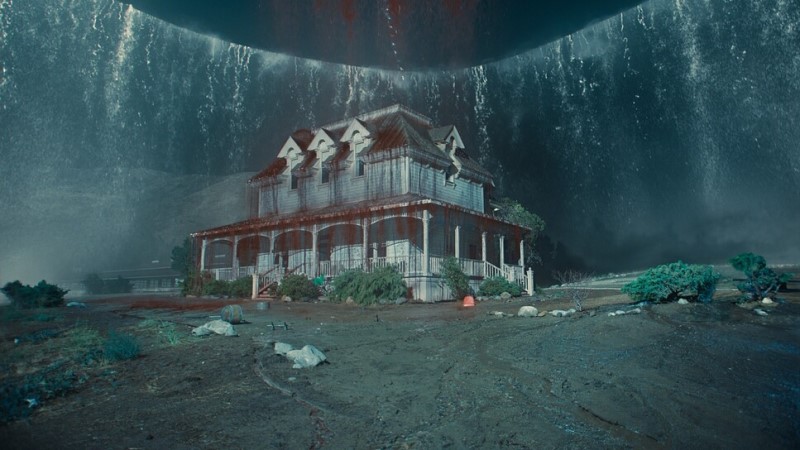
NIGHT SHYAMALAN: THE DECEPTIVE CYAN OF PARADISE IN OLD
M. Night Shyamalan’s thriller Old (2021) masterfully leverages the idyllic associations of cyan. The stunning, vibrant cyan of the secluded cove’s water initially represents a perfect, exclusive tropical paradise.

Old (2021) | Universal Pictures
However, as the characters realize they are trapped and aging rapidly, the meaning of this beautiful color subverts entirely. The inescapable cyan water becomes the glittering, impassable border of their prison, its pristine quality mocking their horrific situation and transforming a symbol of serene escape into one of beautiful, terrifying confinement.
JORDAN PEELE: THE NOCTURNAL CYAN OF NOPE
While Jordan Peele’s Nope (2022) uses red as its most powerful symbolic color for spectacle and horror, cyan plays a crucial atmospheric role in the film’s extensive night sequences. The vast, open landscapes of the Haywood ranch are often bathed in a deep, cool cyan-blue moonlight.
Nope (2022) | Universal Pictures
Again, this cyan is an otherworldly, mysterious hue that enhances the landscape’s scale, the characters’ isolation, and the alien nature of the threat lurking in the sky above, creating a beautiful yet deeply unsettling atmosphere.
SARA DOSA: THE ELEMENTAL CYAN OF ICE AND STEAM IN FIRE OF LOVE
In her breathtaking documentary Fire of Love (2022), director Sara Dosa crafts a narrative from the stunning archival footage of volcanologists Katia and Maurice Krafft. While the film is defined by the explosive, fiery oranges and reds of lava, the color cyan serves as a crucial and powerful counterpoint, representing the opposing elemental forces the Kraffts studied. Cyan appears most strikingly in scenes of their expeditions to icy volcanic regions, where the cool, otherworldly blue-green of glaciers and frozen landscapes provides a stark contrast to the heat and violence of their other missions.
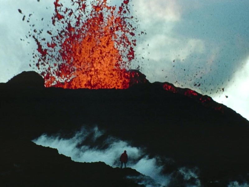
Fire of Love (2022) | National Geographic Documentary Films
This ethereal cyan highlights the vast and diverse environments of volcanic activity, from fire to ice. Furthermore, the steam and gas billowing from volcanic vents are often rendered with a cyan or blueish tint, creating an atmosphere that is both beautiful and dangerously toxic, perfectly capturing the sublime and perilous nature of the Kraffts’ lifelong passion.
THE POWER OF VISUAL REFERENCE: SHOTDECK
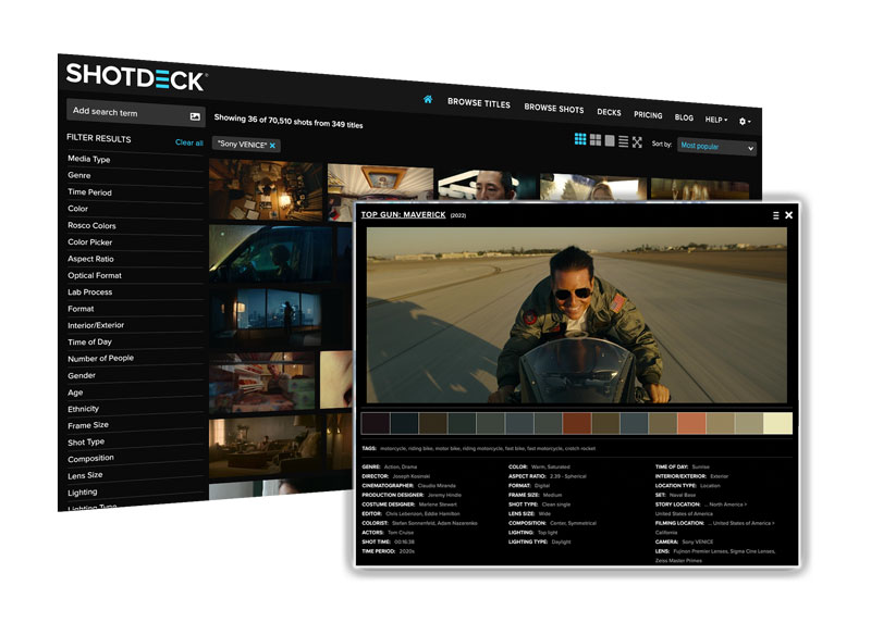
Throughout this exploration of cyan in cinema, we’ve relied on striking visual examples to illustrate the color’s diverse applications and emotional impact. From the clinical, futuristic cyan of 2001: A Space Odyssey and the moody cityscapes of Michael Mann’s Heat, to the otherworldly glow of Avatar and the oppressive atmosphere of Children of Men, these images are invaluable tools. They help us understand how color functions as a central part of the cinematic language. But where can filmmakers, film students, and passionate cinephiles find these specific shots, analyze color palettes in detail, and draw inspiration for their own work?
The answer, increasingly, is ShotDeck. ShotDeck is more than just a vast collection of film stills. It’s a revolutionary resource that’s transforming how filmmakers approach pre-production, visual research, and even film analysis itself. It’s the world’s largest searchable database of high-definition movie images, meticulously curated and tagged with an unprecedented level of detail.
Every image in this article, showcasing the masterful use of cyan across a range of films and directorial styles, was sourced from ShotDeck’s extensive library. As we continue our “Movie Color Palette” series, exploring the vibrant world of cinematic color, resources like ShotDeck will undoubtedly play an increasingly vital role. They empower filmmakers to learn from the masters, dissect visual techniques, find inspiration for using specific hues like cyan, and ultimately, shape the future of cinema.
THE BOTTOM LINE:
From the eerie glow of a computer screen to the vast expanse of an alien sky, cyan has proven to be an incredibly versatile and evocative color in cinema. Its ability to signify both serene, natural beauty and cold, artificial environments gives it a unique power to shape mood and meaning. The directors we’ve explored, from Tati and his critique of modernism to Villeneuve and his visions of the future, all harness cyan’s specific psychological impact. They use it to create worlds that feel futuristic, isolated, sterile, or mysteriously beautiful. Understanding when and how to deploy this cool, complex hue is a key skill in modern visual storytelling.
THE FILMMAKERS ACADEMY ADVANTAGE
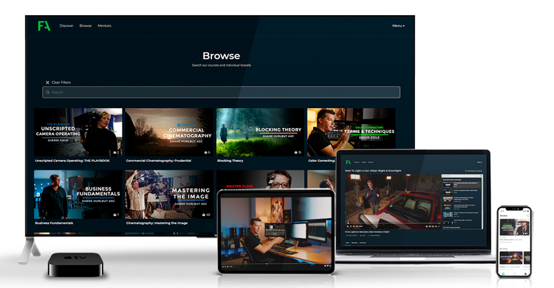
Filmmaking is a collaborative art. That’s why at Filmmakers Academy, we believe in the power of connection. Beyond our comprehensive courses, we offer a thriving community where you can network with fellow filmmakers. Not only that but you can share your work and find collaborators for your next project. Our platform provides a space to connect with industry professionals, learn from experienced mentors, and build lasting relationships that can propel your career forward.
JOIN FILMMAKERS ACADEMY AND SAVE $50!
Ready to take your filmmaking skills to the next level? Join the Filmmakers Academy community and gain access to exclusive content, expert mentorship, and a network of passionate filmmakers. Use code FABLOG50 to save $50 on your annual membership!