The Many Types of Color in Film
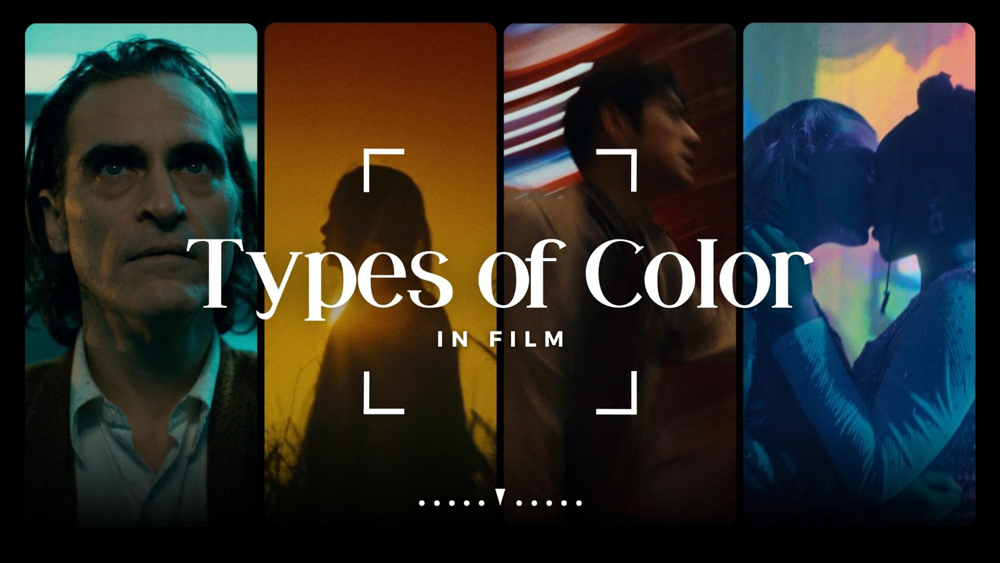
The science of color in film is a fundamental pillar of the visual experience. No matter if it’s the black and white of a noir or the kaleidoscopic bokeh in a romantic drama, all the types of color in film evoke a unique reaction in the audience.
Filmmakers rely on color theory when devising the mood and tone of a film. When starting a project, a cinematographer will create a lookbook and choose a color palette based on the story they want to tell.
Let’s take a closer look at some of the fundamentals of color theory in film and define how they translate to the big screen. Then, we will share a special tool we use from ShotDeck when assembling the look of our projects.
BASICS OF COLOR THEORY IN FILMMAKING
The combination of art and science has produced color theory. Throughout the history of film and its advances, color science has evolved into a complex component of the cinematic process.
If we were to boil it down, color theory would be separated into three basic components.
- Hue
- Saturation
- Brightness
The hue itself is the color while the saturation is the color’s intensity and the brightness is just how dark or light it is.
The next three components of color are shade, tint, and tone. They are managed by controlling the black, gray, and white of a particular hue.
SHADE
To make a color more dramatic, you can add black to the base hue which creates a shade.
TINT
On the other hand, if you want to make a color feel less intense or want to balance more vivid color combinations, you can add white which creates a tint.
TONE
If you want to reveal the complexities of a base color, you can add gray which creates a tone.
COLOR WHEEL ONLINE
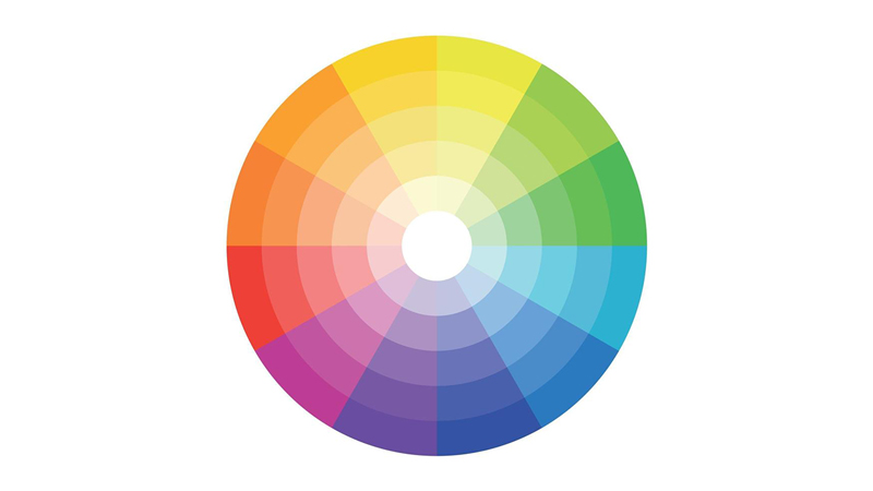
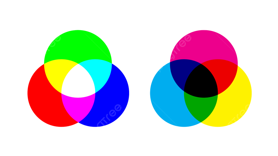
We have Isaac Newton to thank for the color wheel so it’s not exactly a new concept. But there are a few things to keep in mind. For instance, there’s the RYB color wheel (red, yellow, blue) which is ideal for mixing paint. Then, there’s the RGB color wheel (red, green, blue) which is designed for computer and TV screens.
The color wheel illustrates the entire spectrum of colors and showcases how they relate to one another. Altogether, there are 12 main colors in the color wheel. Every color bleeds into the next until it comes full circle completing the wheel, also displaying primary, secondary, and tertiary colors.
PRIMARY COLORS
We alluded to the primary colors above. They cannot be created by any other color combination. RYB and RGB are two sets of cardinal colors that all other colors are derived from.
SECONDARY COLORS
Secondary colors are the next set of colors emanating from the primary colors. For example, the secondary colors of RGB are cyan, magenta, and yellow; while RYB yields purple, orange, and green.
TERTIARY COLORS
If you can see the pattern here, tertiary colors are a combination of primary and secondary colors. Each set includes six tertiary colors.
RED-YELLOW-BLUE (RYB):
- Vermillion (Red + Orange)
- Amber (Yellow + Orange)
- Chartreuse (Yellow + Green)
- Teal (Blue + Green)
- Violet (Blue + Purple)
- Magenta (Red + Purple)
RED-GREEN-BLUE (RGB):
- Orange (Yellow + Red)
- Chartreuse (Yellow + Green)
- Spring (Cyan + Green)
- Azure (Cyan + Blue)
- Violet (Magenta + Blue)
- Rose (Magenta + Red)
COLOR IN FILM SYMBOLISM
Filmmakers have conveyed meaning using distinct colors. Just don’t consider it a rule as some colors may even hold contradictory meanings. For example, the color red could signify fear or love.
Now, let’s review the psychology of colors in filmmaking.
| RED: While it’s said that a deeper red raises blood pressure and can elicit fear and foreboding. It can also represent lust, love, and hope. |
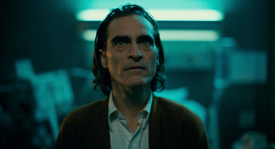
| BLUE: Can range from calming to cold and isolating to passive and melancholic. |
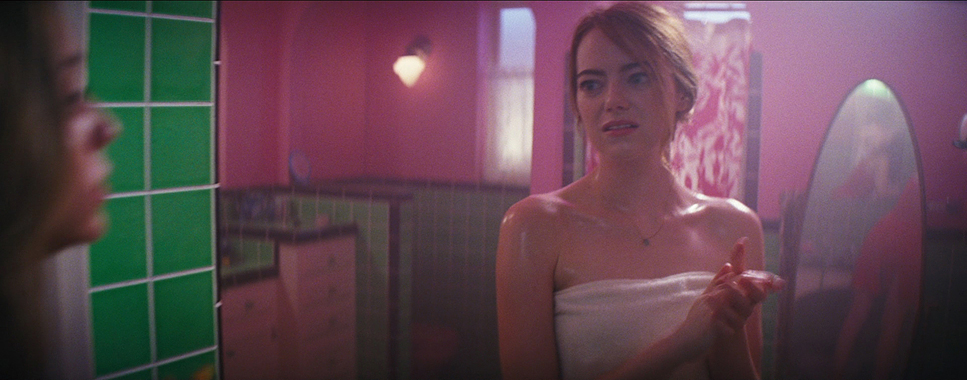
| PINK: In addition to femininity, pink also exudes innocence and empathy. |
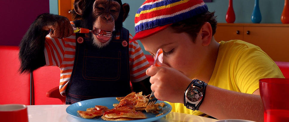
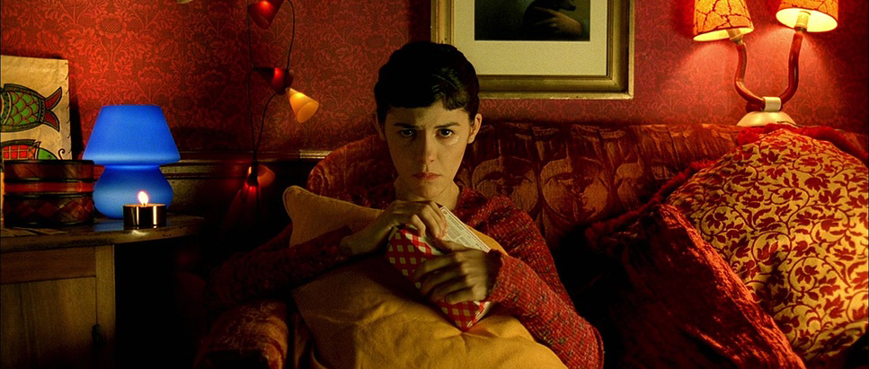
| YELLOW: Idyllic, naivete, and obsessiveness, yellow can also insinuate madness, insecurity, and illness. |
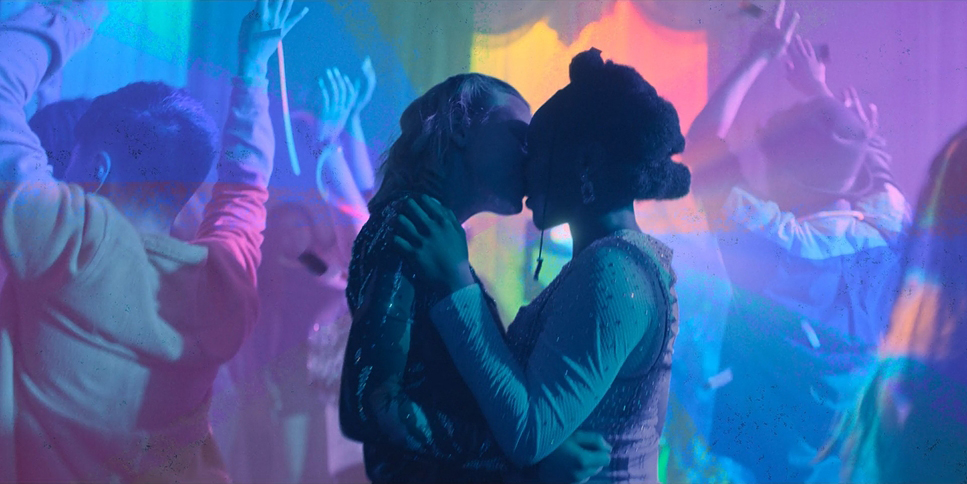
| PURPLE: There’s a fantastical and ominous presence from purple, but also erotic and metaphysical. |
| GREEN: Most notably suggestive of nature, green can also denote immaturity, corruption, and danger. |
| ORANGE: Warm, friendly, and sociable, orange also signifies youth, happiness, and exoticism. |
USE OF COLOR IN FILM
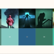
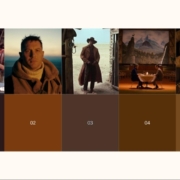
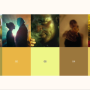
Mood and tone inform the color in film through the use of color palettes like monochromatic, analogous, complementary, triadic, and tetradic.
MONOCHROMATIC COLOR PALETTE
Monochromatic color palettes are harmonious and even a dreamy color combination.
This kind of color palette is based on a single hue with darker shades and lighter tints.
ANALOGOUS COLOR PALETTE
An analogous color palette is full of corresponding colors that are beside one another on the color wheel.
One of the colors is a primary, and the next is a supporting color, and the third is typically an accent color or a blending of the two.
COMPLEMENTARY COLOR PALETTE
Complementary color palettes involve colors that conflict with one another and are opposites on the color wheel.
Characters and themes can be clearly defined through this high-impact color combination.
Examples include red and green, yellow and purple, or blue and orange. When combined, the colors will appear more pronounced.
TRIADIC COLOR PALETTE
A triadic color palette is one that is balanced and evenly matched.
This means there is a dominant color with two complementary colors that are evenly spaced on the color wheel.
For a bold and vibrant palette, the triadic color palette is a solid choice.
TETRADIC COLOR PALETTE
Tetradic color palettes are bold with the use of one primary color and three accent colors.
Altogether, the four colors are evenly spaced on the color wheel.
Just note that it will be more of a challenge with the more colors you use.
DISCORDANT COLORS
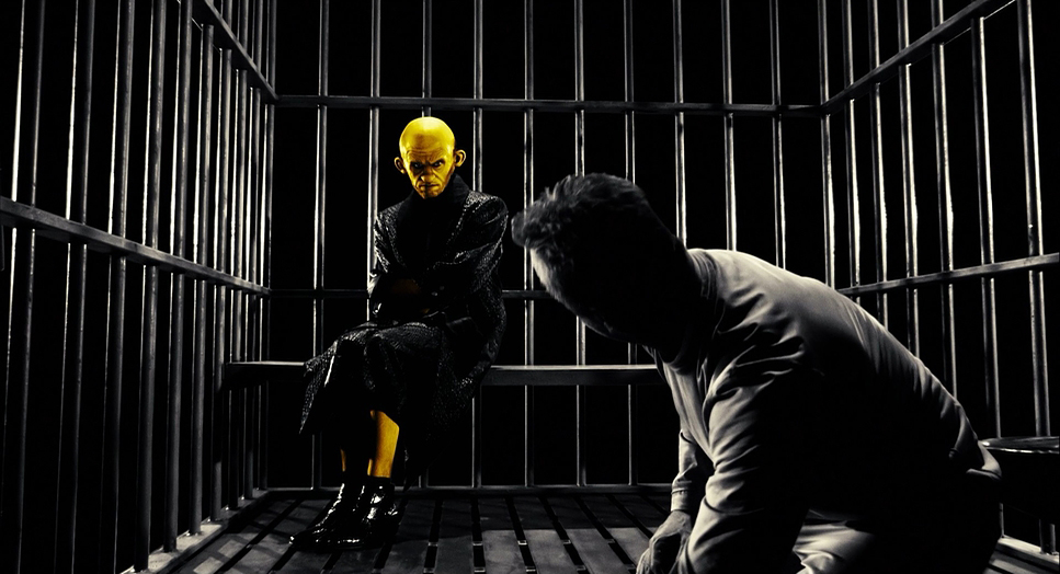
Say you want an object to stand out or refocus the attention of your audience to a new character. Discordant colors stand out from the rest of the film’s color scheme.
ASSOCIATIVE COLORS
The use of associative colors is to build an emotional connection to a particular color with a character or theme.
TRANSITIONAL COLOR
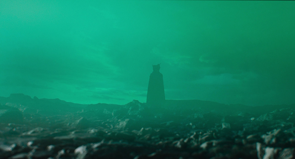
By shifting one color in the film to another, a transitional color produces a change in a character or theme.
 |
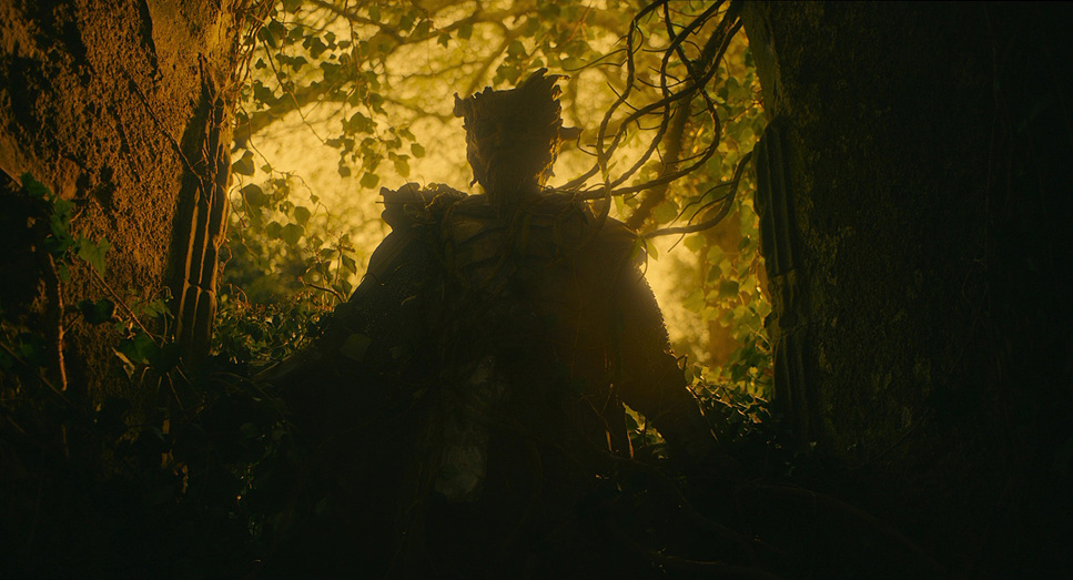 |
The Green Knight (2021)
COLOR TEMPERATURE
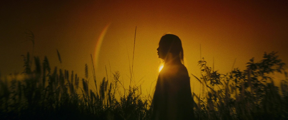
When you look at the color wheel you will notice both warm and cool colors. Warm, meaning colors like yellow, orange, and red; or cool meaning colors like blue, green, and yellow.
Warm colors usher in a feeling of warmth, energy, and coziness, whereas cool colors convey a sense of isolation, apathy, and serenity.
TRY THE COLOR TOOL ON SHOTDECK
When building your deck or lookbook, ShotDeck provides one of the best filtering systems for finding the images you need. And we all know how difficult the process is of finding the ideal image.
The best part about ShotDeck’s filtering system is its color tool. It gives filmmakers the option to filter for exact colors, as well as by color temperature and saturation.
For the especially keen-eyed, you can also search by lab process, optical format, and lighting type.
One of the best functions in ShotDeck’s filtering system is the new Rosco Colors tool. It provides a search box so you can find exactly what you’re looking for. Or, you can scroll through the dropdown menu and peruse the vast selection of Rosco colors.
Take your understanding of the new color tool to the next level with our article, Rosco and Shotdeck Release All-New Rosco Color Feature.
Try ShotDeck now!
More on Color in Film
- Colors in Filmmaking – What Do Yours Represent?
- Building a Color Palette in Your Film
Building Your Cinematic Look
Building Your Cinematic Look starts with the script and continues as a collaborative process throughout the rest of production and post. From sparking inspiration with iconic books on cinematography to creating the lookbook and building the world around you, Shane Hurlbut, ASC pulls from his experience constructing futuristic worlds as well as harnessing light to reveal how to build the look you desire.
