Color is more than just visual in filmmaking. It’s a powerful storytelling tool. It’s an unspoken language that conveys emotions. It foreshadows events and shapes our perception of characters and their worlds. Among the spectrum of hues, red stands out. Red is a particularly potent force. It’s the color of passion, danger, power, and rage. It’s a primal color that demands attention. It evokes strong visceral reactions. Think of the crimson cloak of Little Red Riding Hood. Consider the blood-soaked battlefields of war epics. Red has been used throughout cinematic history to punctuate key moments. It defines character arcs. It imbues scenes with layers of symbolic meaning.
But how exactly does red function within the language of cinema? What makes it so effective at conveying such a wide range of emotions and ideas? In this article, we’ll dive deep into the fascinating world of color theory and psychology. We’ll explore the multifaceted nature of red in film. Then, we’ll shift gears to analyze iconic examples from classic and contemporary cinema. This includes dissecting how masterful filmmakers like Stanley Kubrick, Dario Argento, and Quentin Tarantino have wielded the color red. They’ve used it to create unforgettable cinematic experiences.
We will also look at how red can be used to symbolize many things. It can represent love and lust, violence and aggression and serve as a warning and alarm. We’ll examine how different shades and intensities of red can elicit vastly different responses. Consider the soft glow of a romantic sunset. Contrast that with the harsh glare of emergency lights. Most importantly, we will take a look at how some of the most iconic directors of all time have masterfully implemented the color red into their films.
More Articles About Color Theory:
|
MOVIE COLOR PALETTE SERIES
This exploration of red is just the beginning. This is the first installment in our new “Movie Color Palette” series that will dissect the use of color in film, one hue at a time. In future articles, we’ll journey through the entire spectrum, unraveling the secrets of blue’s tranquility, yellow’s vibrancy, green’s ambiguity, and the myriad of meanings embedded within each color. By understanding the nuanced language of color, you’ll gain a deeper appreciation for the artistry of filmmaking and unlock new tools to enhance your own visual storytelling. So, let’s begin our journey with red, the most primal and powerful color in the cinematic palette, and discover the vibrant stories it has to tell.
RED: A PRIMAL FORCE IN ART AND THE DAWN OF TECHNICOLOR
Before we dissect the cinematic language of red, it’s crucial to understand its profound impact on human psychology. This connection transcends the medium of film and extends deep into the history of art itself. For centuries, artists have recognized and harnessed the power of red, employing it to evoke visceral responses and infuse their works with layers of meaning.
In cave paintings, red ochre, one of the first pigments used by humans, depicted scenes of hunting and ritual, suggesting a connection to blood, life force, and the power of nature. Throughout history, the color red has maintained a similar level of importance.
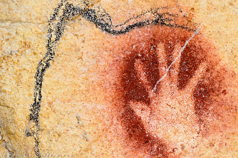
Red hand and mammoth circa 30,000 BP in Chauvet cave, France
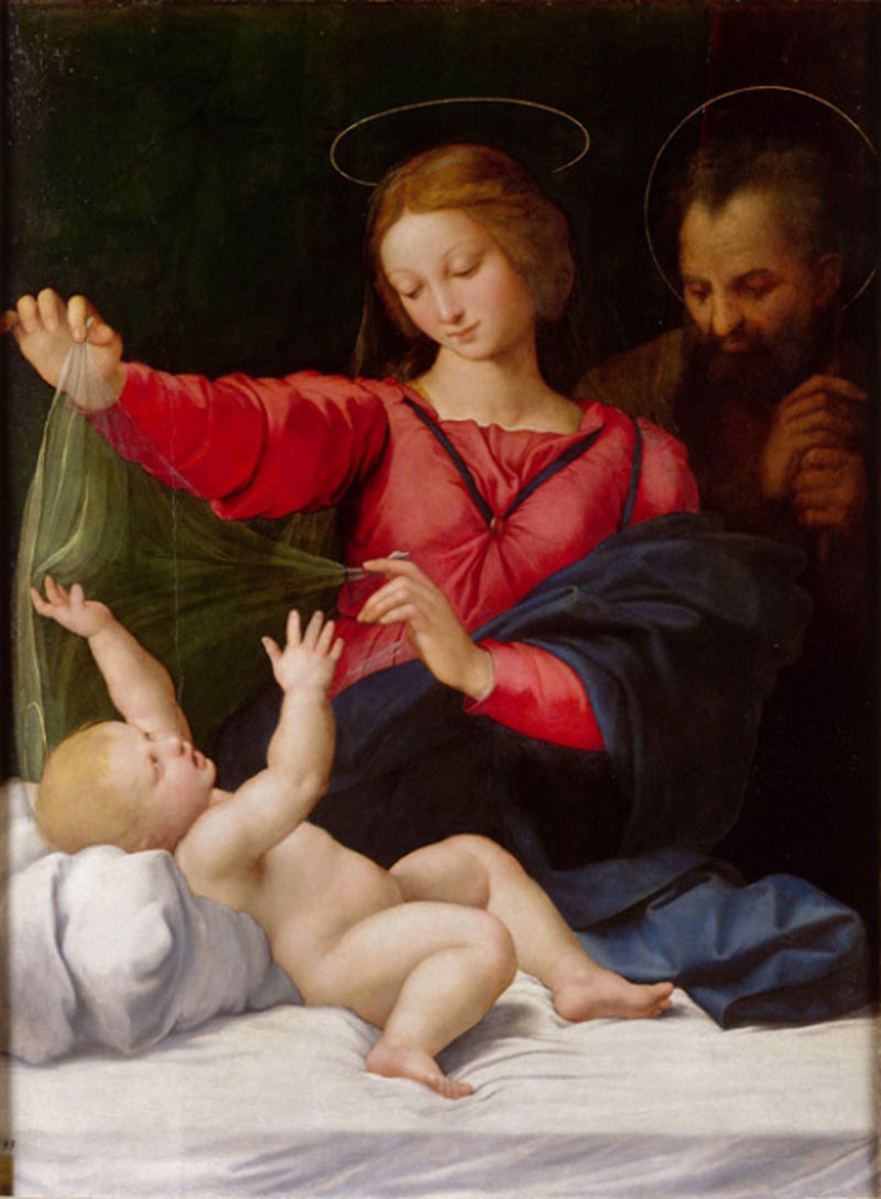
In the vibrant palettes of Renaissance masters, red, often derived from expensive and highly prized pigments like vermilion, signified wealth, status, and religious fervor. Think of the opulent red robes adorning royalty and religious figures in paintings by Titian or Raphael, instantly conveying power and authority.
 |
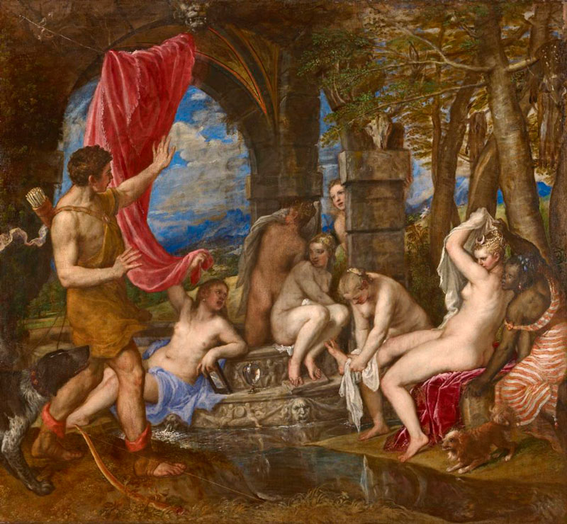 |
(L) Raphael, So-Called Madonna di Loreto or Chantilly Madonna, c. 1511-12 (R) Titian, Diana and Actaeon, 1556–59
Red’s association with passion and emotion also found its way into art. From the dramatic canvases of Caravaggio to the romantic works of the Pre-Raphaelites, red was used to depict love, lust, anger, and sacrifice, often serving as the focal point of emotionally charged scenes. Whether it was used in a subtle manner such as a blush on the cheek of a model in a portrait, or the central theme such as a red dress or backdrop, the color always suffused a passionate and eye-catching tone.
RED IN EARLY CINEMA
This inherent power of red to command attention and stir emotion didn’t go unnoticed by the pioneers of early cinema. As filmmaking transitioned from the stark contrasts of black and white to the vibrant world of color, red naturally took center stage. The advent of Technicolor, particularly the three-strip process developed in the 1930s, was a watershed moment. This groundbreaking technology allowed filmmakers to capture a wider range of colors. However, it was red that truly popped off the screen, instantly becoming a favorite tool for creating visual spectacle.
Early Technicolor films often showcased red in its most flamboyant forms. Think of the ruby slippers in The Wizard of Oz (1939), their vibrant hue is instantly iconic and symbolic of Dorothy’s (Judy Garland) journey and desire for home.
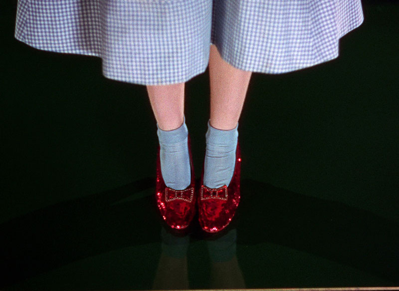
Dorothy’s Ruby Slippers in The Wizard of Oz | MGM
Or consider the lavish costumes and sets of Gone with the Wind (1939), where red embodies the fiery passion of Scarlett O’Hara (Vivien Leigh) and the turbulent backdrop of the Civil War.
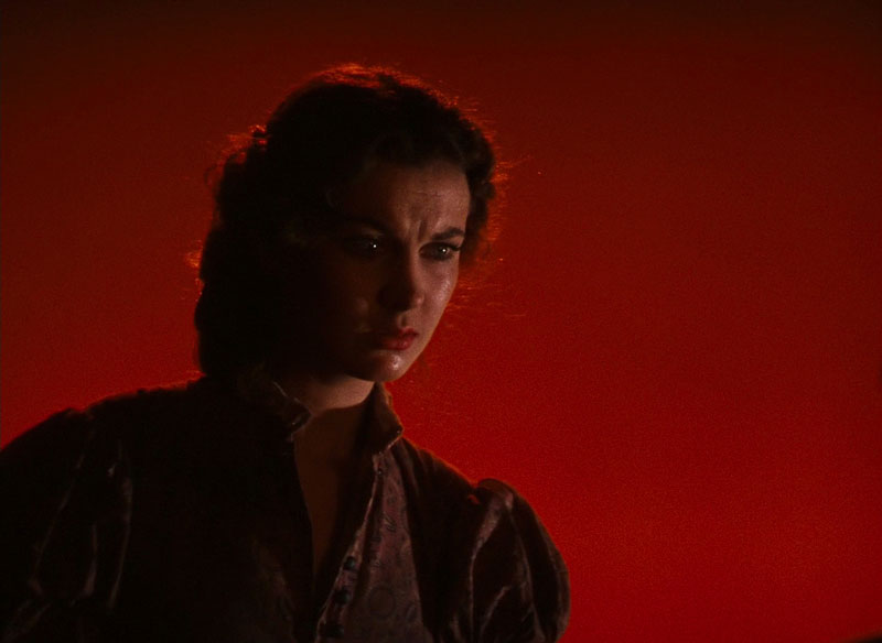
Scarlett O’Hara before a red background in Gone With The Wind | MGM
These films used red not just as a decorative element, but as a narrative device. In that way, it amplifies the emotional impact of key scenes and adds another layer of storytelling to the film. Many of the early Technicolor films featured lavish costumes and colors that showcased the new technology. Red quickly became associated with the magic of Hollywood’s Golden Age, solidifying its place as a cinematic staple. It was in these early Technicolor films that red was first used as a storytelling device. Thus, red cemented its place in film history.
Coming Up…
The transition to Technicolor was more than just a technological advancement. It was a shift in the visual language of cinema. And at the heart of that shift was red, a color already deeply ingrained in the human psyche through centuries of artistic expression, now finding a new and powerful voice on the silver screen. In the next section, we will go into further detail on how some of the most iconic directors of all time used the color red to craft some of the most memorable scenes in film history.
THE POWER OF RED BY ICONIC DIRECTORS
The transition to color provided filmmakers with a powerful new tool, and visionary directors quickly recognized the potential of red to elevate their storytelling beyond the limitations of black and white. They began to use red not merely as a visual flourish, but as a key element of their cinematic language, weaving it into the fabric of their narratives to shape mood, foreshadow events, and define characters.
Let’s examine how some of cinema’s most influential auteurs have wielded the power of red to craft unforgettable moments in film history.
STANLEY KUBRICK
Stanley Kubrick, a master of visual symbolism, frequently employed red to create a sense of unease and impending doom. In The Shining (1980), the crimson flood of blood that bursts from the elevator doors is a shocking and visceral image that instantly establishes the Overlook Hotel’s horrific past.
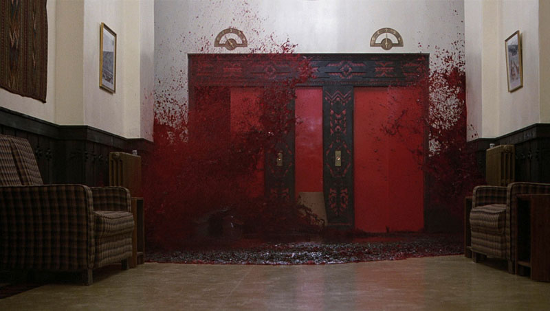
Crimson blood pouring from the elevators in The Shining | Warner Bros.
Later, the repeated use of red in the costumes and set design, particularly in the ominous Gold Room, creates a pervasive atmosphere of dread and psychological tension. The iconic “Redrum” scrawled on the door serves as both a literal and symbolic warning, highlighting the descent into madness that engulfs the Torrance family.
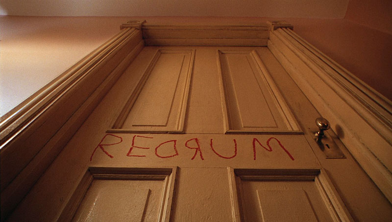
Redrum scrawled on the door in The Shining | Warner Bros.
In 2001: A Space Odyssey (1968), the malevolent red eye of the HAL 9000 computer becomes a chilling symbol of artificial intelligence gone awry, its unwavering gaze representing a cold, calculating threat to the human crew.

HAL 9000 in 2001: A Space Odyssey | MGM
DARIO ARGENTO
Dario Argento, the maestro of Italian Giallo horror, is renowned for his expressionistic use of color, and red is central to his visual palette. In Suspiria (1977), Argento bathes entire scenes in saturated red light, creating a nightmarish, hallucinatory atmosphere.
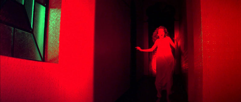
Saturated red light in Suspiria | Seda Spettacoli
The color becomes a visual manifestation of the evil that permeates the dance academy, transforming the setting into a living, breathing entity of terror. The intense reds heighten the sense of disorientation and amplify the visceral impact of the film’s violent set pieces. The use of red lighting throughout the film was no accident, but rather an intentional choice that has made the film one of the most iconic horror films ever.
QUENTIN TARANTINO
Quentin Tarantino, a director known for his stylized violence and darkly comedic narratives, often utilizes red to punctuate moments of extreme action and bloodshed. In Pulp Fiction (1994), the dimly lit, red-drenched interior of the strip club where Marsellus Wallace (Ving Rhames) and Butch Coolidge (Bruce Willis) have their tense conversation is dripping in palpable tension and the threat of violence.
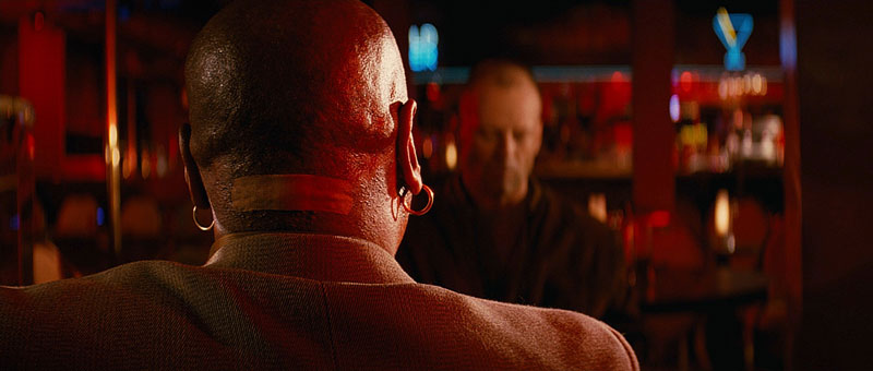
The meeting between Marsellus and Butch bathed in red light | Miramax
The deep reds foreshadow the betrayal and bloodshed that will define their relationship, immersing the audience in a visually and thematically charged atmosphere. The color here is not merely aesthetic; it’s a visual cue. It signals the danger and the underworld dealings that shape the characters’ lives.
Later, the sudden and shocking eruption of red during the accidental shooting of Marvin in the back of the car serves as a darkly humorous punctuation mark, highlighting the film’s blend of violence and absurdity.
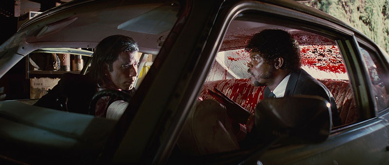
Accidental shooting in Pulp Fiction | Miramax
Another iconic use of red in Tarantino’s filmography is seen in Kill Bill Vol. 1 (2003) when The Bride (Uma Thurman) finally has her showdown with the Crazy 88. The scene is bathed in a deep red, a clear homage to the samurai films of the past that heavily influenced Tarantino.
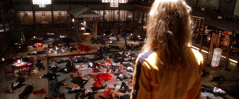
Bloody showdown in Kill Bill: Vol. 1 | Miramax
ALFRED HITCHCOCK
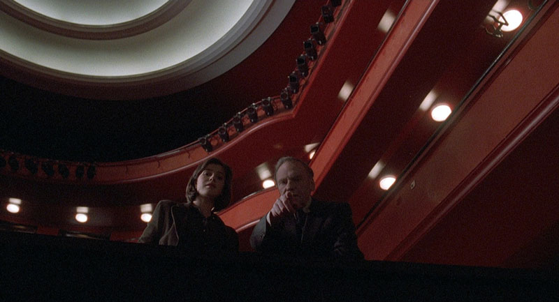
Alfred Hitchcock, the master of suspense, demonstrates a more restrained but equally effective use of red in Vertigo (1958). Here, red is associated with Madeleine (Kim Novak), the enigmatic woman who becomes the object of Scottie’s obsessive desire. Her dressing in red, the red interiors of Ernie’s restaurant, and the red light that bathes Scottie (James Stewart) in a pivotal scene all contribute to an atmosphere of mystery, passion, and danger.
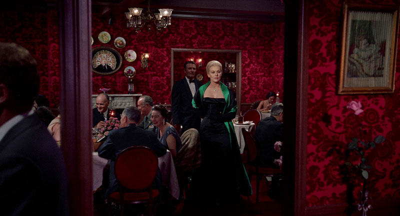
Red interior in Vertigo | Alfred J. Hitchcock Productions
Red blouse in Vertigo | Alfred J. Hitchcock Productions
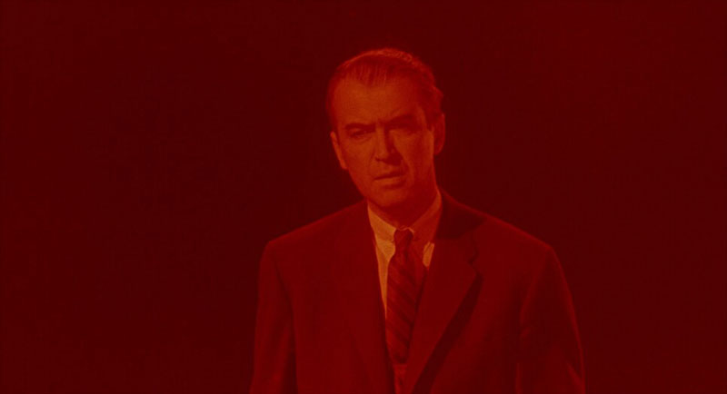
Scottie bathed in red in Vertigo | Alfred J. Hitchcock Productions
The color becomes a visual motif that underscores Scottie’s descent into obsession and the film’s exploration of illusion versus reality.
These are just a few examples of how master filmmakers have harnessed the power of red to create indelible cinematic moments. Whether used to create a sense of dread, heighten the impact of violence, underscore a character’s inner turmoil, or simply add a layer of visual richness, red remains a potent tool in the filmmaker’s arsenal.
Next, we will explore the use of red by modern filmmakers in innovative and thought-provoking ways.
THE USE OF RED BY MODERN FILMMAKERS
The legacy of iconic directors like Kubrick, Argento, Tarantino, and Hitchcock continues to inspire, and the power of red remains a vital element in the palettes of contemporary filmmakers. While the techniques and styles may evolve, the fundamental ability of red to evoke emotion, create atmosphere, and enhance storytelling remains unchanged.
In recent years, we’ve seen a resurgence of bold color choices in cinema, with many directors using red in innovative and thought-provoking ways. These modern auteurs are not simply imitating the masters, but rather building upon the established language of color, adapting it to new narratives and pushing the boundaries of visual expression.
Let’s explore some examples of how contemporary filmmakers are carrying the torch, utilizing red to craft compelling visual narratives.
NICOLAS WINDING REFN
Nicolas Winding Refn, known for his highly stylized and often violent films, frequently employs red to create a sense of hyper-reality and impending danger.
In Drive (2011), one of the most memorable examples is the scene in the dressing room. In this moment of brutality, the Driver (Ryan Gosling) viciously attacks a hitman.

The red dressing room in Drive | FilmDistrict
Refn also uses red in more subtle ways throughout the film. The red and white checkered tile in the restaurant, a seemingly innocuous detail, adds a layer of visual unease. It hints at the dangerous undercurrents that run beneath the film’s surface.
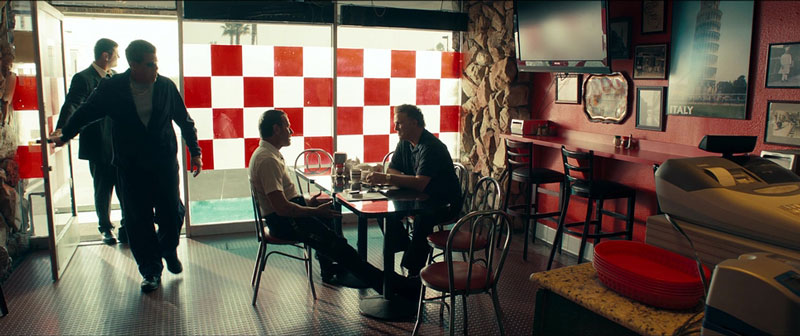
The red and white checker wall in Drive | FilmDistrict
Additionally, Refn strategically employs red lighting in select scenes to heighten the mood and create a sense of heightened reality, often foreshadowing moments of tension or violence.
Ryan Gosling bathed in red light in Drive | FilmDistrict
Refn’s use of red is often bold and graphic, creating a visceral impact that lingers long after the credits roll.
THE SAFDIE BROTHERS
The Safdie Brothers (Benny and Josh) are known for their gritty, realistic style that often features stressed characters in difficult situations. The Safdie Brothers’ film Good Time (2017) showcases an effective use of red in many scenes, including when Connie (Robert Pattinson) is trying to escape with his brother after the failed bank robbery.

The use of red dye after the failed bank robbery in Good Time | Elara Pictures
Connie dyes his hair red, and later, the red dye is all over him, creating a visual representation of his desperation and the danger he is in.
Later, when Connie is on the run, the film features many scenes that are bathed in red light, emphasizing his paranoia and the walls that are closing in around him as he attempts to escape.

Connie bathed in red light in Good Time | Elara Pictures
JORDAN PEELE
Jordan Peele has quickly become a master of modern horror, and his use of color is a key element of his craft. In Us (2019), the red jumpsuits worn by “The Tethered,” the film’s antagonists, are instantly striking and unsettling.
Red Jumpsuits in Us | Blumhouse
The uniformity of the red creates a sense of collective threat, while the color itself evokes associations with blood, danger, and revolution. In that way, the red jumpsuits become a powerful visual symbol of the film’s themes of duality, class struggle, and societal unrest.
Us vs. Them in Us | Blumhouse
The use of the red jumpsuits also creates a striking visual contrast with the more muted tones of the protagonists’ clothing, further emphasizing the “us vs. them” dynamic at the heart of the film.
DENIS VILLENEUVE
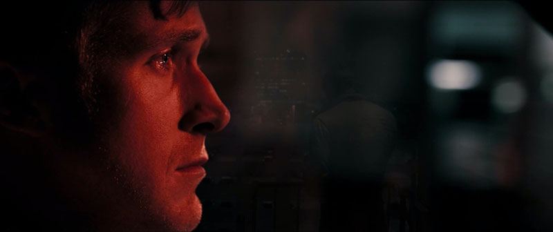
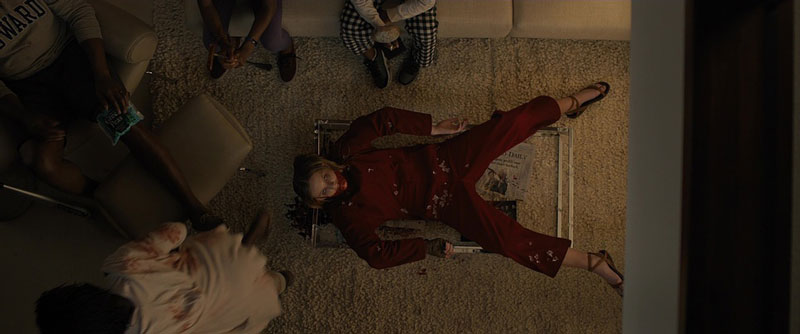
Denis Villeneuve, a director celebrated for his visually stunning and thought-provoking films, demonstrates a nuanced understanding of color. In Prisoners (2013), he uses red to create a sense of unease, foreshadow danger, and highlight key thematic elements.
Throughout the film, red objects and lighting are strategically employed. For instance, the red whistle that belongs to one of the missing girls becomes a recurring visual motif, representing both a desperate hope for rescue and the potential for violence.

Keller (Hugh Jackman) discovers the red whistle in Prisoners | 8:38 Productions
Red is also used in the clothing of certain characters which is used to draw suspicion from the audience.
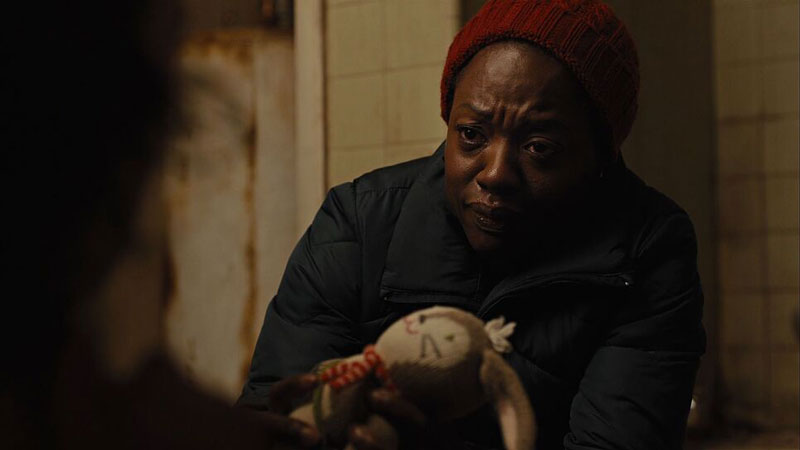
Nancy (Viola Davis) wears a red cap | 8:38 Productions
Villeneuve also uses red lighting in select scenes, particularly in moments of tension or heightened emotion. This subtle yet deliberate use of red contributes to the film’s unsettling atmosphere and underscores the moral ambiguity at the heart of the story.
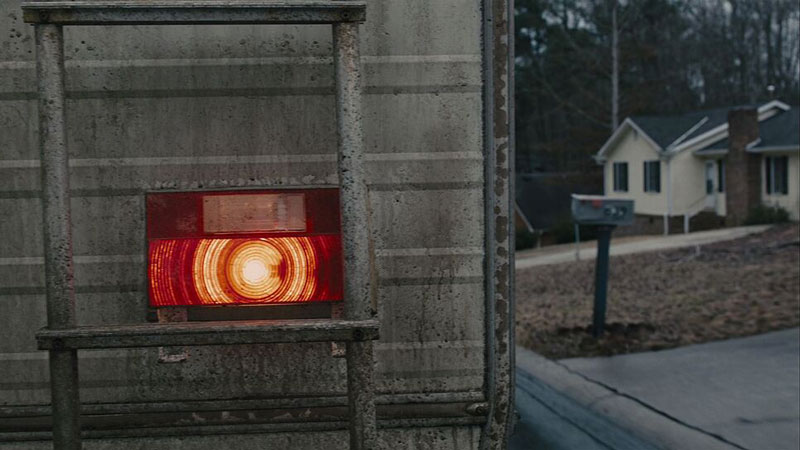
Red Lights in Prisoners | 8:38 Productions
The color becomes a visual cue, hinting at the darkness that lurks beneath the surface of the seemingly ordinary suburban setting.

The red taillight in Prisoners | 8:38 Productions
PARK CHAN-WOOK
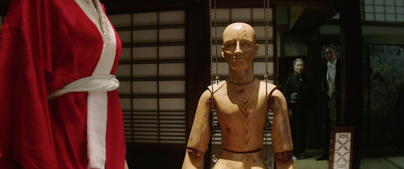
Park Chan-wook, the South Korean auteur known for his visually arresting and often disturbing films, is a master of color symbolism. In The Handmaiden (2016), he employs red to signify passion, deception, and hidden desires.

Red Strawberries in The Handmaiden | CJ Entertainment

The use of red robes in The Handmaiden | CJ Entertainment
The red ink used for calligraphy, the red accents in the costumes, and the red lighting in certain scenes all contribute to a richly layered visual tapestry that mirrors the film’s complex and twisty narrative.
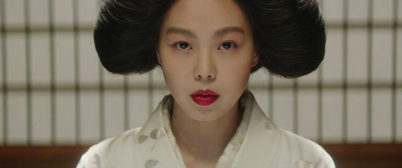
Red Lipstick in The Handmaiden | CJ Entertainment
Red Robes in The Handmaiden | CJ Entertainment
The color becomes a visual representation of the characters’ inner lives, hinting at the secrets and manipulations that drive the plot.
The accent of red with photos in The Handmaiden | CJ Entertainment
The use of red in The Handmaiden is subtle but pervasive, adding a layer of visual richness to an already complex narrative.
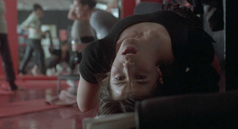
JEAN-PIERRE JEUNET
Red often signifies danger, passion, or violence. However, it can also evoke warmth, joy, and connection. Jean-Pierre Jeunet’s Amélie (2001) offers a prime example. This charming Parisian fairytale uses red in a more whimsical way. Red is a recurring visual motif in the film. It contributes to the film’s overall sense of optimism. It adds to the playfulness and romantic idealism. This isn’t about blood and guts. It’s about the heart and the small joys of life.
Amélie Poulain (Audrey Tautou) is the film’s titular character. She is often associated with the color red. Her apartment is filled with red accents. We see red wallpaper and red lamps. There are red knick-knacks on her shelves. This use of red reflects her vibrant inner world. It shows her quirky personality and depicts her capacity for finding joy in the mundane. It is not a depiction of her but of her surroundings. Jeunet uses it to display her personality.
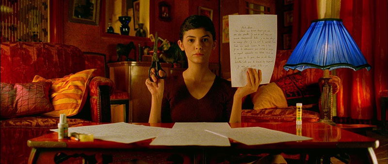
Red wardrobe and interior in Amélie | Claudie Ossard Productions
RED SYMBOLS
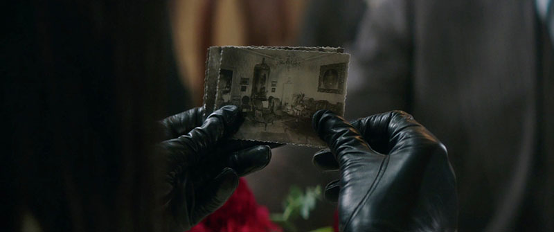
The film also uses red to highlight moments of connection and kindness. Amélie orchestrates acts of anonymous generosity. Red often appears in these scenes. It subtly reinforces the positive impact of her actions. Consider the red suitcase Amélie returns to its owner. There’s the red photo booth where she leaves clues for Nino. Even the red heart-shaped box containing childhood treasures is significant. These all become visual symbols of human connection. They represent the small miracles that Amélie creates.

Red photo booth in Amélie | Claudie Ossard Productions
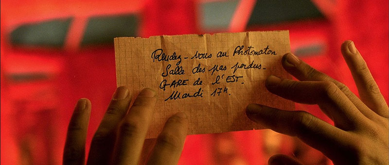
Clue with red background in Amélie | Claudie Ossard Productions
CONTRASTING RED WITH GREEN
Contrast this with the film’s use of green. Green often appears in scenes depicting loneliness or isolation. The juxtaposition of red and green is careful and deliberate. It creates a visual dialogue throughout Amélie. It highlights the contrast between connection and disconnection as well as joy and melancholy.
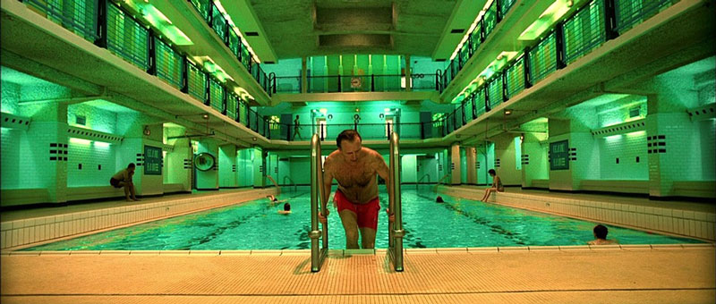
Interior pool in Amélie | Claudie Ossard Productions
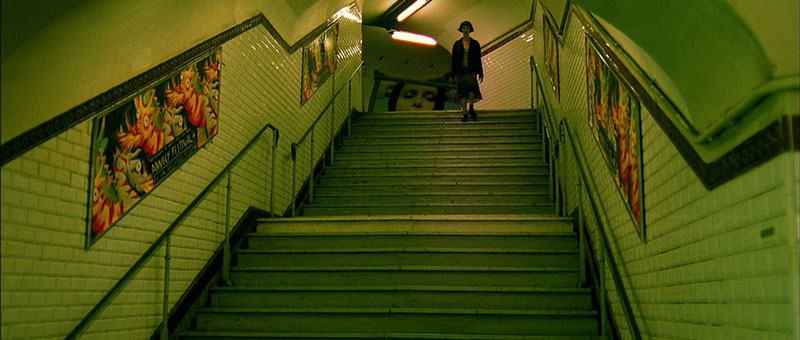
Train station in Amélie | Claudie Ossard Productions

Green shirt on red door in Amélie | Claudie Ossard Productions
Red and green are naturally complementary colors. Jeunet crafts the film to use these colors strategically. He uses them at the most opportune time and to reinforce the tone of the scenes.
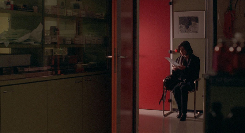
KRZYSZTOF KIESLOWSKI
Krzysztof Kieślowski’s Three Colors: Red (1994), the final installment of his Three Colors trilogy, offers a profound meditation on fate, connection, and the complexities of human relationships. As the title suggests, red is not merely a visual element in this film. It’s a pervasive, symbolic presence that permeates the narrative and underscores the film’s central themes. This film takes the color and name to another level, deeply exploring the concept.
The use of red in Three Colors: Red | MK2 Productions
RED VISUAL MARKERS
Unlike the bold, often violent reds of Tarantino or Argento, Kieślowski employs a more subtle, yet insistent, approach. Red appears throughout the film in a variety of forms: clothing, objects, lighting, and even the environment itself.

MK2 Productions

Red table cloth and red apple in Three Colors: Red | MK2 Productions
Valentine (Irène Jacob), the young model who serves as the film’s protagonist, is frequently seen wearing red. Notice everything from her red sweater, red coat, and even the red dog she rescues. They all become visual markers of her compassion, vulnerability, and the burgeoning connections she forms throughout the story.
Red interior in Three Colors: Red | MK2 Productions
COLOR AS NARRATIVE CONNECTIVE TISSUE
The retired judge (Jean-Louis Trintignant), a pivotal figure in Valentine’s life, is also linked to red. His home contains red accents, and he often sits bathed in the warm glow of a red lamp. This use of red in relation to the judge is more ambiguous. It suggests a past filled with passion and perhaps regret. This hints at the secrets and moral complexities that lie beneath his seemingly detached exterior. It could also be a nod to his profession since red is associated with law and order.
Red theater in Three Colors: Red | MK2 Productions
But red in Three Colors: Red extends beyond individual characters. It’s woven into the fabric of the film’s world. Red cars, red billboards, red bowling balls, and even the red ferry that bookends the film all contribute to a sense of interconnectedness and predetermined fate.
The red car in Three Colors: Red | MK2 Productions
These recurring red motifs suggest a hidden order beneath the surface of everyday life. Specifically, hinting at the invisible threads that link seemingly disparate individuals and events. It is a masterclass on how a director can use a single color to emphasize their film’s main themes.

Red exterior in Three Colors: Red | MK2 Productions
The film’s climax, a dramatic storm and shipwreck, brings all the surviving characters from the trilogy together. The prominent red of the rescue efforts and the survivors’ blankets underscores the themes of fraternity, compassion, and the possibility of redemption.

Shipwreck in Three Colors: Red | MK2 Productions
It’s a powerful visual culmination of the film’s exploration of human connection, suggesting that even in the face of chaos and tragedy, hope and empathy can prevail.
THE POWER OF VISUAL REFERENCE: HOW SHOTDECK IS REVOLUTIONIZING FILMMAKING

We’ve used striking visual examples throughout this exploration of red in cinema. These images illustrate the power and versatility of this potent color. We’ve looked at iconic imagery from classics like The Shining and Suspiria. We’ve also examined the nuanced palettes of contemporary masters like Nicolas Winding Refn and Park Chan-wook. These images are invaluable tools. They help us understand how color functions within the language of film. But where do filmmakers, film students, and cinephiles go to find specific shots? Where can they analyze color palettes or seek visual inspiration?
This is where ShotDeck comes in. ShotDeck is a revolutionary online resource. It’s changing the way filmmakers approach pre-production, visual research, and even film analysis. It’s the world’s largest searchable database of high-definition movie images. Each image is meticulously curated and tagged. This provides an unparalleled level of detail.
Every image in this article was sourced from ShotDeck’s impressive library. They showcase the masterful use of red across a range of films and directors. We will continue to explore the vibrant world of color in film. As we do, resources like ShotDeck will play an increasingly vital role. They will help shape the future of cinema.
THE BOTTOM LINE: THE UNSPOKEN LANGUAGE OF RED
Our exploration of red in cinema has been revealing. We’ve uncovered a color far more complex than its primal associations. Red is a powerful force on screen. It signifies a duality of love and rage, passion and danger, revolution and warning. Filmmakers have harnessed this power from the earliest days of Technicolor to contemporary cinema. They use red to shape narratives, define characters, and craft unforgettable moments.
Master filmmakers like Kubrick, Argento, Tarantino, and Hitchcock employed red to great effect. They created dread, punctuated violence, and underscored obsession with this color. Today, directors like Refn, the Safdie Brothers, Peele, Villeneuve, and Park Chan-wook continue this legacy. They are finding innovative ways to utilize red’s evocative power. Consider the unsettling red jumpsuits in Us. Remember the chilling red eye of HAL 9000. Think of the symbolic red lighting in The Handmaiden. Red can be a bold statement or a subtle undercurrent. It can be a literal representation or a symbolic cue.
This exploration of red marks the beginning of our “Movie Color Palette” series. We will delve into other colors in future installments. Each hue possesses a unique ability to influence our emotions and understanding of the narrative. Remember red’s profound impact on cinematic storytelling. By recognizing the nuanced language of color, we deepen our appreciation for filmmaking artistry. Prepare to see the world of film through a new lens. This lens will be tinted with the full spectrum of cinematic color. Utilize resources like ShotDeck for visual inspiration. The colorful journey has just begun.
THE FILMMAKERS ACADEMY ADVANTAGE

Filmmaking is a collaborative art. That’s why at Filmmakers Academy, we believe in the power of connection. Beyond our comprehensive courses, we offer a thriving community where you can network with fellow filmmakers. Not only that but you can share your work and find collaborators for your next project. Our platform provides a space to connect with industry professionals, learn from experienced mentors, and build lasting relationships that can propel your career forward.