Color Wheel
A color wheel is an illustrative, circular diagram that organizes colors to demonstrate the relationships between them. It’s a fundamental tool for artists, designers, and filmmakers, providing a visual representation of color theory. While various iterations exist, the traditional color wheel, often associated with Johannes Itten, arranges colors in a way that clearly defines primary, secondary, and tertiary hues. This structure not only helps in understanding color mixing but also serves as a basis for creating harmonious and impactful color palettes.
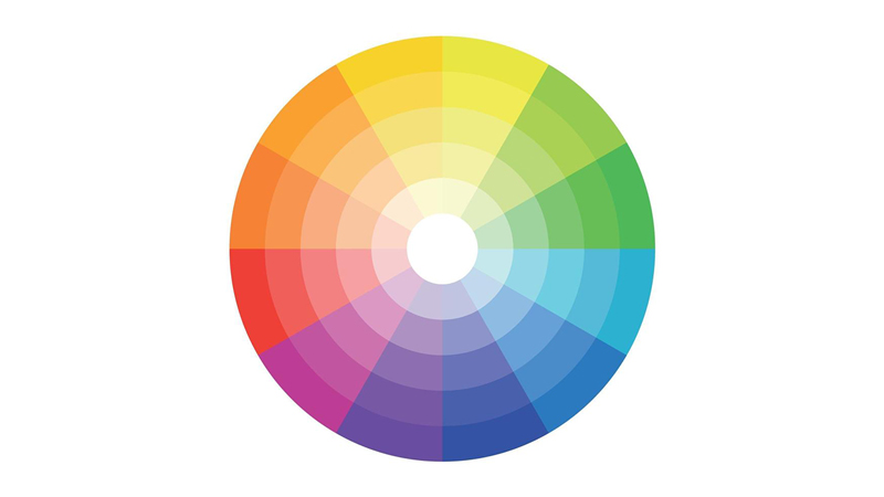
The Orders of Color
The organization of a color wheel is typically based on three distinct orders of colors:
- Primary Colors: These are the foundational colors from which all other colors can be mixed. In the traditional RYB (Red, Yellow, Blue) model, commonly used in art and design education, these are red, yellow, and blue. It’s important to note that in digital and print media, different primary color models are used, such as RGB (Red, Green, Blue) for screens and CMY(K) (Cyan, Magenta, Yellow, and Key/Black) for printing.
- Secondary Colors: These colors are created by mixing equal parts of two primary colors. In the RYB model, these are:
- Orange (Red + Yellow)
- Green (Yellow + Blue)
- Purple/Violet (Blue + Red)
- Tertiary Colors: Also known as intermediate colors, these are formed by mixing a primary color with an adjacent secondary color. This results in six hues that bridge the gap between the primary and secondary colors, providing a more nuanced spectrum. In the RYB model, these are:
- Yellow-Orange
- Red-Orange
- Red-Purple
- Blue-Purple
- Blue-Green
- Yellow-Green
Color Harmony and Schemes
Beyond simple color mixing, the color wheel is indispensable for identifying color harmonies – combinations of colors that are considered aesthetically pleasing. Common color schemes derived from the color wheel include:
- Complementary Colors: Colors directly opposite each other on the wheel (e.g., red and green, blue and orange). This combination creates high contrast and visual excitement.
- Analogous Colors: Colors that are adjacent to each other on the wheel (e.g., yellow, yellow-green, and green). One often finds these schemes in nature, and they create a sense of serenity and unity.
- Triadic Colors: Three colors evenly spaced around the color wheel (e.g., red, yellow, and blue). Triadic schemes offer vibrant contrast while maintaining harmony.
- Split-Complementary Colors: A variation of the complementary scheme where, instead of the direct opposite, the two colors adjacent to the complement are used. This provides strong visual contrast but with less tension than a direct complementary pairing.
- Monochromatic Colors: Variations in lightness and saturation of a single color. This scheme is subtle and sophisticated.
Color Contrasts in Film Analysis
Johannes Itten, in conjunction with his color theory, identified seven types of color contrasts that describe the varied subjective effects different color combinations have on the viewer. A systematic analysis of a film excerpt based on its color contrasts can be highly valuable for an artistic interpretation of its color composition. For filmmakers, understanding these contrasts is crucial for visual storytelling, setting mood, and conveying emotion.
The contrasts particularly relevant for film analysis include:
Contrast of Hue (Contrast of Pure Hue):
This refers to the contrast created by juxtaposing different pure colors. The undiluted intensity of primary colors, for example, offers the strongest contrast of hue.
Light-Dark Contrast:
The juxtaposition of light and dark values of colors forms this contrast. It is fundamental to creating depth and form in an image, and is one of the most powerful tools for guiding the viewer’s eye.
Cool-Warm Contrast:
This contrast arises from the opposition of cool colors (blues, greens, some purples) and warm colors (reds, oranges, yellows). Warm colors tend to advance visually, while cool colors recede, allowing filmmakers to create a sense of depth or to evoke specific moods (e.g., warmth for comfort, coolness for alienation).
Complementary Contrast:
As mentioned earlier, this involves colors directly opposite each other on the color wheel. When placed next to each other, complementary colors intensify one another, creating a vibrant, energetic effect. In film, filmmakers can use this to draw attention to specific elements or create visual tension.
Contrast of Saturation (Contrast of Quality):
Juxtaposing colors with high saturation (intense, pure colors) with (or ‘alongside’) those with low saturation (dull, desaturated colors, or those mixed with gray) creates this contrast. Highly saturated colors tend to pop, while desaturated colors appear more subdued, allowing filmmakers to emphasize or de-emphasize certain visual elements.
Contrast of Extension (Contrast of Proportion/Quantity):
This contrast deals with the relative areas or proportions of different colors in a composition. A small amount of a vibrant color can balance a large area of a more neutral or less intense color.
Simultaneous Contrast:
This describes the phenomenon where surrounding colors influence how one perceives a particular color. For example, a neutral gray will appear to take on a tint of the complement of the surrounding color.
Colors in Filmmaking
The color wheel, therefore, is more than just a chart of colors. This foundational guide explains how colors interact, demonstrates how to mix them, and illustrates how creators strategically employ them to craft visually compelling and emotionally resonant narratives in filmmaking and other visual arts. Its principles empower creators to make deliberate and impactful choices in their use of color.
« Back to Glossary Index